06 May From Antique to Chic
IF CURVY AND COLORFUL POST-MODERN DETAILS, GLASS BLOCKS, and a prodigious amount of pink — on moldings, cabinets, floors, and logs — ever came back in style, this 1990s home in the notable Owl Creek neighborhood near Colorado’s Snowmass Village would be the Rocky Mountain’s center of sophistication.
Custom-designed by the original owners to maximize uniqueness and privacy, the four-bedroom, 7,000-square-foot residence was a beloved family home for 30 years. As the owners’ interests changed and their children had families of their own, the house suddenly felt dated, its voluminous spaces overwhelmingly cold and impersonal.
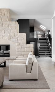
A grand fireplace, a remnant of the home’s former design, is now lined with a black firebox interior to complement its contemporary surroundings. The stairs, also an existing feature, were retreaded with brushed steel, and ornate hand railings were replaced with steel and glass.
“The house definitely was different,” says interior designer Noelle Hernandez, whose firm, Matter, was engaged to orchestrate a head-to-toe remodel.
Initially, the owners simply wanted to update their master bedroom, a vast and impersonal space with no logical orientation. “The logs set the tone for a post-modern look,” says Soraya Gallego, Hernandez’s sister, business partner, and the lead designer for the Aspen, Colorado-based firm. “We recommended removing them immediately.”
Beginning with the master bedroom, the Matter team, which also includes Hernandez’s daughter, Nicole Stewart, began a process of elimination that eventually took over the entire home. Select windows were removed, arced ceilings were lowered and squared off, and details were pared down to essential elements. “We took it down to the studs, and then as we rebuilt it,” says Gallego, “we were able to redirect the spatial flow so that only essential details remained, exaggerating the impact of the art, views, lines, and textures.”
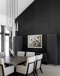
: In the dining room, the Bulthaup black “suede” paneling and buffet contrast with the Troscan table and chairs, which are upholstered in crisp Holly Hunt fabric. A Jonathan Browning glass chandelier illuminates the table.
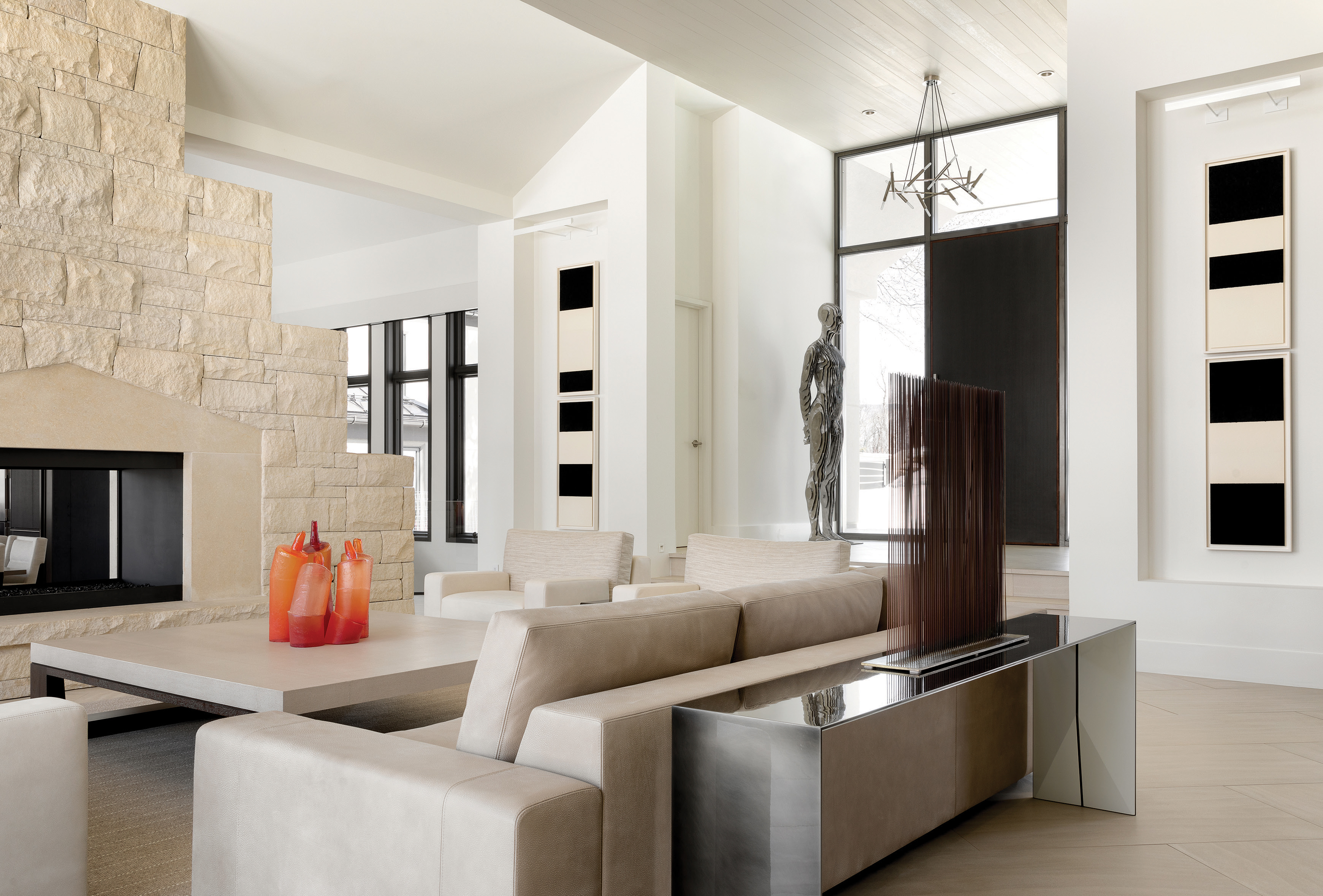
Updating the home also meant showcasing the couple’s considerable modern art collection. And, because art curation is a service that Matter offers, the team was able to direct everything from lighting design and the sizing of art walls to selecting specific pieces. Hernandez accompanied her clients — twice — to Art Basel in Miami, returning with a 6-foot-tall bronze sculpture by Julian Voss-Andreae, a Harry Bertoia sculpture, several Richard Serra paintings, and a piece by German artist Udo Nöger.
For Gallego, whose background in commercial and marine design combines the best of right and left brain attributes, this project was a joy to oversee. Military-grade organizational skills, as she calls them, come in handy on any project, but particularly on one like this where accountability is key. “If you are able to demonstrate in advance where you are going, it’s easy to move in a very orderly fashion in that direction,” Gallego says.
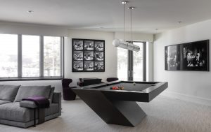
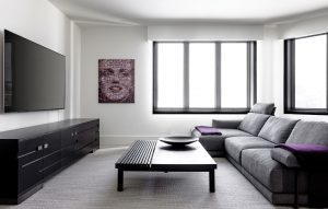
The lower-level living area and game room features a sofa and coffee table from Poliform. A suspended tubular light fixture from Roll & Hill highlights a cantilevered pool table — a gift to the owner — from Mitchell Pool Tables. Black window frames punctuate the spare palette, adding light and depth to a previously dark and confining space.
And, as Hernandez points out, “We got our marching orders, and we dug right in.” Save for the placement of the stairs, fireplace, and the exterior façade, every last detail of the original design was completely gutted, squared off, opened up, or transformed to reveal a minimalist and modern aesthetic throughout the home. “These homeowners are very discerning and experienced in building and design,” says Stewart. “We had to sell them on some major changes. Fortunately, they knew it was worth the risk.”
In the new Bulthaup kitchen, windows were eliminated because, as Hernandez recalls, “you had to wear sunglasses during the day just to move around in the space.” True to Bulthaup’s purist German designs, the kitchen — a study in high-quality materials, straight lines, and minimal color — is also an entertainment space where the owners can mingle with their guests, moving seamlessly between the exterior decks and the living and dining rooms. Black Bulthaup cabinetry is paired with a slick white backsplash, crisp stainless steel, and soft leather seating. Large-format tile flooring adds depth and nuance. To create intimacy, the Matter team lowered the kitchen ceiling by approximately 8 feet, leaving space for a small playroom for the grandchildren, accessed via the stairs, and located directly overhead.
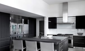
In the kitchen, black Bulthaup cabinetry with a suede-like finish is paired with a slick white backsplash, crisp stainless steel surfaces, and soft leather stools from Cassina. The large flooring tiles add depth and nuance to the open space.
In the living room, log columns and beams were replaced with a sophisticated tongue-in-groove drop ceiling, a detail that eases the physical and visual transition between the front door and the larger space. Double-volume dark-paneled accent walls bookend a neutral palette.
The stairs, also an existing feature, were retreaded with brushed steel, and, in a nod to the home’s minimalist aesthetic, blackened steel and glass replaced ornate hand railings. Upstairs, the repetition of materials in two guest suites is just subtle enough to make the rooms feel larger and more luxurious. The transformation, says Gallego, came about simply by manipulating the existing conditions. “It’s the same house with the same square footage. When you remove the extraneous details, it feels so much more spacious,” she says.
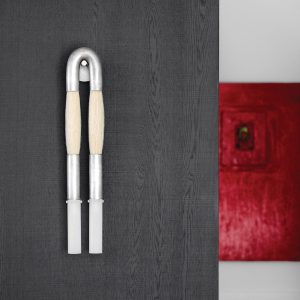
A Horse Hair Pendant from Apparatus ties in with the theme of the house.
Of all the eye-catching details in the home — and there are many — the furniture and world-class art collection are perhaps the most significant. Combining specialty pieces by local artisans with luxurious custom furnishings curated specifically for a home is a designer’s dream. “Because the owners entertain a lot,” explains Hernandez, “Nicole had the challenge of finding unique pieces that are not going to be seen in another house in Aspen. So, the hunt was on!” Everything Stewart sourced — from a custom Holly Hunt leather sofa to Joseph Jeup lounge chairs to a unique horsehair wall sconce by Apparatus — was carefully chosen to complement the artful nature of the home.
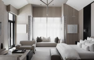
The designers lowered the ceilings and removed windows in the master bedroom to create an intimate and relaxing environment. A serene palette of soft colors and textures complement furnishings from Joseph Jeup, Holly Hunt, and Donghia.
Hernandez, Gallego, and Stewart pride themselves on providing architectural and decorative solutions in any style. Currently, the firm is trending toward the clean, high-end, minimalist look, but that’s only because clients are requesting it, says Hernandez. “Our process is highly collaborative. We don’t push our choices on them. We want them to walk into their home and feel like they were a big part of the process.” That goes for everything, from the kitchen to the closet to the garage, she says. “We make sure that when they walk in, it’s their home, not ours.”


No Comments