
16 Jan Russian River Respite
WHEN A COUPLE FIRST VISITED what was to become their wine country property, it had almost everything: a scenic 45-minute approach up a rural, winding road; a beautiful remote site with far-reaching views; established olive trees and lavender; an orchard and vegetable gardens; a rustic modern guesthouse; and a spectacular lap pool and water feature with an adjacent trellis structure. It was all set up for outdoors-oriented wine country living. But there was a missing piece, explains architect Jonathan Feldman of San Francisco-based Feldman Architecture: It lacked a main house to tie it all together.
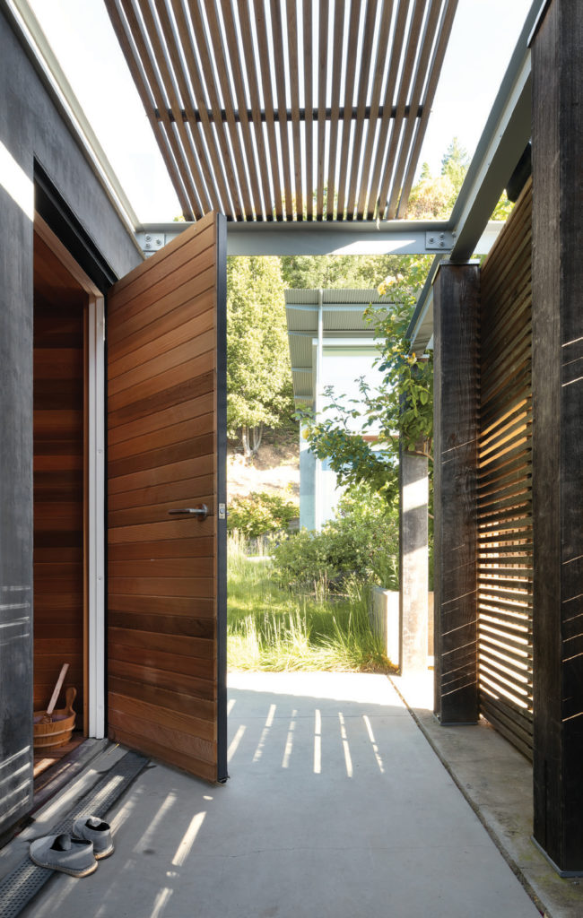
The sauna is clad in Western red cedar, and the pool cabana walkway, with its trellis of teak slats, leads north to the main house.
“It is a gorgeous site and had a Modernist cabin with a large pool,” Feldman explains. “But the original owners had sold the property before they built a main house. We were fortunate to inherit something we respected, but, by itself, the cabin was awkward. It needed something else to relate to it.”
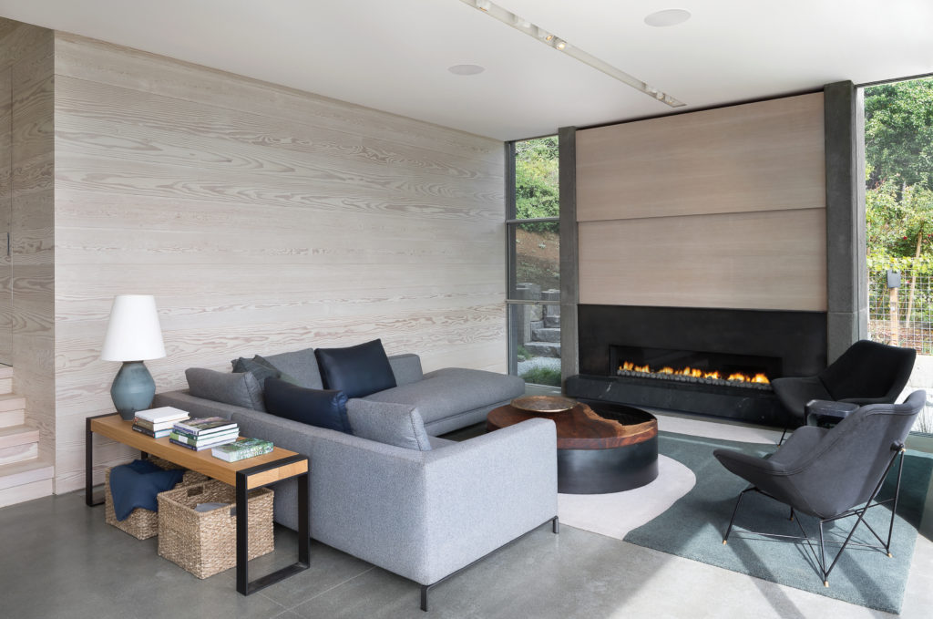
A concrete and blackened steel fireplace anchors the living room. Bleached Douglas fir paneling and polished concrete floors set the tone for the space, which was designed to be as neutral as possible to keep the focus on the outdoors.
The existing structure was simple in form, built of concrete and wood with a shed roof of corrugated metal. “We all liked it a lot; it was charming, though a little rough in terms of the quality of detailing,” says Feldman. “We thought, how do we take our cues from that little cabin, but design it a step up in terms of precision and refinement?”
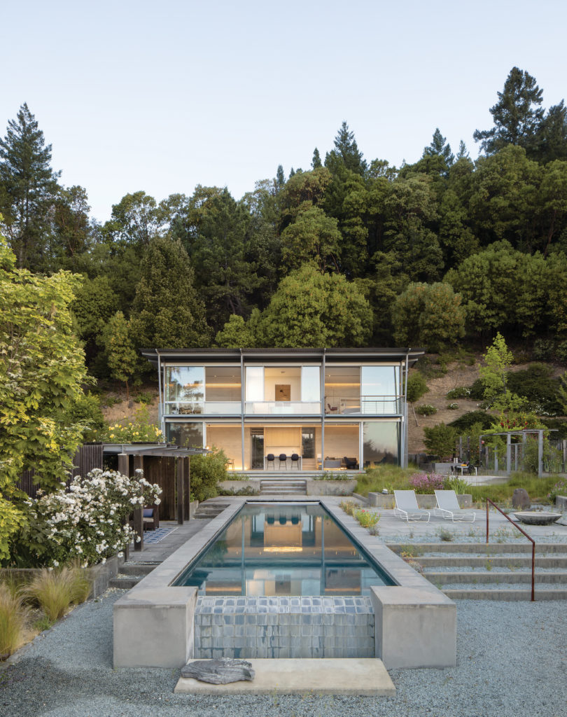
The front façade of the house is made entirely of sliding glass panels by Panoramah.
The buyers were design aficionados and arrived with a vision for the new home. They loved Tom Kundig buildings, Feldman says, and were interested in pursuing a Regional Modernism, rich in warmth and materiality. Working collaboratively, the owners and architects agreed to begin by echoing the simple form and aluminum doors of the existing cabin.
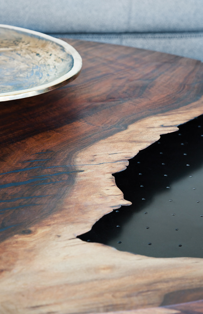
A live-edge detail on a custom reclaimed Claro walnut and blackened steel coffee table from Arborica brings the outdoors inside.
The resulting structure presents as modest and remarkably simple: a pristine, clean-lined, two-story volume with minimal detailing and furnishings. The façade completely opens to the view, while from the private master bedroom the prospect is into the zen-like hillside garden. The lower level is mostly one large volume that opens along its entire length to the outdoors, stepping out onto a full-length patio, then down to the pool. In the central kitchen, a service area is cleverly hidden behind a wall, and the space flows into the open dining area.
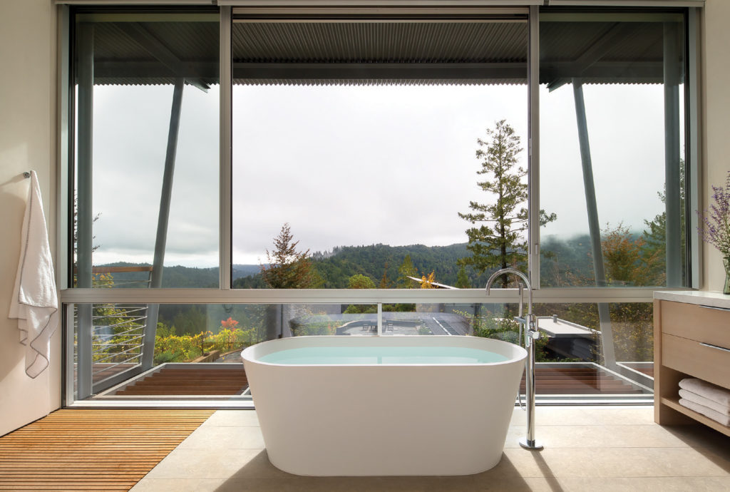
A sculptural Blu Bathworks tub with a Dornbracht faucet invites one to relax and enjoy the expansive views to the south. The porcelain tile floor gives way to teak slats in the open shower area.
Throughout the home, the tone and materiality are restrained; a palette of grays are found in the stucco and poured-in-place concrete, and white appears in the bleached Douglas fir paneling and upstairs flooring.
“This was a tricky project, yet so simple,” says the architect, who credits contractors Cello & Maudru for their attention to detail. “It’s in the precision and minimalism of detailing where the hard work goes.”
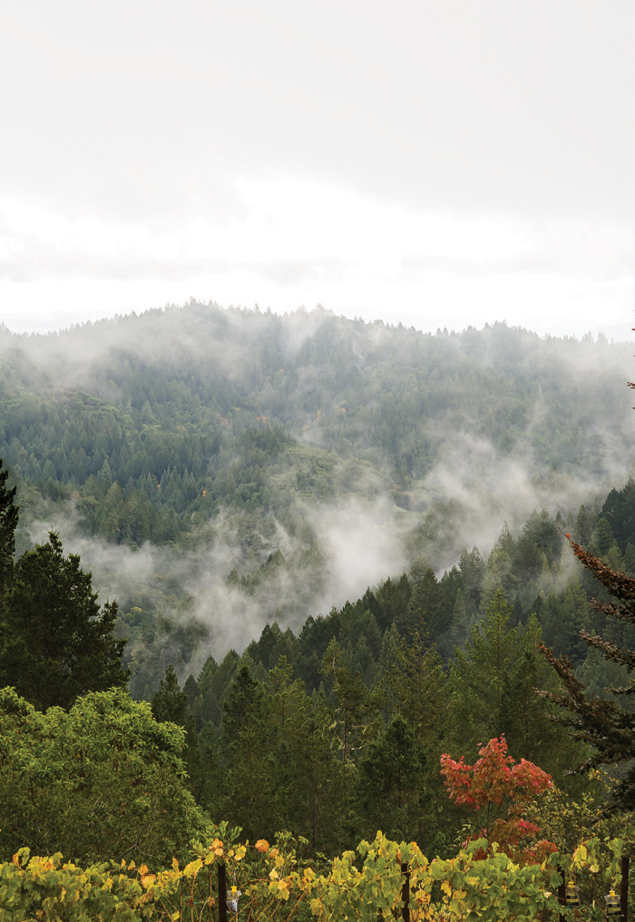
The views of the mountains around Sonoma change with the seasons.
The home’s furnishings and art are equally minimal. The owners, explains interior designer Susan Collins Weir, are passionate gardeners. For them, she says, “It was all about how to bring the landscape to the interior of the house. In our conversations, we mostly talked about the landscape and changes to the garden over the course of the year. They wanted a very natural palette, and they didn’t want art; they wanted the house to be about the materiality of the architecture.”
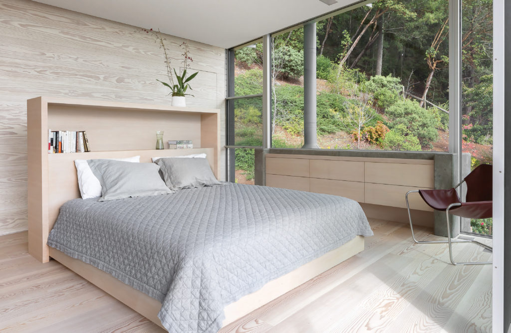
The second-floor master bedroom features a material palette of concrete and bleached fir.
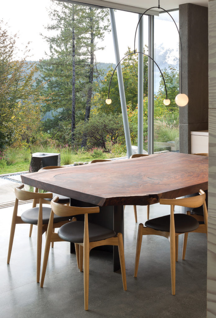
Key pieces — such as a spectacular live-edge dining table and, in the living area, a custom wool rug and a steel and wood coffee table — were designed specifically for each space, while natural materials, such as leather slingback chairs and wool and linen upholstery, were used throughout the rooms. In the upstairs guest room office, an artisan-made wood-slab desk within a poured-in-place concrete form cantilevers out into the space. The effect throughout the home, says Weir, “is very wine country. It’s very simple, organic, and materially rich.”
Naturalistic plantings by Arterra Landscape Architects help the home integrate with its site.
Gretchen Whittier of Arterra Landscape Architects was brought in to help the new building integrate into the landscape. “The existing site was beautiful, with madrona, manzanita, and beech,” she says. “The owners knew plants really well and knew the site really well; it was fun to work with them, even with a minimal palette.”
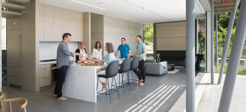
The combined kitchen, living room, and dining room open to an outdoor living space delineated by the exposed steel structure that supports the house and deck.
They chose naturalistic plantings and a mixture of wood and gravel to blend with existing elements. Meanwhile, the buildings relate to each other stylistically, while speaking to the pool and view in both placement and orientation. Both structures have their backs to the hillside, not just for minimal impact on the landscape, but also for solar management. “There’s incredible light all day,” says Whittier. “There’s dappled morning light, then full sun, which is beautiful. And in the afternoon, when the sun goes behind the hill, it’s magical. It’s a hot site, but there’s this large body of water in its center; even if the temperature is high, the site doesn’t feel too hot.”
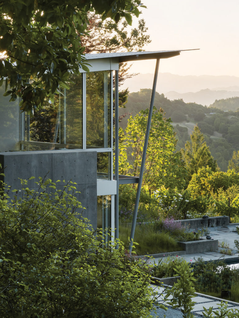
With the owners, architect, interior designer, builder, and landscape architect working in collaboration to tread lightly, respect the site, and enhance existing features, the result is sensitive and cohesive as well as programmatically successful. “The placement of the new building created a holistic master plan, along with the terracing and the gardens,” says Feldman. “And that tied everything together.”


No Comments