13 Mar Rendering: Designs for People First
Walk into the office of Scott|Edwards Architecture (S|E A) on East Burnside Street in Portland, Oregon, and you won’t be able to tell who is who. “We tend to shy away from formal titles in our office. S|E A is a very democratic place with quite literally no doors. You can’t tell which desk belongs to a principal, an associate, a designer or an intern, as we encourage open and frequent communication and collaboration,” says James Lee, marketing director for S|E A.
Most telling is the firm’s corporate slogan, “People First | Design Forward,” which verbalizes its philosophy of maximizing interaction between the design team and clients.
Each of the seven principal architects, including founder Sid Scott, have a broad range of expertise. They work with a core group of project managers and senior designers, with assistance from more than 60 employees. The company prefers a work balance of 50/50 when it comes to designing public and private buildings, Lee says. It’s a resourceful way for the firm to ride the waves of development and the economy, but it also provides a cross-pollination of lessons learned from the diversity of projects.
Designing in a Northwest Regionalist vernacular, the architects closely consider factors specific to where they live: the weather throughout the seasons, the native flora and fauna, the topography, the geology, how the sun moves through the landscape, the history of how people have lived there throughout time, and the available local materials. Consideration of these factors provides endless inspiration.
To demonstrate how a site evolves into a cohesive design that is both intrinsically beautiful and eminently functional, Peter Grimm, architect and principal, points to the Portland Heights Residence.
The 6,800-square-foot home connects its residents to the outdoors and “frames” an extensive art collection. Perched on the edge of a steep, sloping lot in the Portland Heights neighborhood, the home has commanding views to the east and north, overlooking downtown Portland and Mount St. Helens.
“We started the design process with one simple premise: to capture and frame the views, bringing the outside in, and to present the city as a work of art for the home’s interior spaces,” Grimm says.
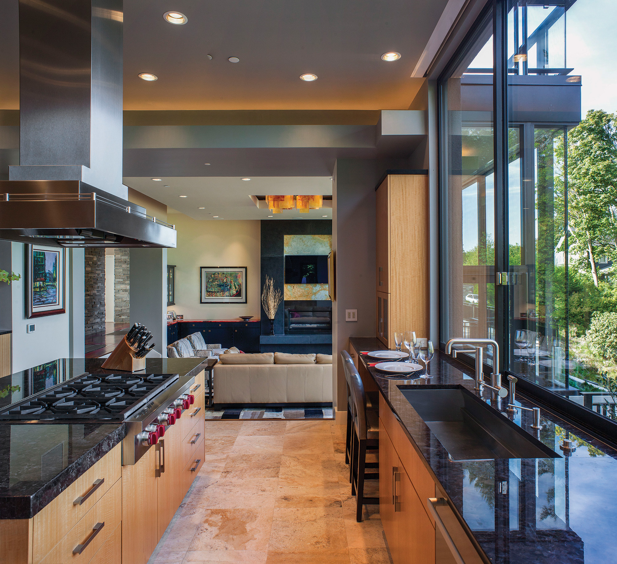
To achieve this, the architect oriented the major living spaces to the views and engineered a floor-to-ceiling wall of windows across the living room, dining room and kitchen.
“The result is a living gallery, with a nice balance of natural light, beautiful works of art and fantastic views of the northwest landscape and city beyond,” he says.
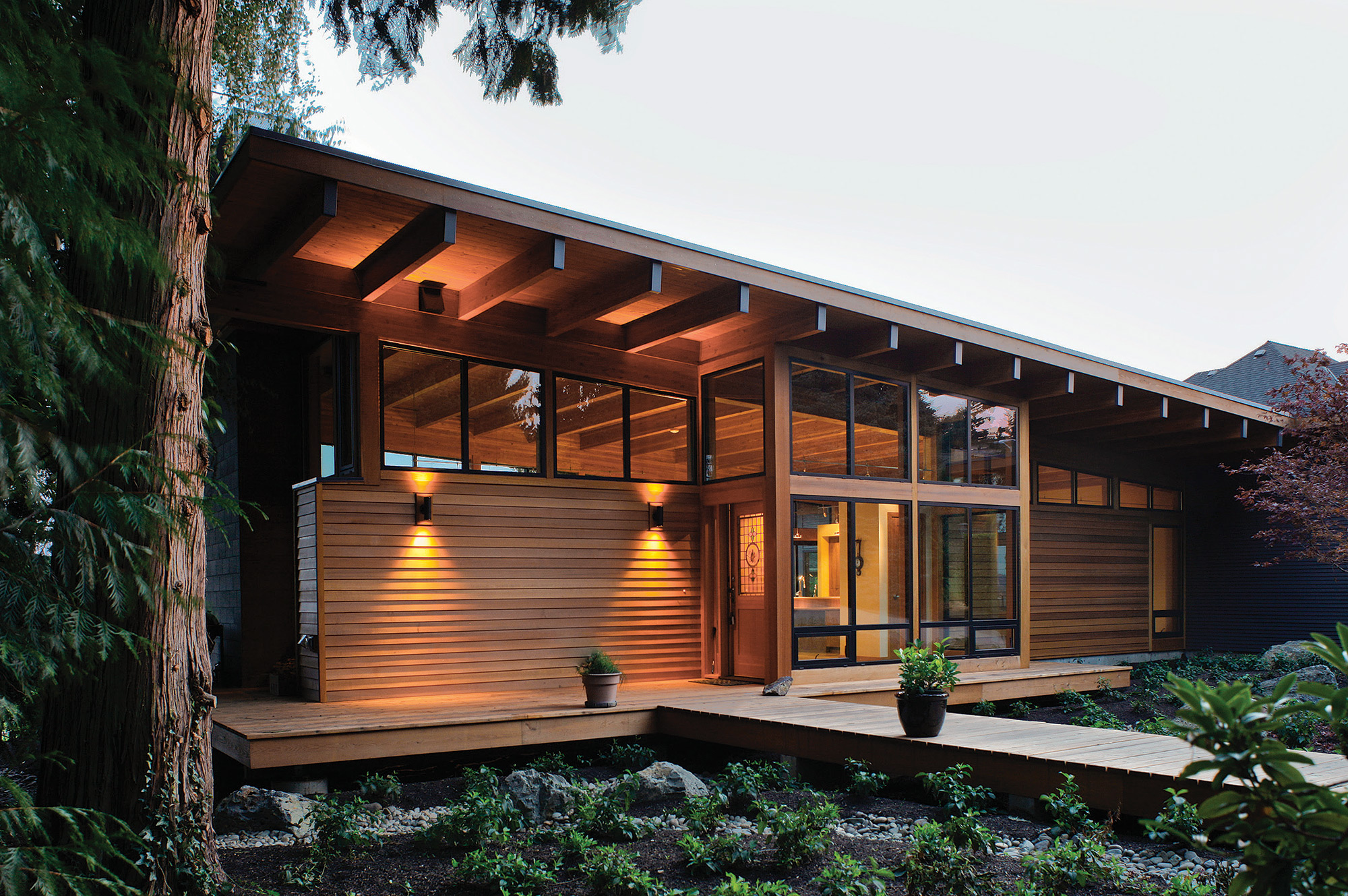
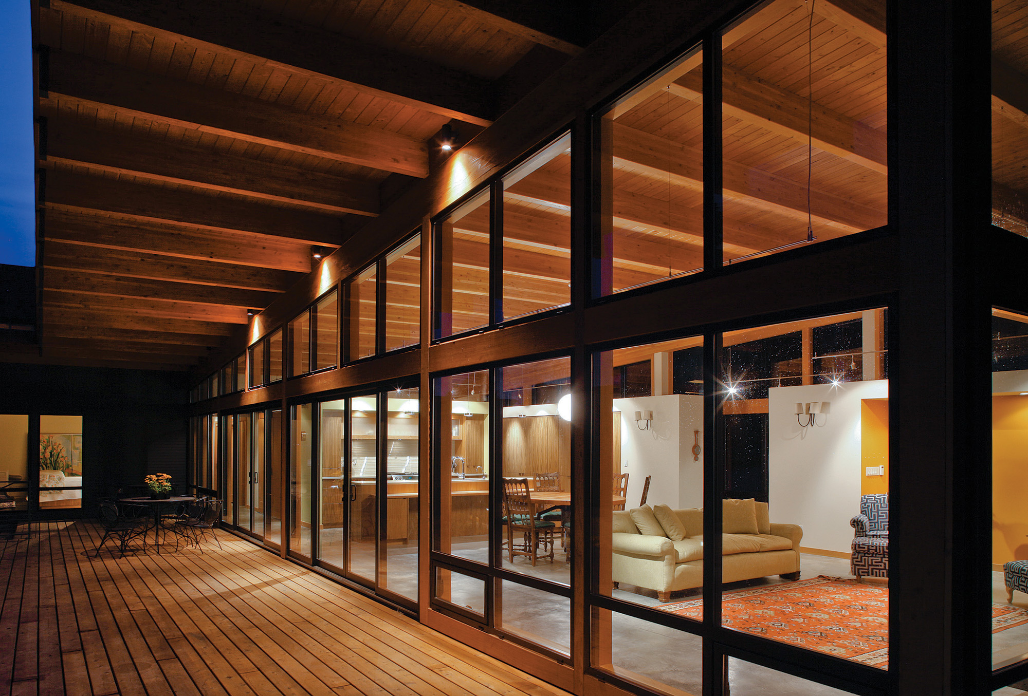
The Hotchkiss Residence near Vancouver, Washington, overlooks the Columbia River and was another home designed with views in mind. Capitalizing on the home’s southern exposure, the home includes passive solar strategies with lots of glass and a large, overhanging roofline that creates an outdoor living room and provides shelter from the summer sun and winter rain.
“In the Hotchkiss Residence, the livability aspect was very straightforward; the client wanted a one-story house that had a strong connection to the landscape and was open and inviting to their families,” says Rick Berry, principal residential designer.
Designed for a retired couple, the 2,000-square-foot, L-shaped home includes public and private wings. The public spaces directly open up to the outdoors, and the home incorporates design elements that will allow the homeowners to live there as they get older.
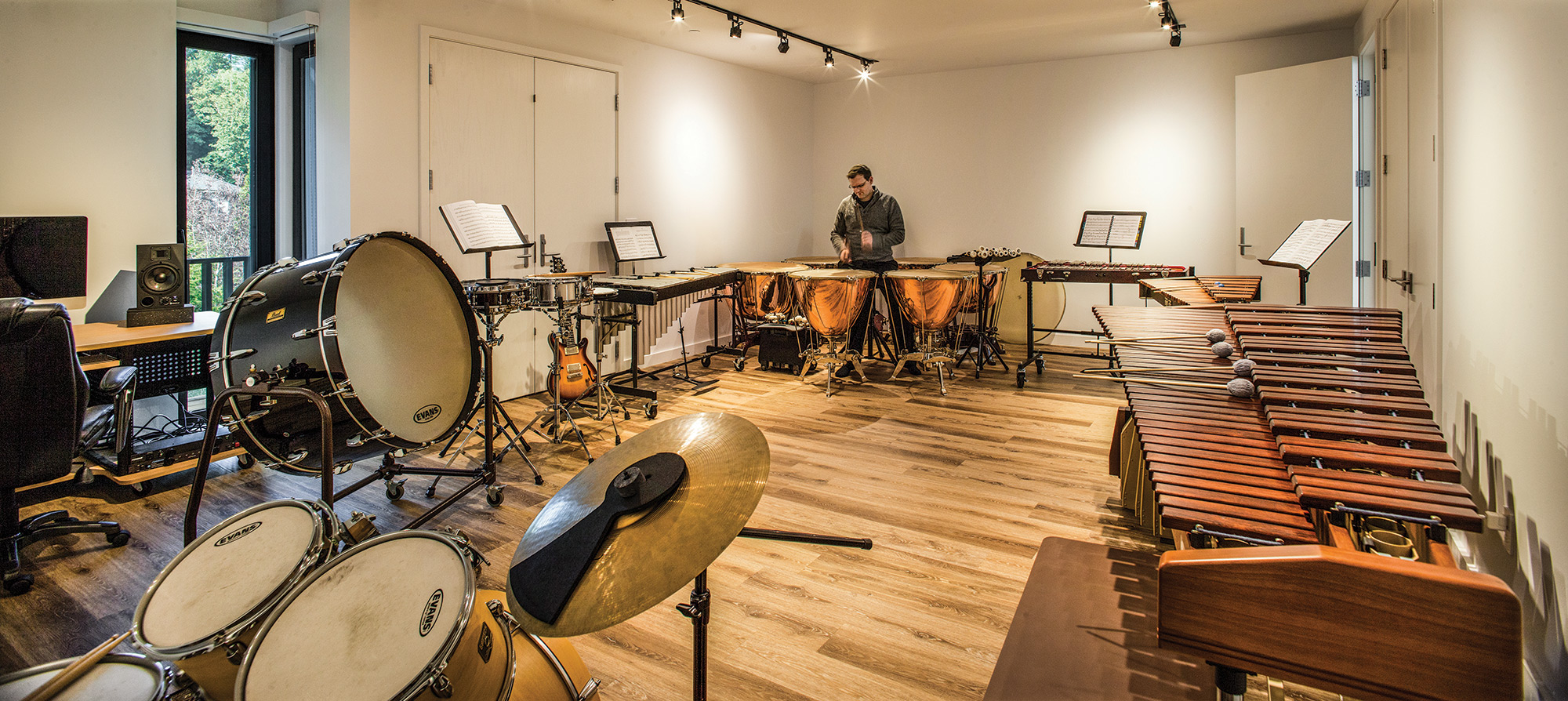
The Music Box House, located in Portland, also makes smart use of space. Designed for a family of musicians, the residence includes separate areas for family time and individual interests. The husband, a member of the Oregon Symphony, needed room to practice the timpani. And the wife needed a piano studio for teaching lessons. They also wanted space for entertaining and giving small concerts.
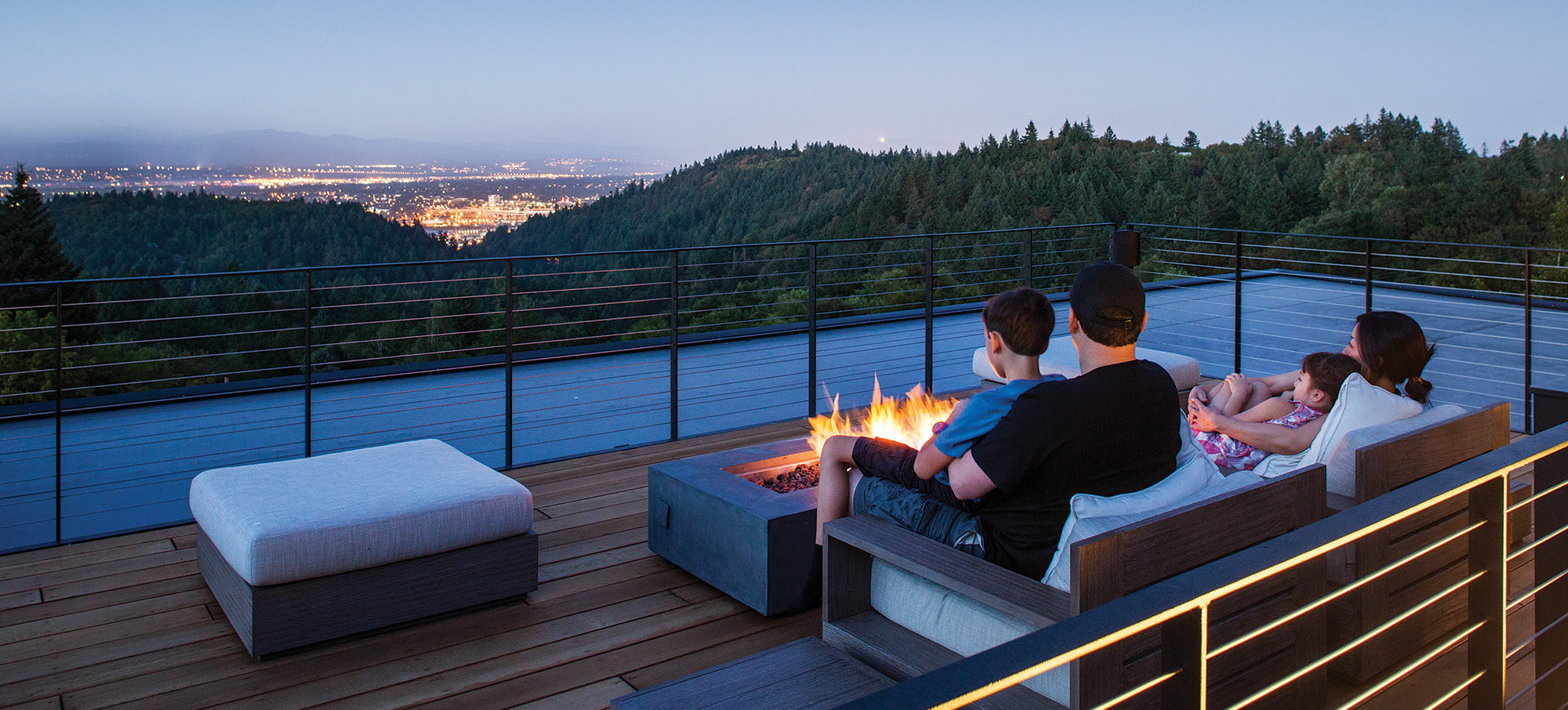
S|E A designed a home that met all of these requirements and added an outdoor rooftop aerie for hosting parties, stargazing and enjoying splendid vistas of Mount St. Helens and Mount Rainier.
Berry, the project’s principal architect, says the design of the Music Box House presented two challenges: the unique space required for practicing instruments and the steep site.
“The site has one of the most breathtaking panoramic views in Portland,” Berry says, “however, to capture the view you have to get above the rooflines of the other houses in the neighborhood below.”
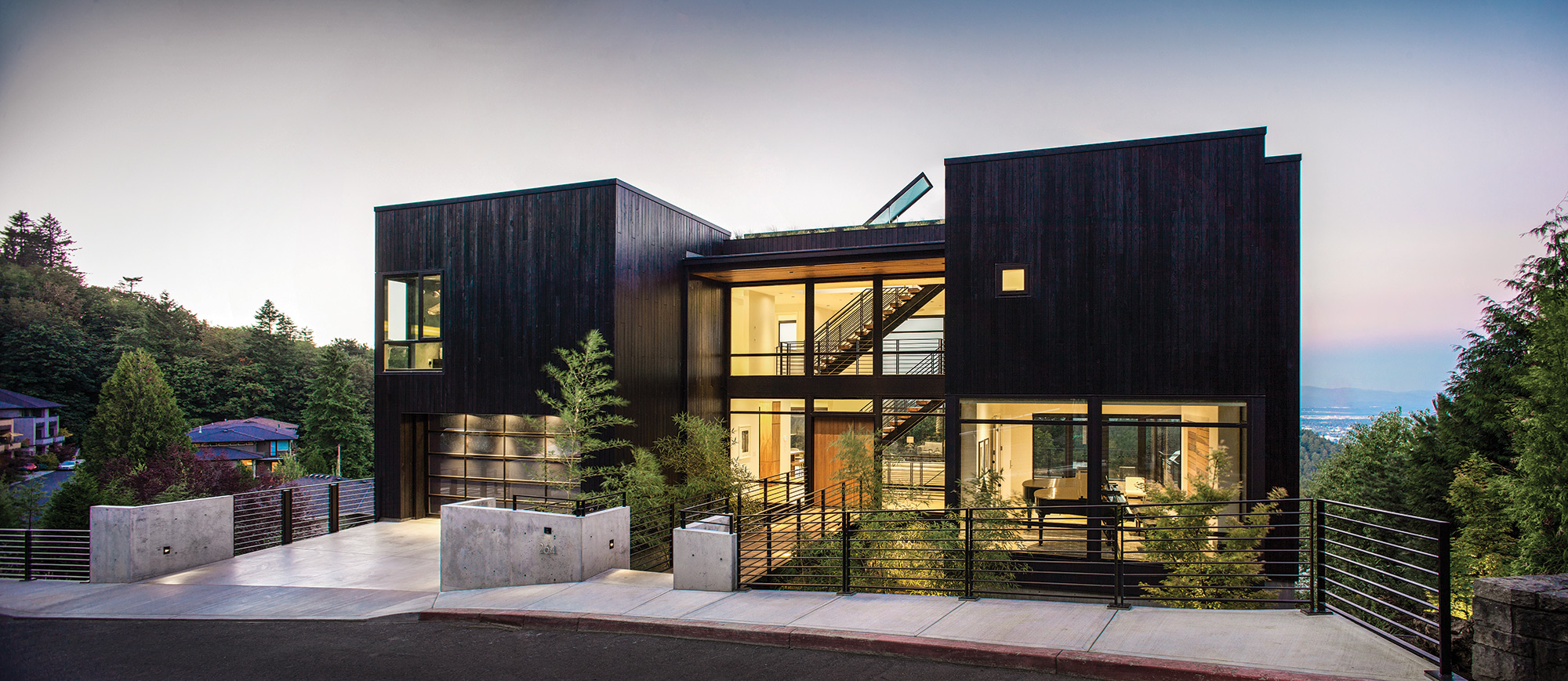
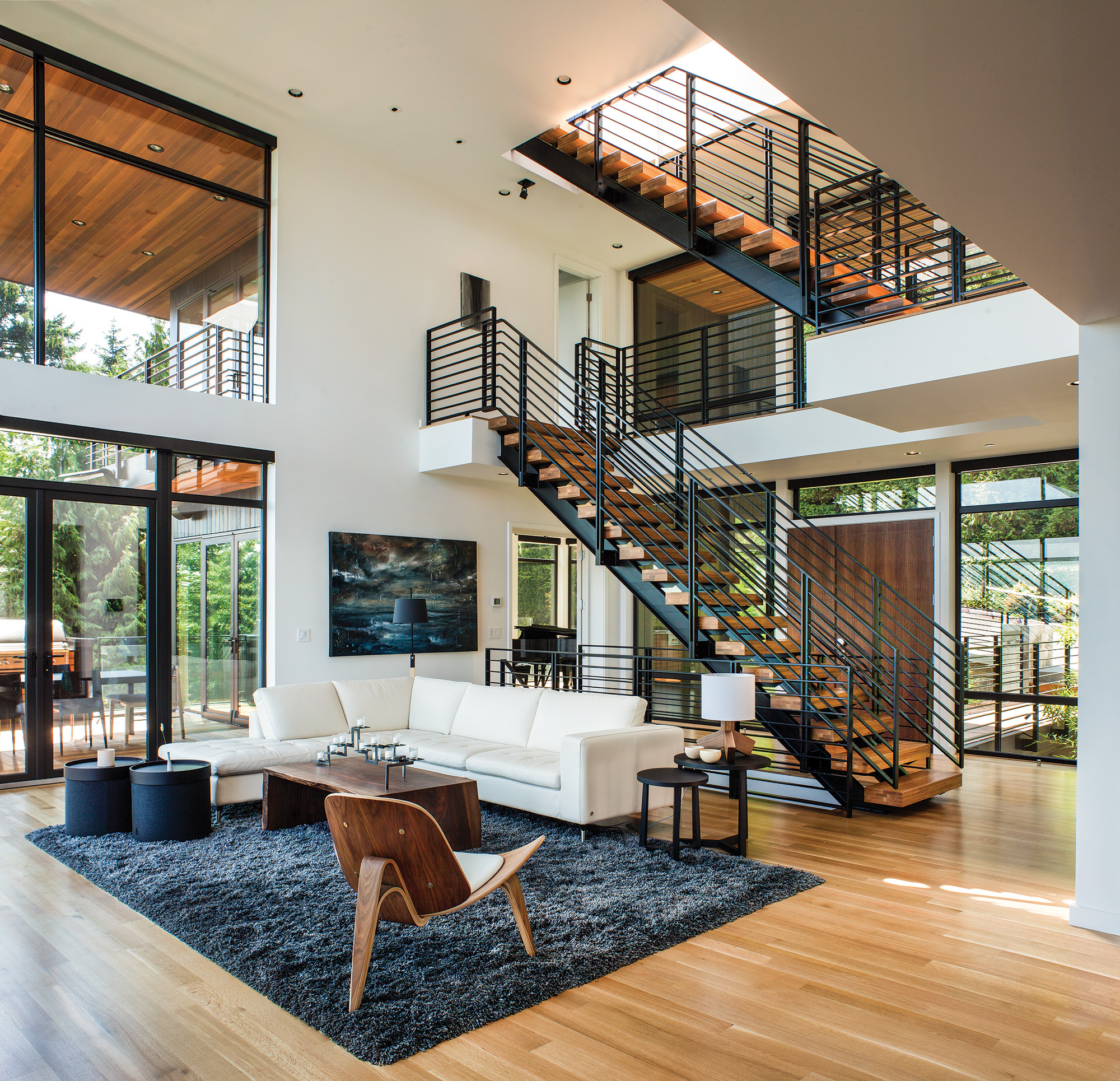
To meet this challenge, he designed the house as a layer cake of spaces, starting with shared spaces on the first floor and private spaces located above. The U-shaped contemporary home has large volumes on both sides with a glassy two-story entry space and a staircase in the middle. The staircase connects these separate areas and leads to the rooftop deck, accessed through a large skylight.
Visitors to the home change on a daily and nightly basis as music students and guests come and go. Guests and students enter through the front door and go to the piano room on the first level or the timpani room, located on the lowest level.
“Being musicians, the owners open their home up for parties and fundraisers on a regular basis,” Berry says. “There might be a private concert occurring on every level of the home, including the roof, all acting as main stages in the home for these intimate concerts.”
The foundation for the success of S|E A is best summed up by Lee: “Listening is the most important tool we use on every project. The better we are at listening, the more effective we can be as designers and educators for our clients throughout the design process.”
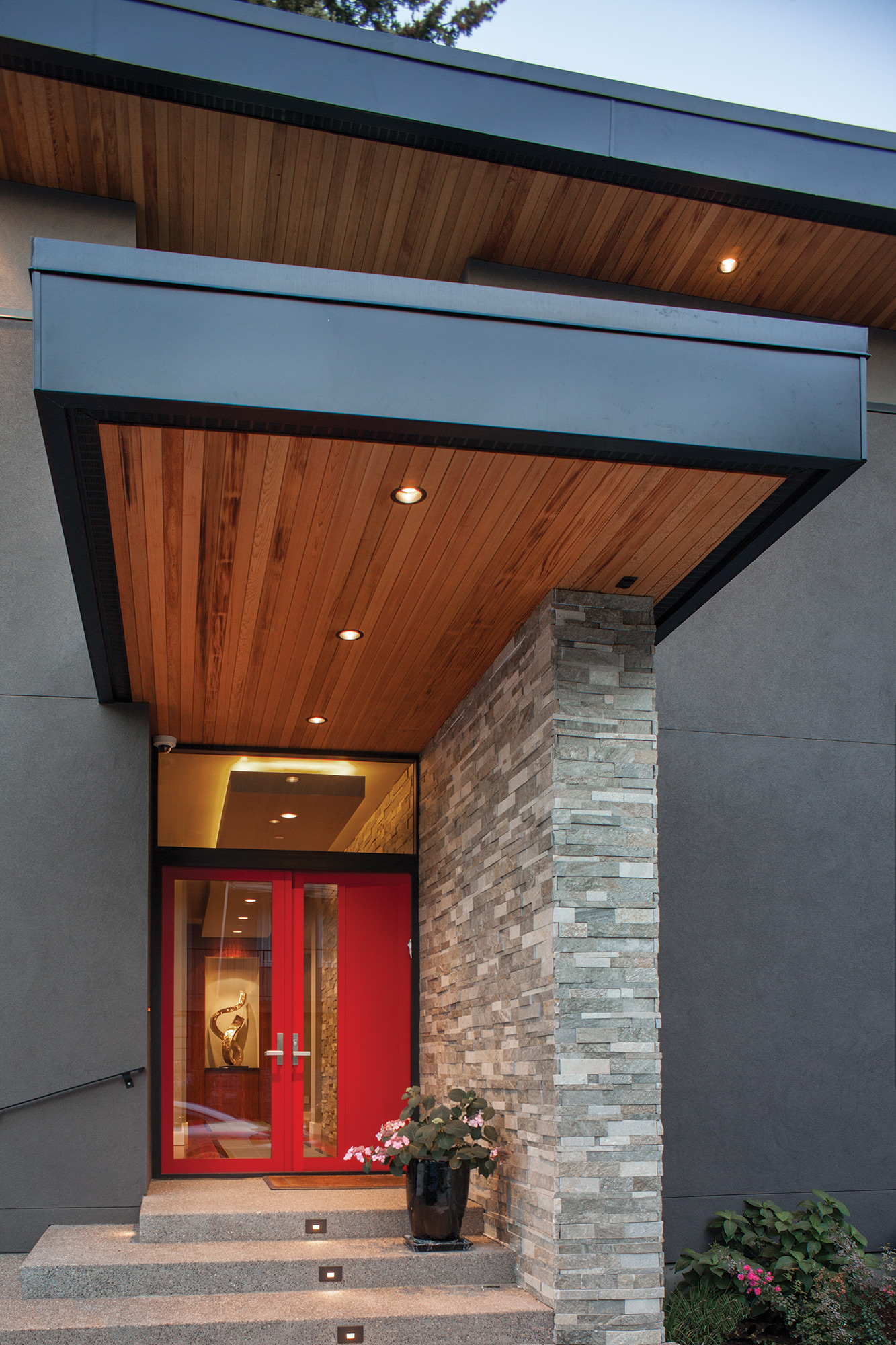
- A bright red front door welcomes guests to the home.
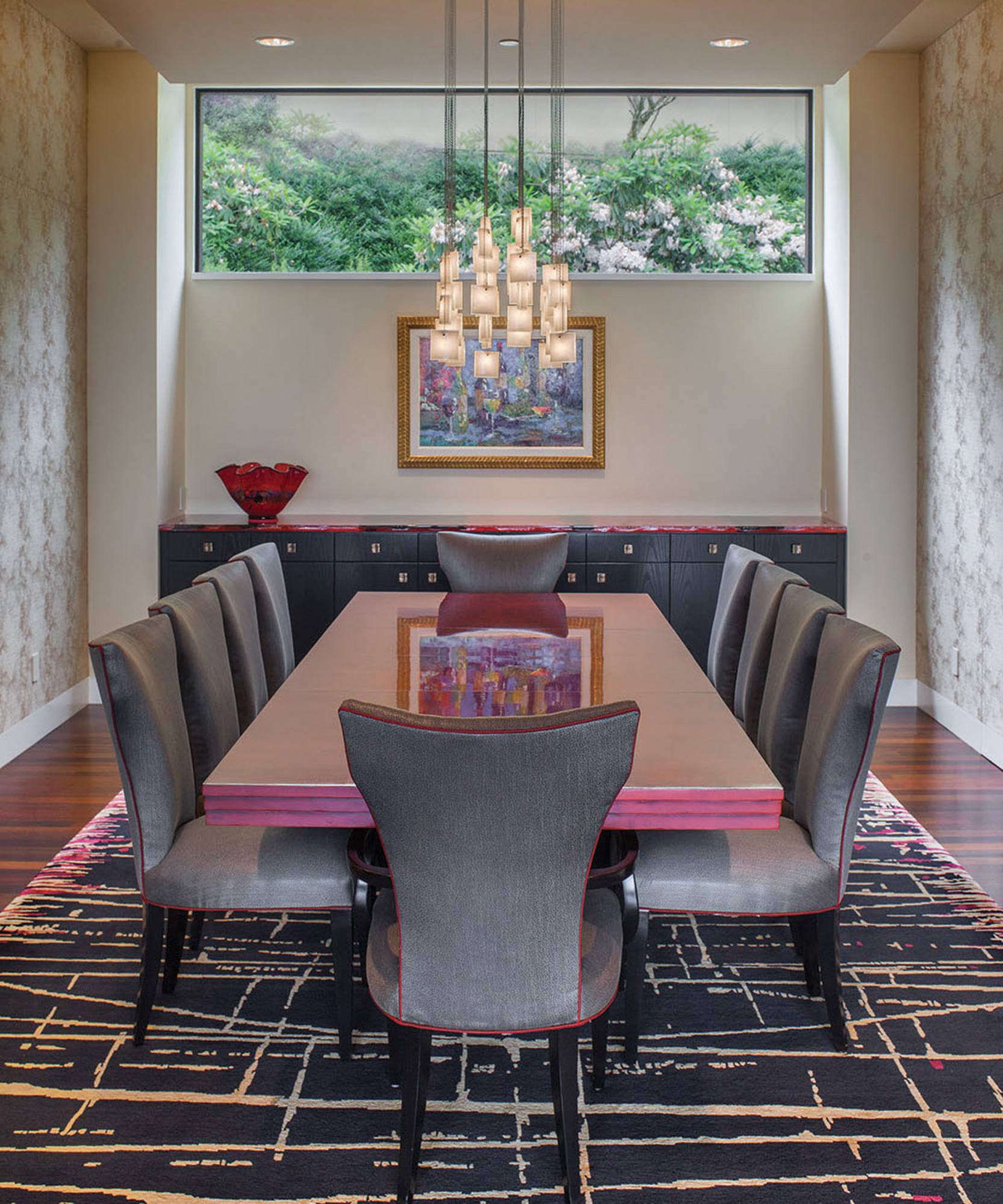
- The design of the dining room is a perfect blend of artful and intimate.
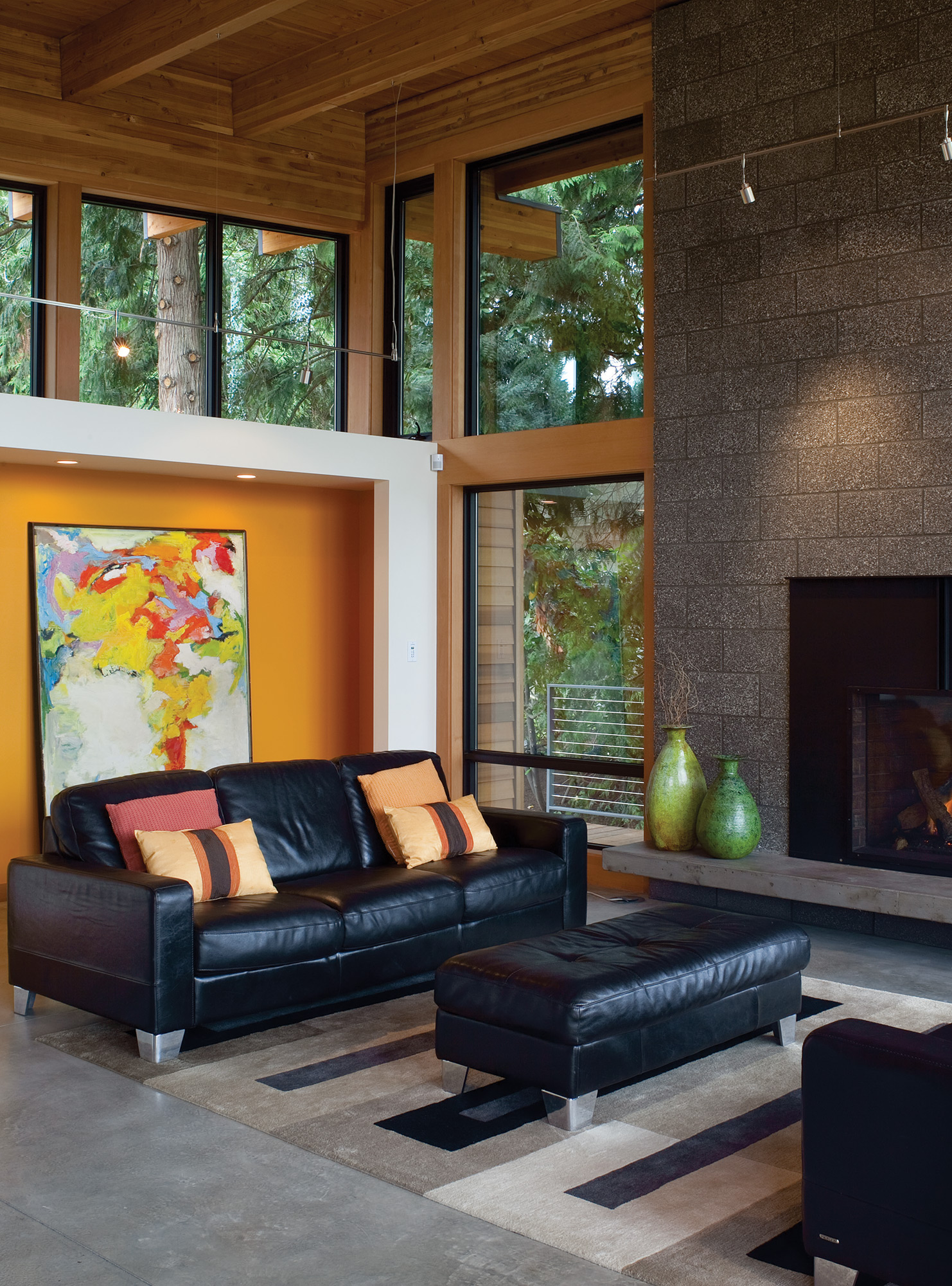
- The living room is anchored by the fireplace, and the natural light and vibrant art adds warmth and pops of color.
- The timpani room is a private space tucked away from the home’s public spaces so the homeowner can practice for hours on end without disrupting others.
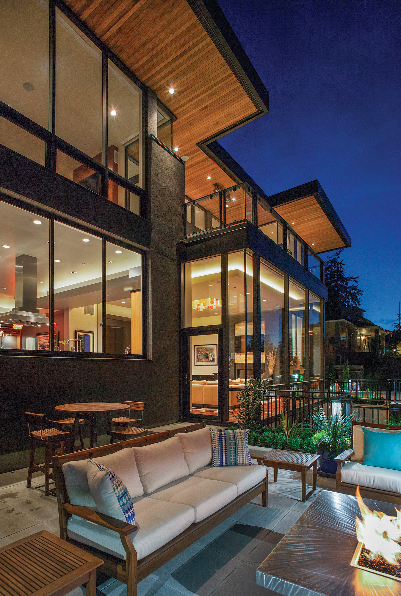
- The Portland Heights Residence includes walls of glass to bring in light and the views outside.
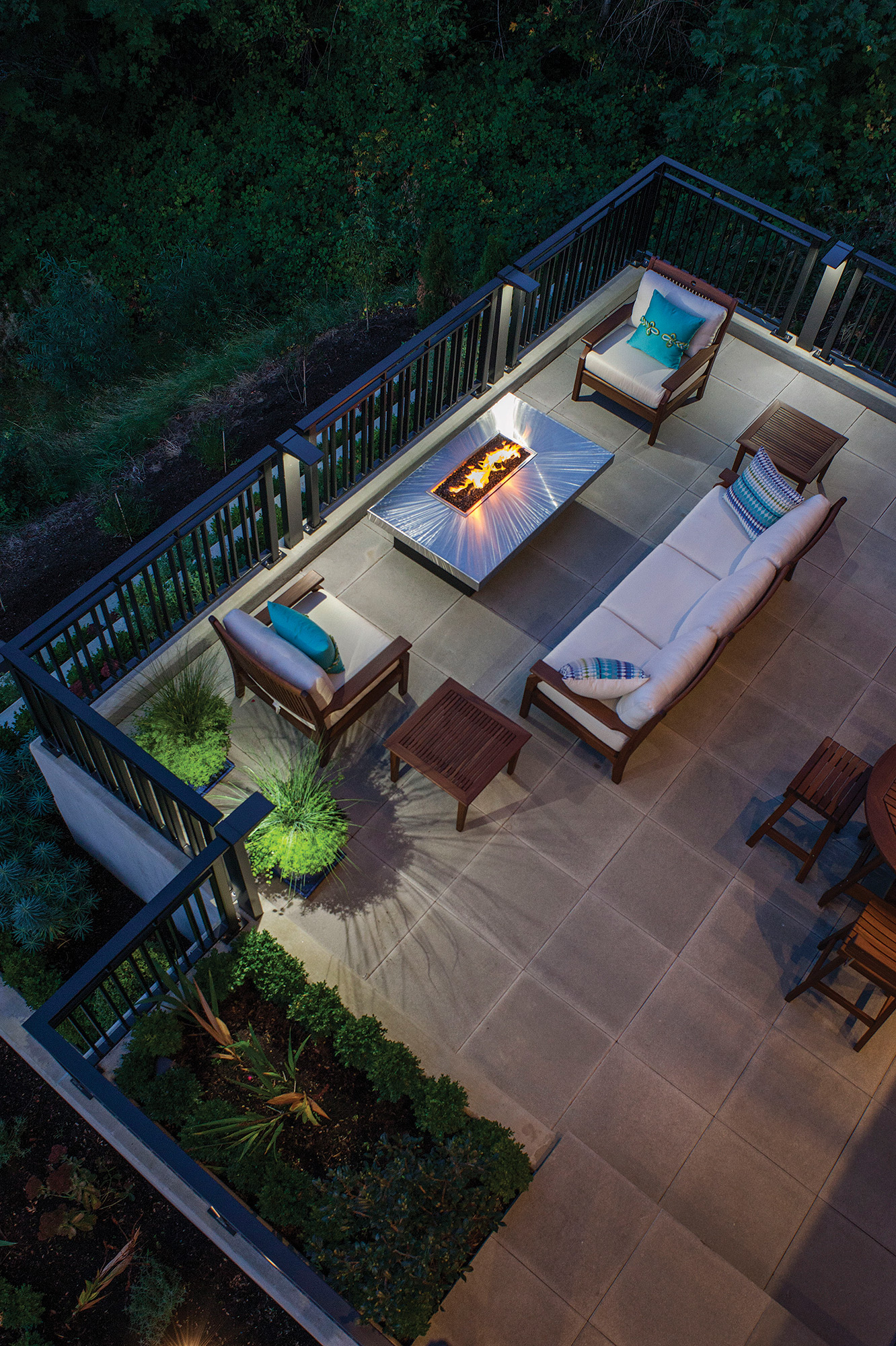
- Comfort was key in this seating area on the main deck in the Portland Heights Residence.
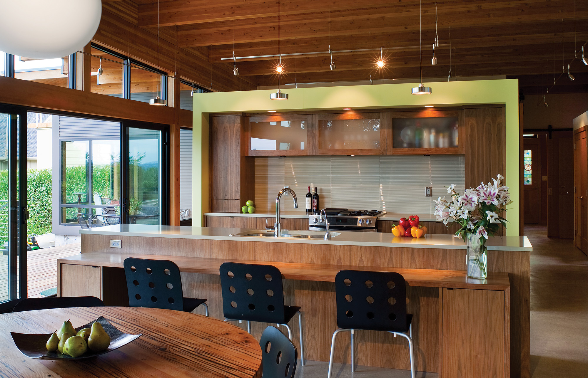
- An open floorplan leads from the kitchen to the living room in the public wing of the house.
- The family gathers to enjoy the setting sun and endless views on the rooftop deck.
- In the Hotchkiss Residence, a raised walkway leads the homeowners and visitors over native plants and creates an unmistakable path to the entrance.
- The distinctive dark stain on the exterior of the Music Box House dramatically contrasts with lacy bamboo landscaping.
- Expansive covered decks provide space for year-round living.
- With a nod to the musicality of this family, the railings are reminiscent of a musical staff.


No Comments