08 Nov Designing the West: Reinventing Classic
Maybe it was her childhood spent across the street from the picturesque, historic Wind Point Lighthouse on Lake Michigan that first sparked designer Kathleen Burke’s love of beautiful spaces. Perhaps it was watching her parents remodel their family home, an old farmhouse with good bones. Or it could have been the years Burke spent accompanying her father, a real estate developer, as he walked construction sites in and around her hometown of Racine, Wisconsin. “I just always knew that this was what I wanted to do,” says Burke, now in her fourth decade of a successful interior design career in Lafayette, California.
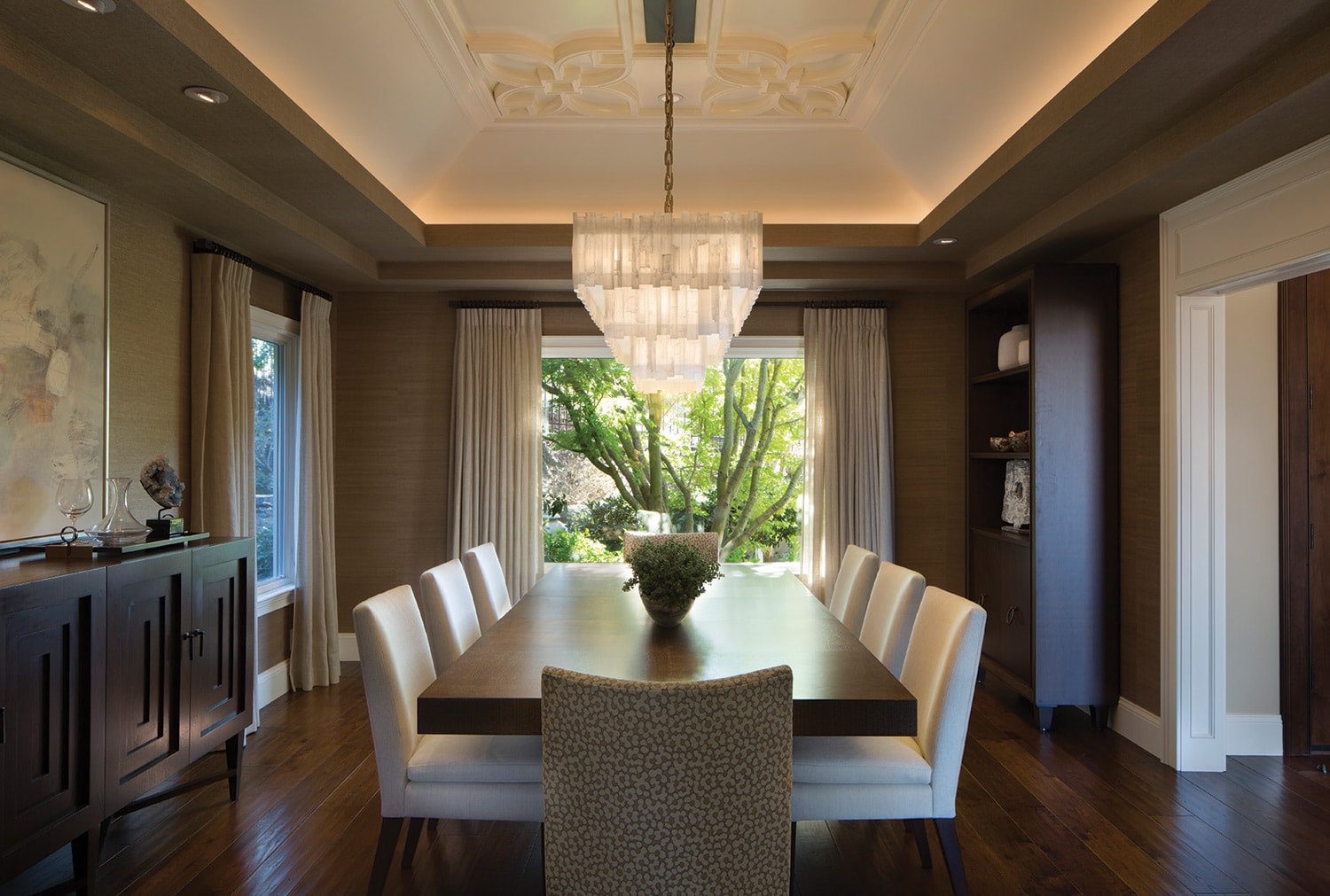 Burke’s team created a dramatic dining space, adding a framed soffit to the coved ceiling and trimming it with intricate molding. The ceiling support was reinforced to accommodate the weight of an alabaster chandelier from A. Rudin. The Michael Berman Trousdale table, of black walnut ceruse, is surrounded by custom A. Rudin chairs. The artwork above the side board is by Robert Kingston.
When she enrolled at the University of Wisconsin after high school, architecture and interior design degrees weren’t offered, so Burke instead majored in art and minored in math. As a college sophomore, she embarked on the school’s Semester at Sea program. “An ocean liner took us from New York to these amazing ports in Africa — places like Morocco, Senegal, Liberia, Kenya, and Tanzania,” she says. “In India, I saw the Taj Mahal and fell in love with the country’s Moorish influences. Then we went to Asia, where I was inspired by the culture and beautiful design aesthetic.”
From dated to dazzling, the family room features comfortable Patricia Edwards sofas covered in creamy linen. The old rock fireplace was replaced with a travertine stone slab surround, and the ceruse walnut and bronze Montana coffee table is by Berman Rosetti.
A world view wasn’t the only thing Burke garnered during her time abroad. She met her husband-to-be on the ship, and later moved with him to Phoenix, Arizona. Now, certain about her future vocation, she enrolled in Arizona State University’s architecture and interior design program. “I wanted to be more than an interior decorator; I wanted to learn about drafting, proportion, scale, and architecture,” Burke says.
Calming neutrals and soft textures create a peaceful retreat in the master bedroom. The four-poster David Iatesta bed is topped with a coverlet and bedskirt of Kerry Joyce fabric and surrounded by custom bed curtains of Zimmer + Rohde fabric. An inviting window seat includes built-in storage.
After a stint living and working in Boulder, Colorado, the couple settled in the Northern California area in 1988 and Burke launched her eponymous firm. Kathleen Burke Design is based in Lafayette, within easy driving distance of the San Francisco Design Center. The firm’s headquarters are bright and airy, with white walls and marble accents. “Our offices have good light, which helps us develop and clearly see all the elements of our projects,” Burke says.
She likes to begin the design process in her clients’ existing homes whenever possible. “We walk through to get a general idea of the things they like, to see what’s working and what’s not, and to learn more about their lifestyle,” she says. “Then we begin to help them develop their inspiration, using resources like Houzz, Pinterest, design magazines, and books to hone in on their individual style preferences.”
Because of her architectural background, the designer and her team often get involved early in the process, whether it’s a new build, an addition, or a whole house remodel. “We’re very comfortable interfacing with the team of the architects, builders, and contractors, and we avoid a lot of problems by being involved from the beginning,” Burke says. “We continually look at the big picture and keep the team on track so our clients don’t have to worry about the small stuff.”
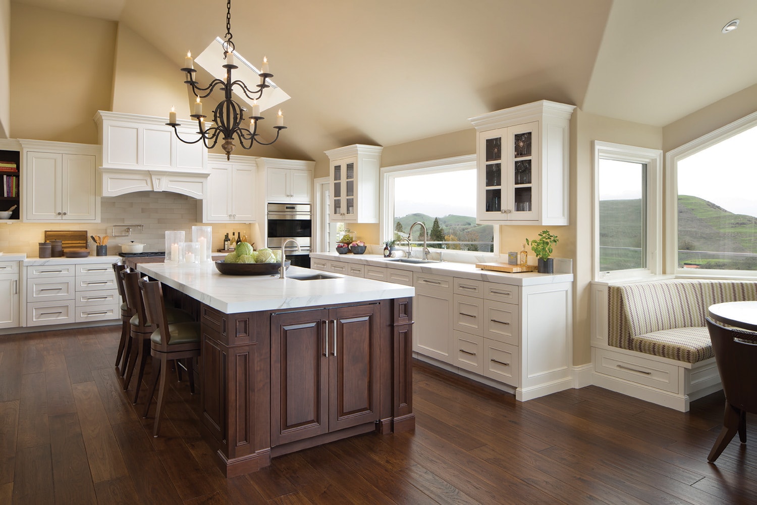
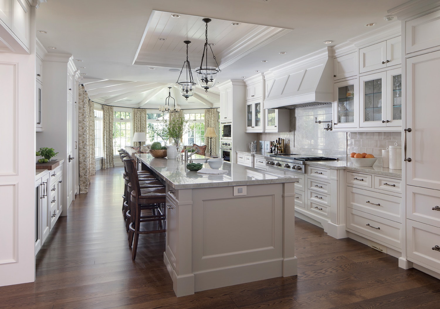 In Janet and Rick Cronk’s kitchen, Burke paired custom white cabinetry and a matching hood with neutral quartzite counters and a gray tile backsplash by Walker Zanger Studio Moderne. A generously proportioned island is illuminated by a pair of Formations pendant lights. New hardwood floors match the home’s existing floors.
Utilizing AutoCAD, the team creates space plans and detailed drawings for everything from complex rooms, such as kitchens and bathrooms, to furniture layouts, lighting arrangements, and window treatments. The designers also think about tiny details, such as vent placement and where to hang curtain rods. “We always keep the overview in mind as we pick out things like finishes, flooring, tiles, cabinetry, and storage,” Burke says. “Knowing the bones of the house, we can really help our clients organize the spaces.”
A detail of the dining room, where curvy Provence armchairs by Panache Designs reference the lines of the Gregorius|Pineo chandelier overhead. Fabric-covered walls showcase a collection of botanical prints.
A remodeled kitchen features traditional detailing, like the Francois and Co. metal oven hood, and rustic touches, like the naturally weathered reclaimed wood ceiling. The lanterns over the pewter-topped island are antiques that were refinished in neutral tones. The chandelier over the dining table is from Formations.
Janet and Rick Cronk worked with Burke to remodel an existing house in Lafayette that they gutted. “Kathleen is very detail oriented, and she presents lots of choices,” says Janet Cronk. “She and her team did all the space planning and CAD drawings so that we could envision how the new rooms would look and function. For us, one of the key reasons to work with her was her great staff and the fact that she’s always looking for the perfect solution.”
Cronk says the kitchen is her favorite room in the house. “It’s a hardworking, functional space where I love cooking for our family and friends,” she says. “Kathy chose these indestructible, neutral quartzite counters that look beautiful with the white cabinetry and gray tile backsplash. We have a huge island with pewter cabinets and tons of storage, and the prep area is separate from the beverage area, so people can get drinks without feeling like they’re in the way.”
Burke says her designs continue to be influenced by her travels. “My husband and I have spent a lot of time in Europe — Spain, Italy, France, and England — and we’ve been to many inspiring places like Ecuador, Cambodia, and Japan.
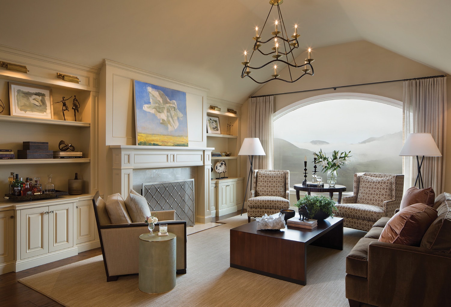 A new, arched picture window emphasizes the view in a redesigned living room. Furnishings include a handcrafted, custom coffee table, a pair of Patricia Edwards armchairs, and a contemporary framed chair from A. Rudin. The chandelier is by Visual Comfort.
The firm has won numerous Best of Houzz awards, and although Burke has done her share of commercial projects, such as restaurants and retail stores, she says her heart is in the residential side of the business. “For me, it’s all about the relationships we enjoy with our clients,” she says. “When you’re involved in helping people craft or recraft their homes, it’s an ongoing joy to help them create a nice lifestyle.”
WA&A Wants to Know…
Interior designer Kathleen Burke shares some of her favorite inspirations, spaces, and design sources.
Do you have a favorite design book?
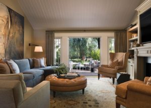
A 1900s antique rug from Tony Kitz established a family room’s color palette, with plush, comfortable furnishings in a balance of warm tobacco hues, cool aquas, and earth tones. The artwork is by Tom Lieber, and the round, caramel, tufted leather ottoman is from Kravat.
How about if I share three? Michael S. Smith’s book, Houses, is a favorite. I love The Welcoming House: The Art of Living Graciously by Jane Schwab and Cindy Smith. Contemporary Classical: The Architecture of Andrew Skurman is a great resource for classic architectural detailing.
Describe your own home.
It’s a modernized, California ranch home with traditional roots. The house was built in 1948, and it’s in a rural, country setting in Lafayette. It’s warm and cozy, with things we love like modern artworks and handcrafted light fixtures. We preserved the original doors that slide into the wall, so one whole side of the house opens up for indoor-outdoor living and entertaining.
Tell us about one of your favorite interior wall colors.
Benjamin Moore’s OC-1 Natural Wicker might not look exciting on the chip, but on the wall it reflects the other colors in the room and becomes richer. It has a subtle, delicate nuance, especially when it’s used in a room with white trim.
Describe your personal entertaining style.
Our gatherings tend to be casual, but I like to have everything organized  and ready. We enjoy entertaining outside, and we have a large picnic table that seats up to 12 people. I’ll set it with cloth napkins, nice plates, and glasses, and maybe create an informal arrangement of flowers from the garden. For dinner, I might serve something simple like local salmon.
When you want to unwind, where do you like to travel?
My husband and I love Napa Valley. We’re road bikers, so we love to ride, eat, and drink.


No Comments