01 Dec Let there be light
When Austin interior decorator Elizabeth Stanley decorates a client’s house, her signature style is sophisticated and witty. When Stanley decorated her own house, she was able to give that imprimatur full sway, mixing high-style Modernism with an intelligent injection of flea market treasures, vintage pieces, fine antiques and contemporary art. Her secret: The decorator loves garage sales, particularly in the established close-to-town neighborhoods where she lives in Austin, Texas.
“You never know what might turn up,” the savvy shopper says. In fact, it was at a garage sale that Stanley and her husband, Aaron, managing partner of an investment group, found the house they ended up buying. “I stopped at a sale at a house I’d always loved,” she says, “and the owner and I became friends.” Two years later the friend called to say she was putting the house on the market.
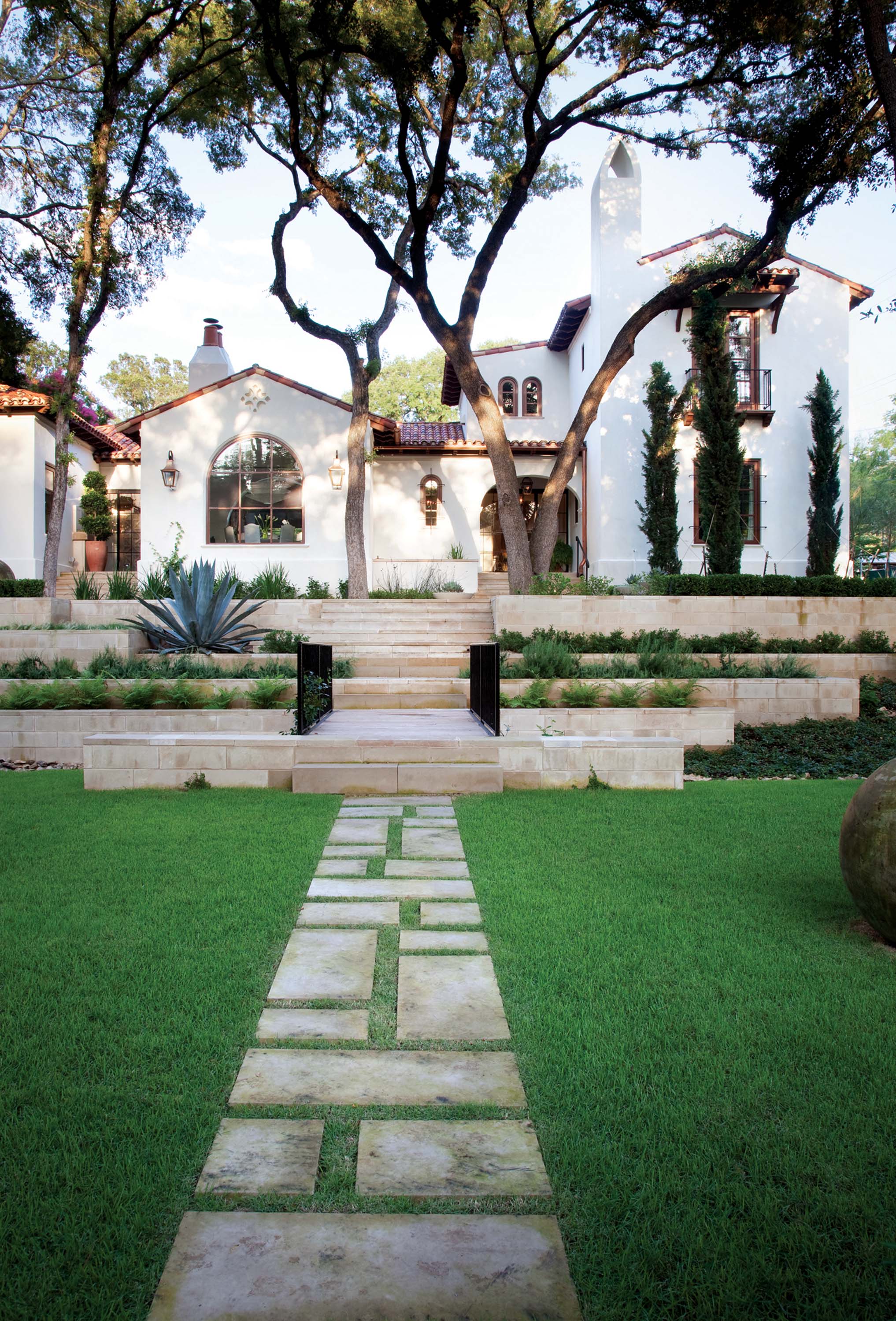
The Spanish-style house reminded Aaron of his father’s house in Palo Alto, California. Locally, it was an icon. After the couple purchased it, they called in Austin architect Ryan Street, who confessed to be long smitten with the one-story white stucco house, too. “I used to drive by it all the time,” he says. Street was an obvious choice to renovate the central Austin gem: He specializes in the Mediterranean and Spanish vernaculars, styles that sit well in the craggy hills of central Texas.
Street’s charge was to make the two-bedroom house bigger and brighter. “Spanish-style houses tend to be dark anyway,” explains the architect, “but this one was sheltered by lots of trees that made the interiors even darker.” Progress on the renovation plans was destined to meet obstacles — and these would eventually prove insurmountable. “The house was in really bad shape,” says Aaron Stanley. Finally, architect and clients had to make a difficult decision to tear the house down and start over.
“Since we all loved the original house so much,” says Street, “we were determined to honor it and use it as our inspiration. We would just make it better.” For the designer, that was the signal that she could reinvent the interiors. “I wanted them to be more modern,” Stanley says. That meant no heavy wood beams and brooding light — and it meant an open floor plan, which was essential for a couple who loves to entertain.
Because of a large drainage easement across the front of the property there wasn’t much buildable land. “We stuck to the old footprint of the house,” says Street, which determined that the now four-bedroom first floor would be long and narrow like the original dwelling, but with a second floor for the master suite and terrace.
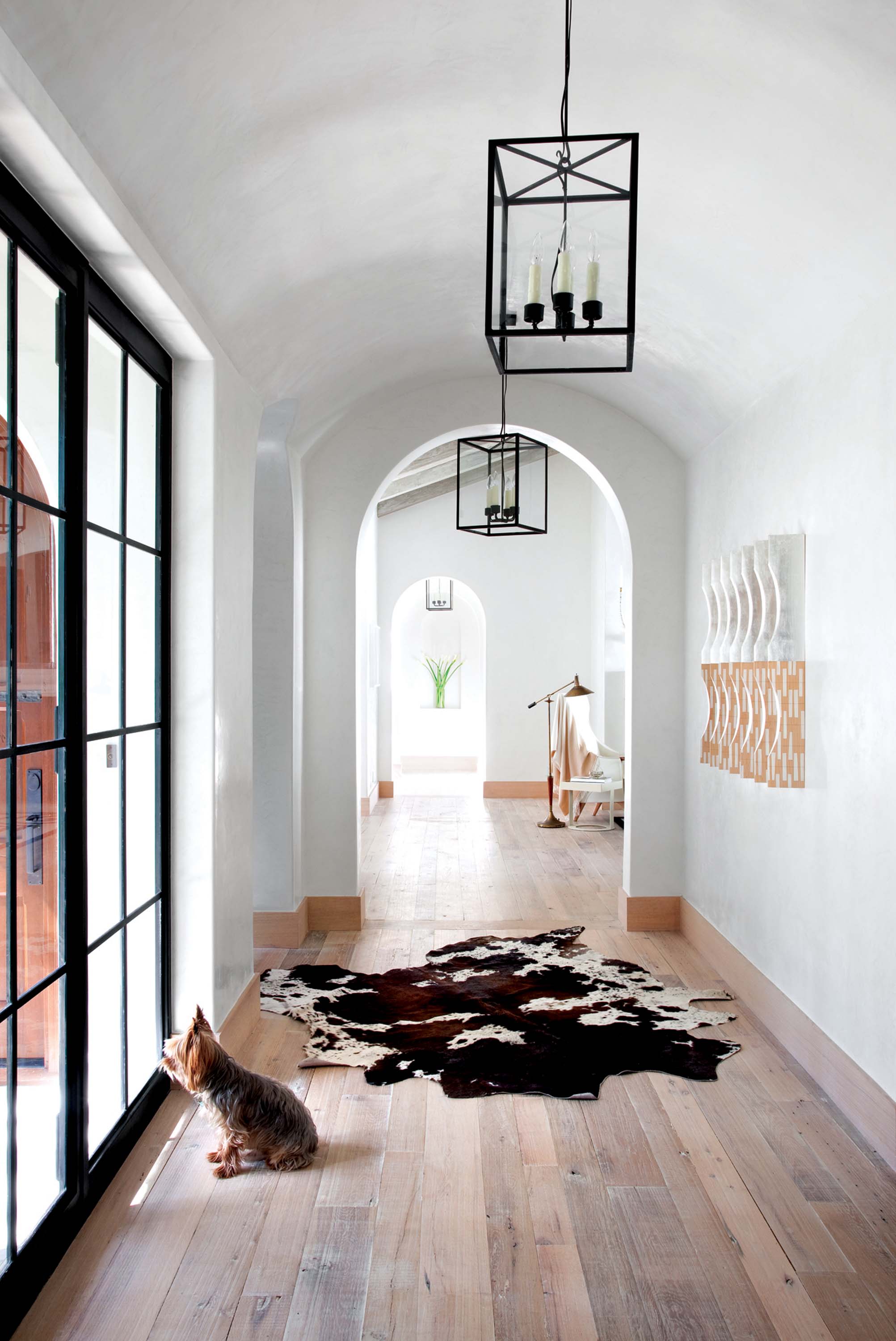
Consideration of where light would come from was the top priority and ended up driving the design in ways that made the final result very special. “It’s important to get light into the core of the house,” says Street, “because then the entire house is suffused with light.” To that end, he added skylights wherever he could — two in the kitchen and one over the stairwell, both at the center of the house. Downstairs in the 4,400-square-foot house, Street included floor-to-ceiling steel-framed windows (a modern touch) in the dining room, living room and in the entry hall. “I thought of these rooms as outdoor rooms, almost as if they were courtyards.” There were real courtyards, too — in front, Street specified terracing that gracefully connected the house to the creek that meandered along the street. In back, a courtyard was big enough to allow for a pool.
Stanley worked with the architect on finishes that would enhance light even more. Stark white waxed Venetian plaster walls are a crisp background for the Stanleys’ art and wall hangings; the lustrous finish evokes sumptuous luminosity in every room. “I wanted a light and airy feeling,” says Stanley, who chose furniture accordingly. A chandelier made of Japanese paper in the dining room provides gentle light overhead; an acrylic and tangled-driftwood chair and a vintage acrylic coffee table are witty commentary on what’s seen and not seen. Underfoot, Stanley selected white oak floors with a silky blue-gray finish that’s light as air; ceiling beams received a similar treatment.
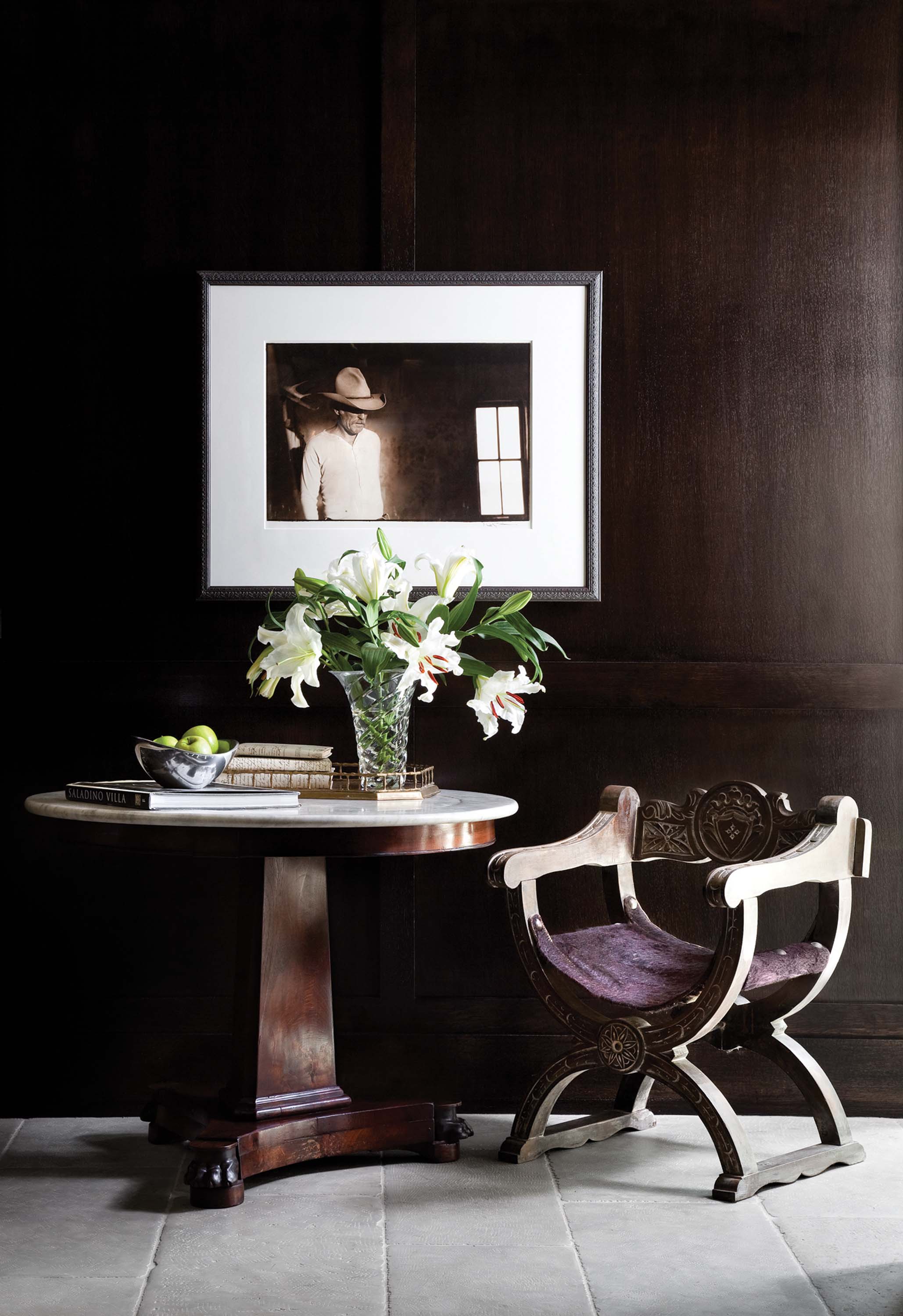
Meanwhile, the designer worked with a close friend, gallery owner Deborah Page Schneider, to find art that suited her wide-ranging taste. Some pieces are dramatic, such as the zebra head with a cigarette stuck in its mouth, or the skull dripping with dried tar that Stanley hung in front of an antique mirror. Others — like Bill Wittliff’s photograph of Robert Duvall from the television mini-series “Lonesome Dove” — are introspective.
Thanks to the designer’s ability to merge art and living spaces, the house never feels like a museum where display overrides livability. “Elizabeth and Ryan did a good job of making this house function both as a house and as a place to display art,” says Aaron Stanley.
Ryan Street compliments his client, too: “She took the Spanish style and updated it — it was the perfect vision for this house.”
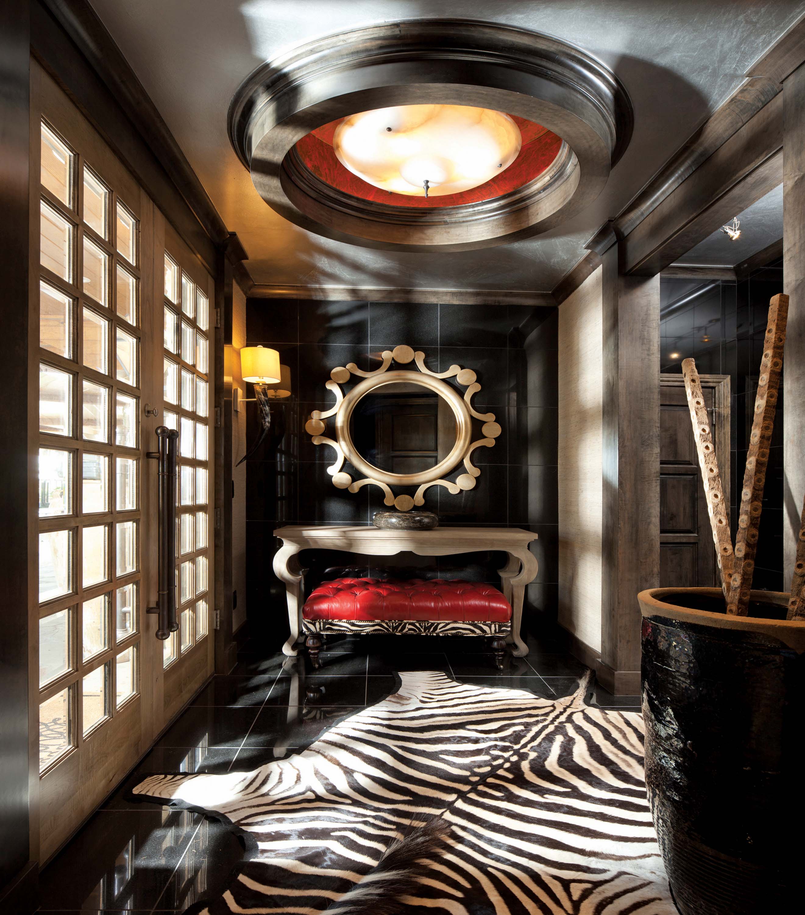
- In the entryway, black granite on the floors and walls provides the perfect backdrop for a zebra hide rug and red accents, a theme employed throughout the great room.
- A photograph of Robert Duvall from Bill Wittliff’s “Lonesome Dove” series hangs on the ebony-stained wood-paneled walls in the game room.
- Stanley’s antique-meets-mod palette is at work in the living room where a vintage Lucite coffee table is paired with an edgy wood-and-Lucite “Ghost” chair. The Louis Philippe mirror and antique French glass sconces animate the waxed-plaster walls with reflected light. In the dining room Stanley’s custom resin table is surrounded by Os de Mouton chairs upholstered with Luisa Cevese plastic fabric.




No Comments