04 Apr Unexpected Beauty
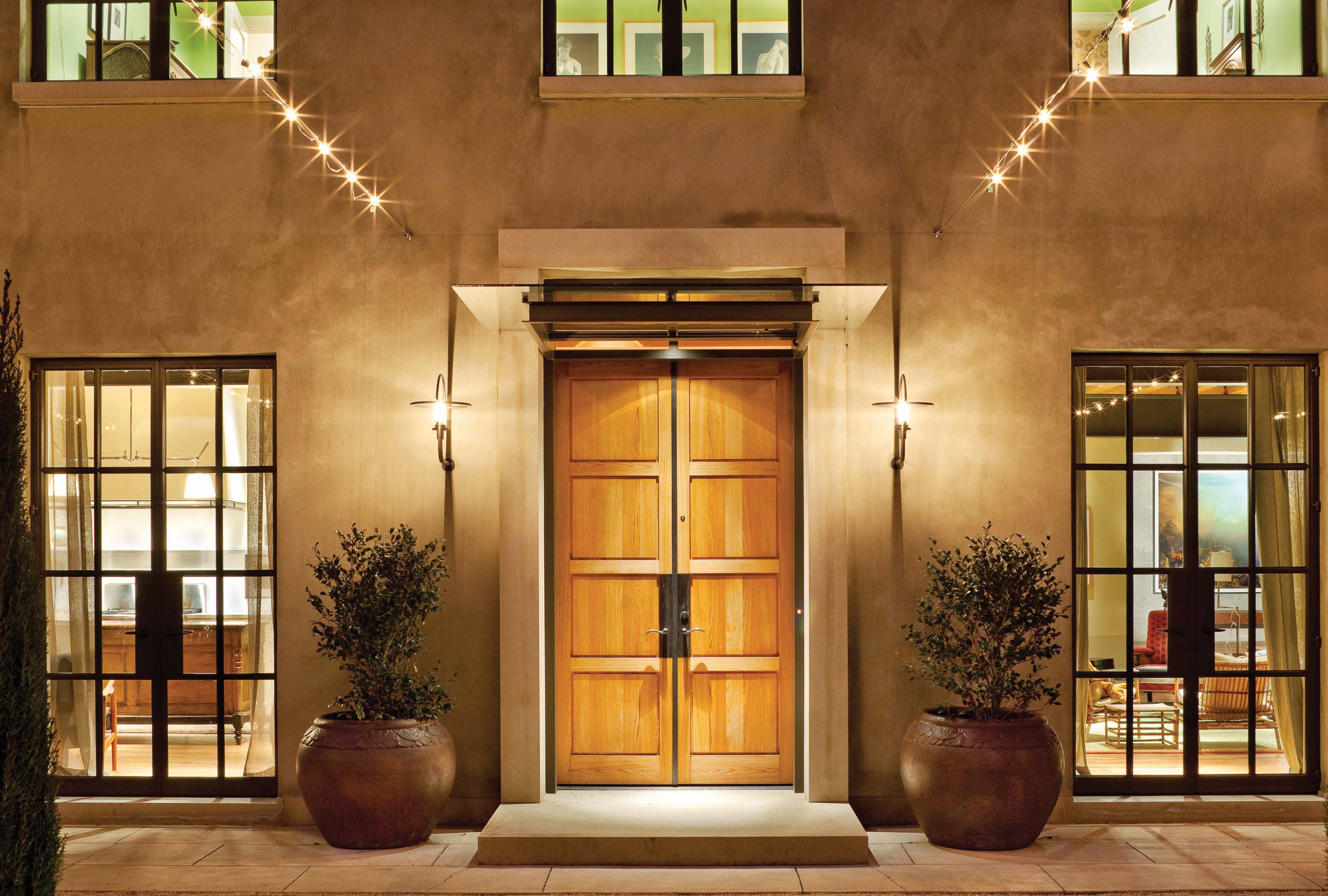
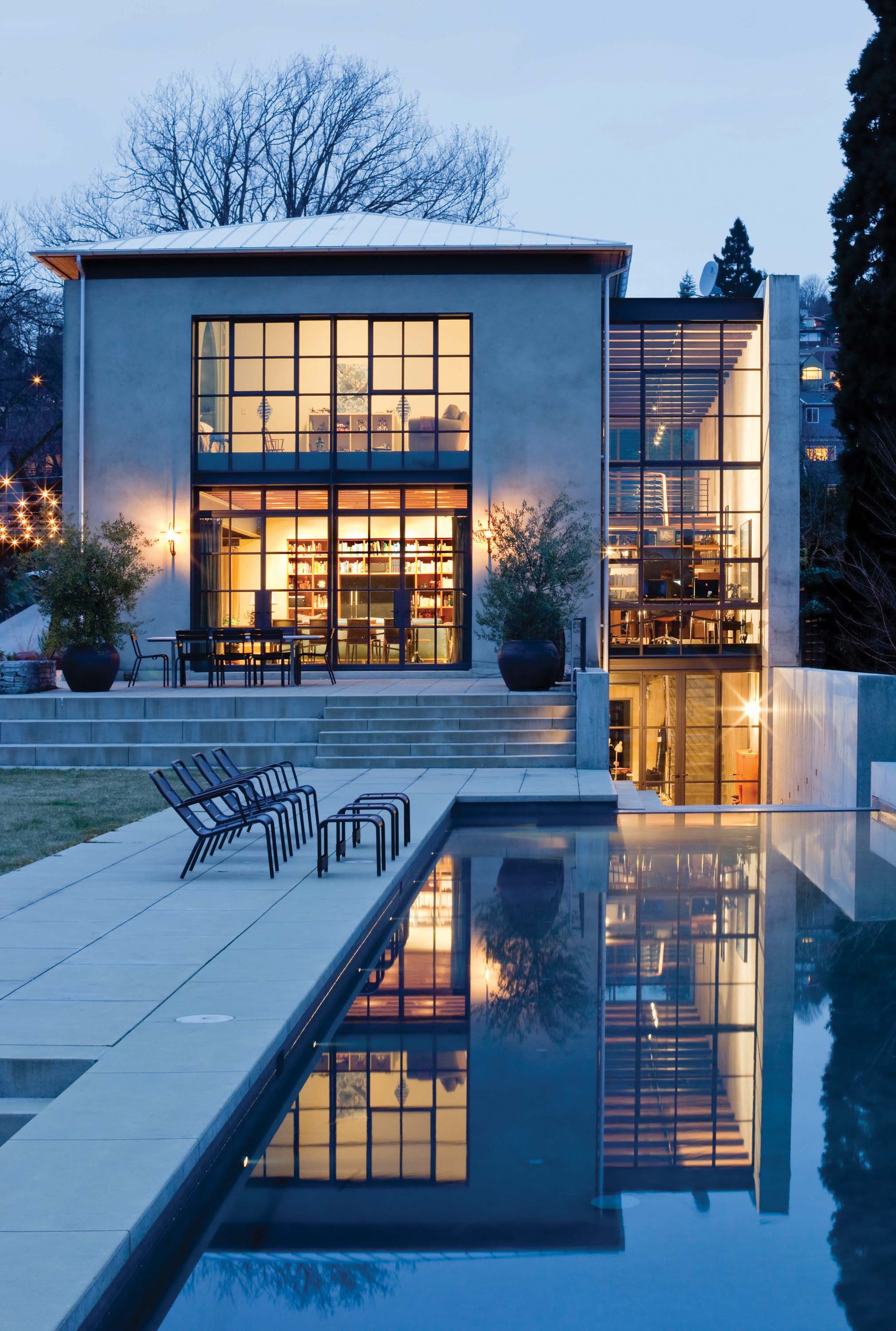
The cables of lights over the garden and the boxlike exterior of Seattle’s Southpaw residence lead me to anticipate a modern European villa inside. With repeating patterns of windows and double doors, I’m expecting an interior full of woodwork, wall beams and wonder.
I’m only right about the wonder. The house opens up unexpectedly to reveal bare walls of concrete, stucco and plaster. Ceilings are exposed. There’s no ornamentation. Enjoying this space is about appreciating proportions, the purity of the materials and the super-refined finishes to surfaces.
“I guess it’s a villa,” says architect Tim Hossner, a partner at Replinger Hossner Osolin Architects in Seattle. “But this is really more pared back to the bones of what is beneath that, the ruins of the villa, which we think can be just as interesting, if not more interesting.”
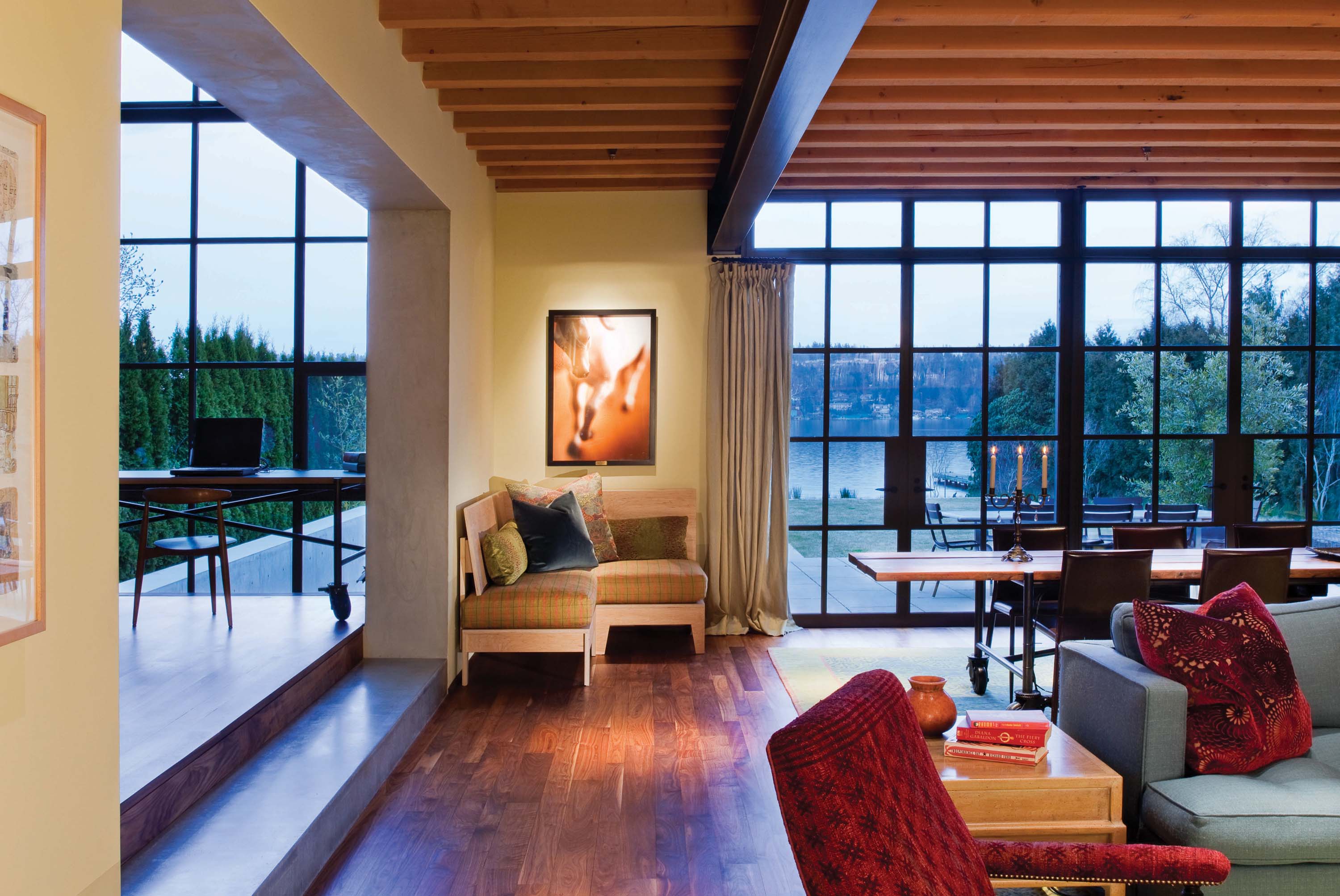
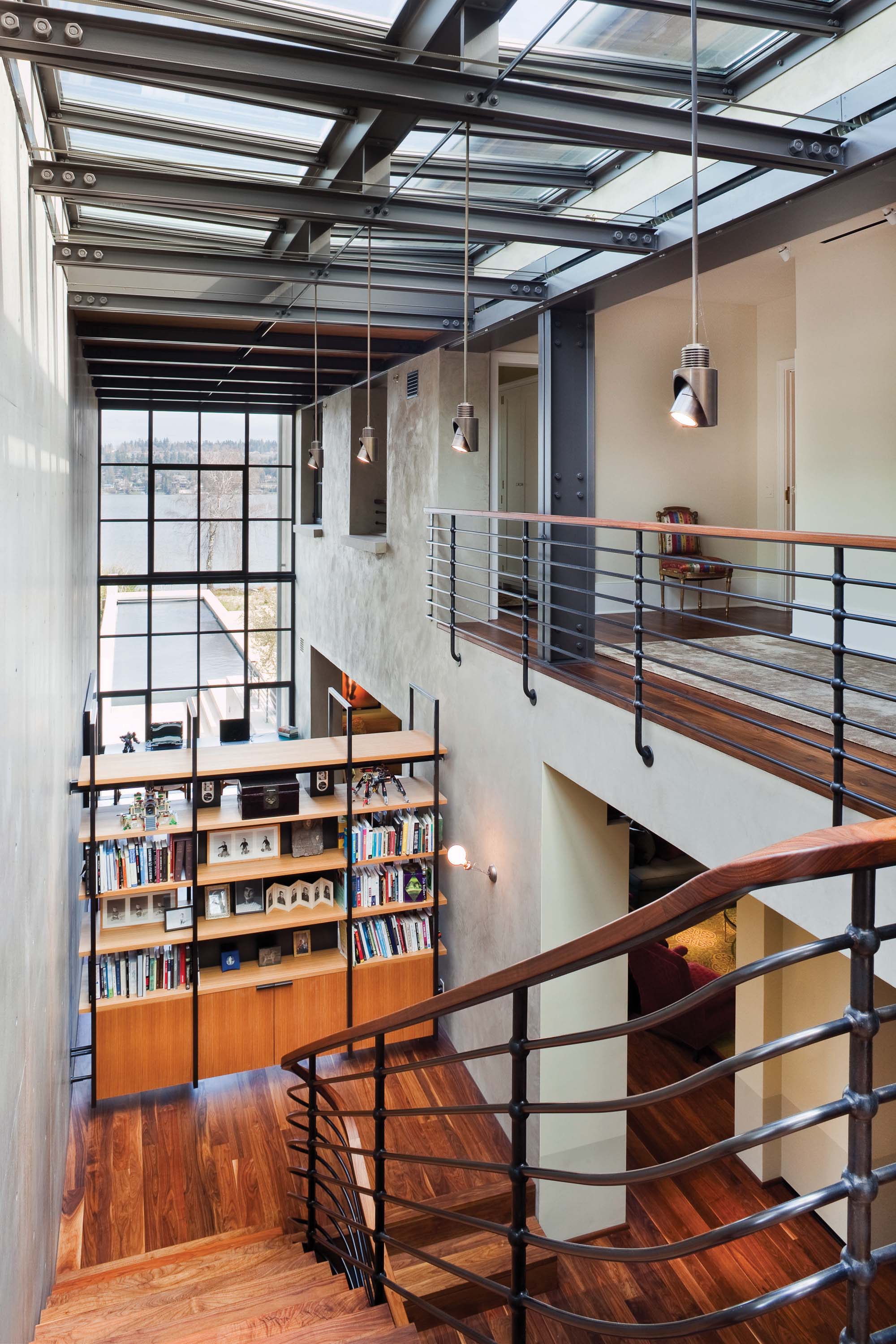
Toward the back of the house, that villa seems to fade away. Exterior finishes and glass windows establish the feel that you are stepping out of the house when entering this space. “We call this area The Slot,” says Hossner. “It’s a very dynamic space, out of time with the house.” Skylights open up above the stairs, and both ends of this space are glassed in. While most houses along Lake Washington face the water, the Southpaw residence purposefully has the water view on the east end, allowing the house better access to sunlight. When rays sneak through Seattle clouds, they hit the concrete wall and cast a glow over the whole space. The effect is not unlike the sunset print that hangs over The Slot. A concrete step leads you back down into the living and dining room, as if you’ve stepped through the wall to get back into the villa.
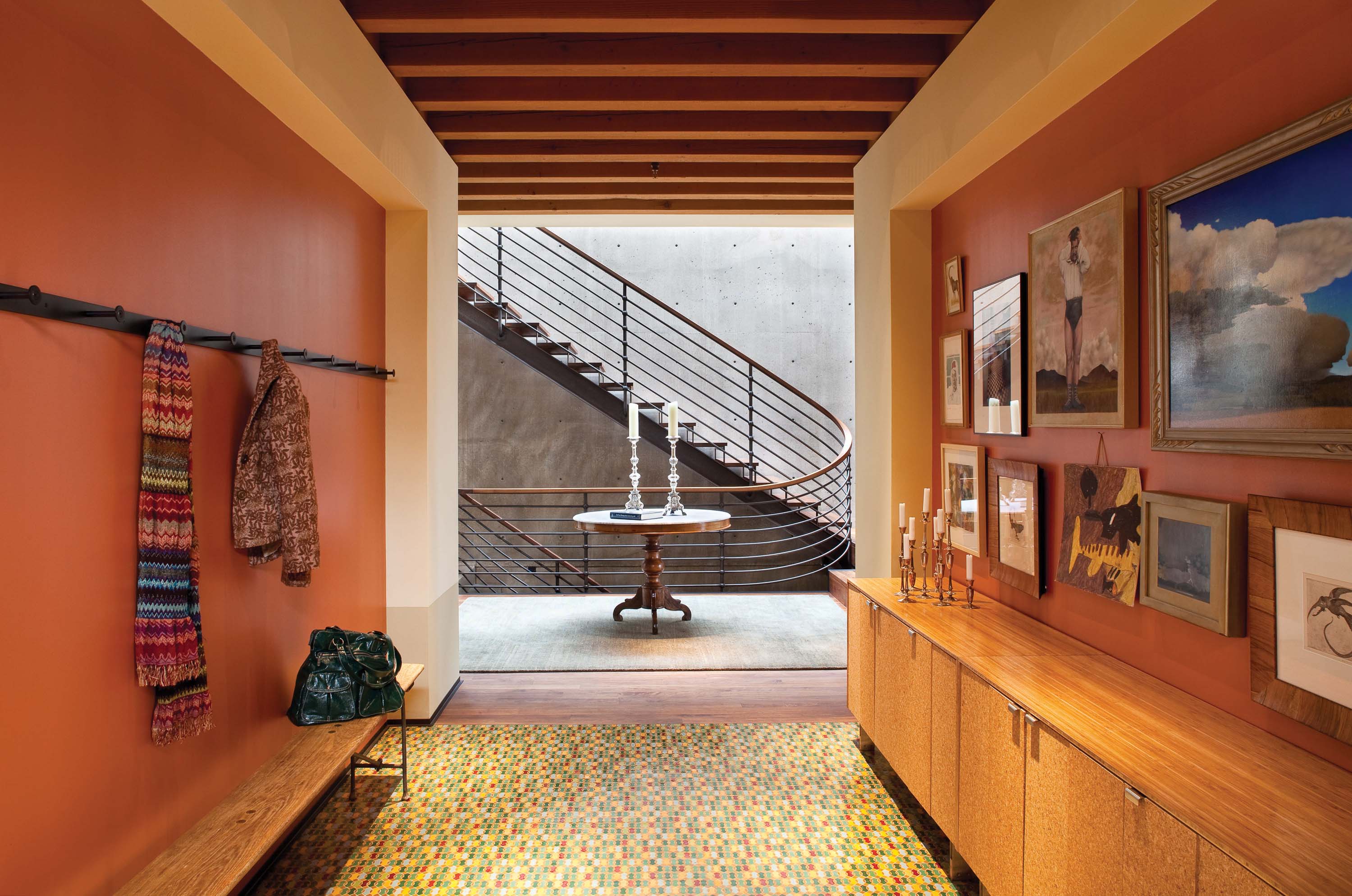
Although the building materials were chosen for their simplicity, colorful and complicated aspects pop up everywhere. The warm entryway guides guests into the home over a carpet of individually hand-laid Moroccan tiles. The powder room beneath the stairs is a bit like a concrete vault — until you open the door and are greeted with the bright yellow floral pattern that covers the walls. Upstairs the rooms are full of treasures such as laser-cut wood shutters, Moroccan lamps, bright wallpaper and delicate wall sconces.
Combining disparate styles, materials and moods was important for the owners. There is something from almost every decade in the home, and the living room alone took more than a year and a half to pull together. Designer Janice Viekman led this process, finding some pieces through antique dealers and designing others herself.
Pulling together this juxtaposition of furnishings “was a tricky thing,” says Viekman. “It was really my job to be the composer, to ensure that all the pieces felt comfortable together.” Perhaps this was most challenging in the kitchen, where a huge buffalo print keeps an eye over the modern appliances and antique kitchen island. Just as mosaic tiles, period furniture and walls of glass and concrete fit together harmoniously in the rest of the home, the colors of the buffalo print and the modern sink in the antique island bring the kitchen together with an unexpected beauty.
- Overlooking the pool and Lake Washington beyond, The Slot and the living room are connected here with a concrete step.
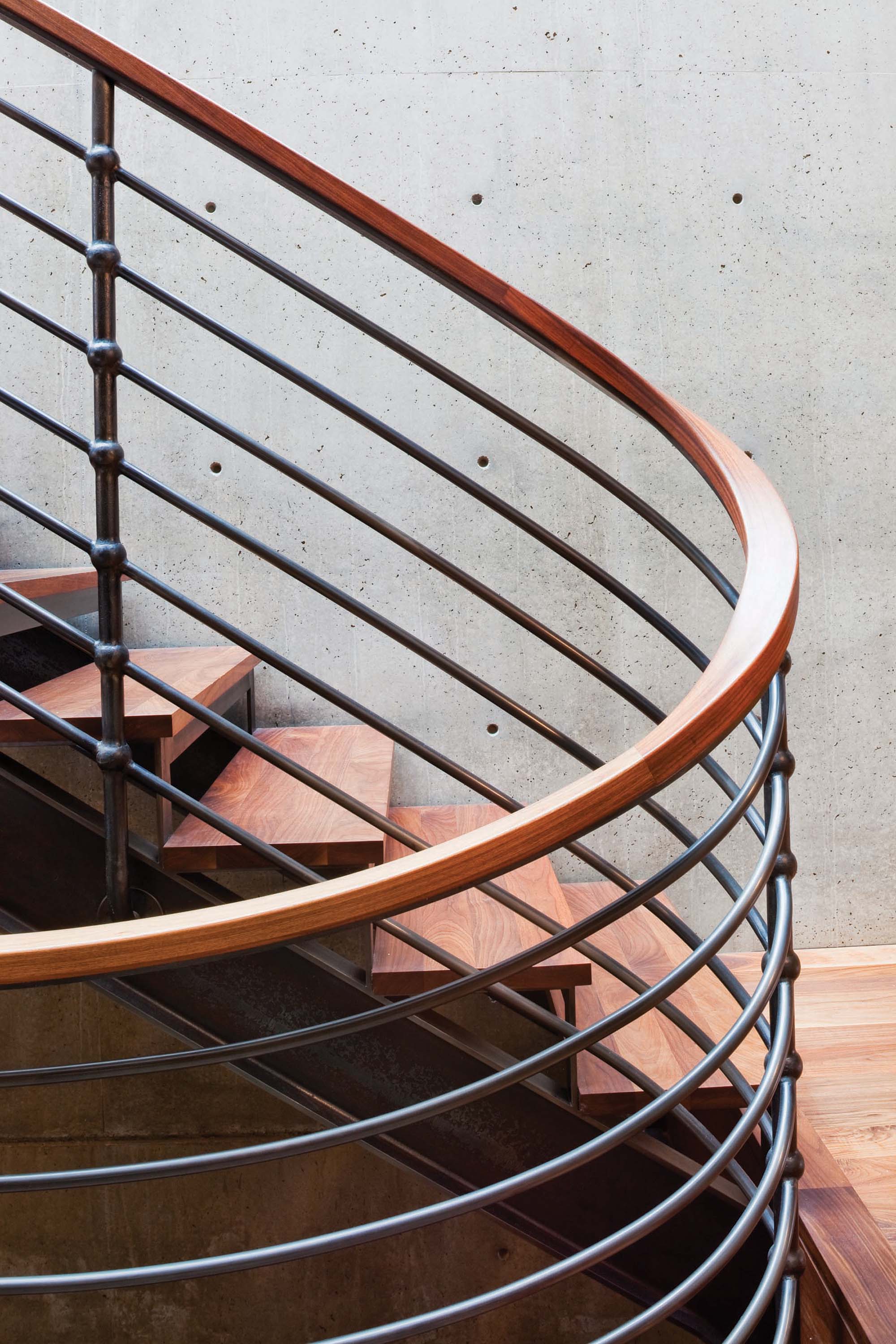
- Both the concrete wall behind the stairs and the entryway flooring took some work. The concrete was poured in place, while the tiles were flown in from Africa and individually hand laid by Moroccans.
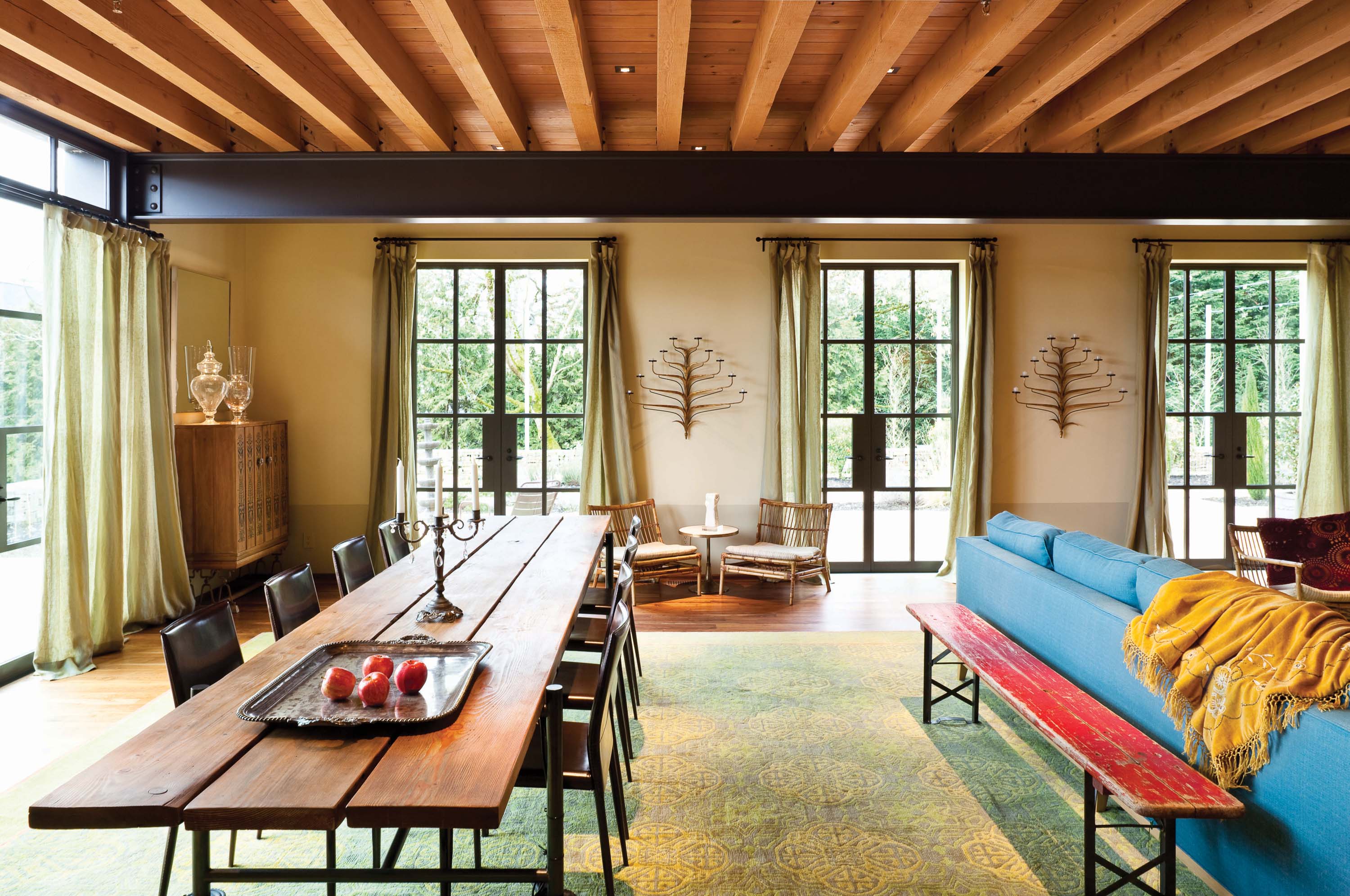
- Inspired by the scaffolding which surrounded the house during construction, Janice Viekman designed a dining room table that is anything but static. It is on wheels, easily shortened and lengthened, and contains plug-ins for laptops and library lamps.
- The top of The Slot offers long views of the lap pool and Lake Washington beyond.
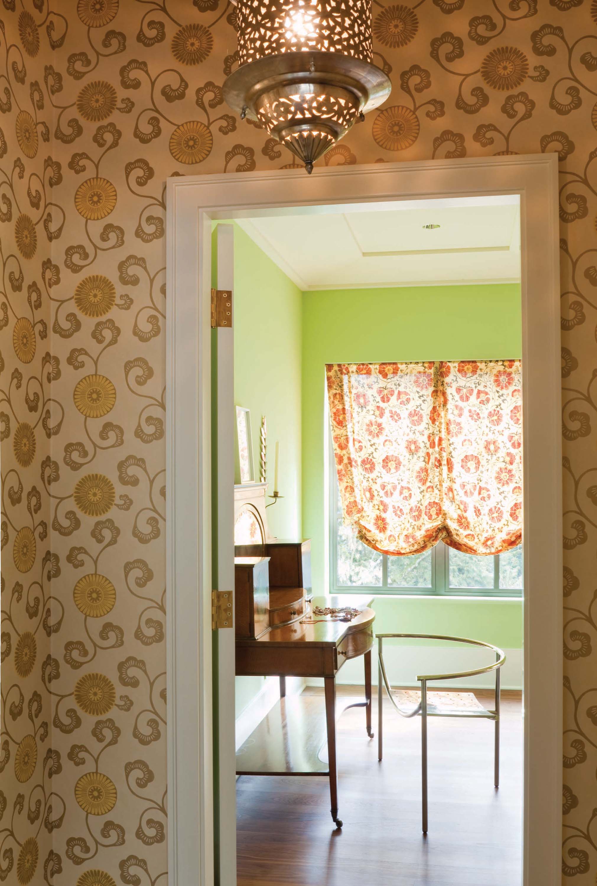
- This simple antique desk and Philippe Starck chair sit in a quiet corner of the master bedroom.
- Both the lap pool and the cables of lights over the garden create structured outdoor spaces that are used well past summertime.
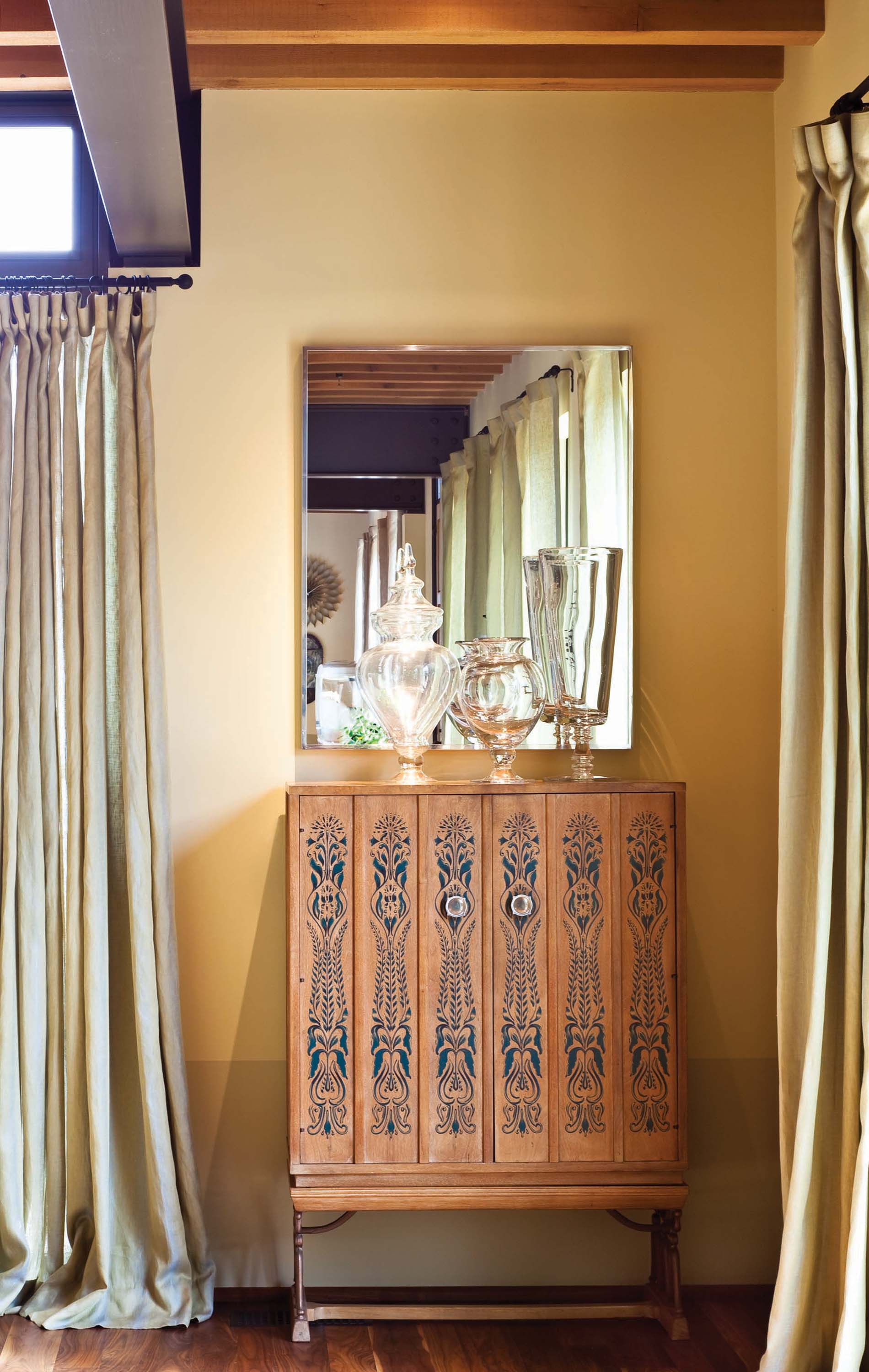
- Every corner of the home showcases designer Janice Viekman’s talent in bringing different elements together.
- Steel fabricator Todd Von Mertens worked on-site to detail the curves of the staircase and handrails.


No Comments