01 Sep Designing the West: William Peace
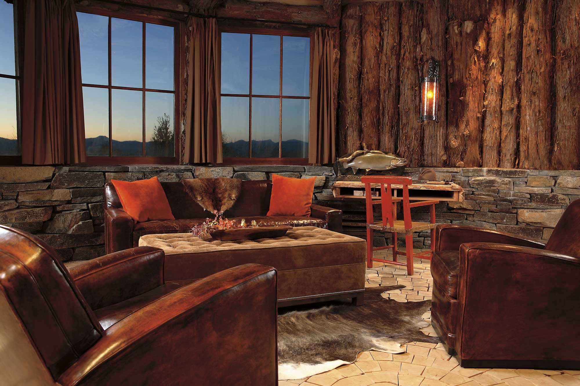
French Art Deco or rustic. New York versus Montana. Soft against rough. Designer William Peace, ASID, thrives on a style of contrast that has made him a leading force in the interior design community.
For Peace, design contrasts are an art form. He uses contrast to create intrigue rather than any form of pattern. Peace’s favorites are pleasing to the eye and beguiling to the fingertips. His sophisticated, approachable interiors have landed him in numerous national publications, as a guest on radio and television interior design programs and have won him many awards including the prestigious National ASID Project award for residential interiors.
Named “Southeast Designer of the Year” by the Atlanta Decorative Arts Center, Peace finds working with dichotomous elements to be natural. His own life, after all, has been a study in contrast. At a young age Peace was drawn to art, always doodling and sketching. Before a career in art became a possibility, he spent his summers on construction crews where he worked as a framing carpenter, block layer and surveyor. Looking back now, Peace says his years in construction shaped both his future and his approach to design. His knowledge of building is recognized by those he works with in the field. Montana architect Candace Miller notes, “Perhaps the most invaluable quality I find with Bill’s involvement is his grasp for architectural detail, which makes the process dynamic and a much more collaborative effort.”
Choosing to major in studio painting at art school, it didn’t take long for Peace to realize that making a living as a painter was going to be tough. As a hands-on person, he wanted to be in the field, somehow integrating his love of art into the interest he had for the building process. Peace started in the design program at the University of Kentucky studying interior design, photography and architecture. Interior design united his interests and made his artistic side sing. He knew he’d found his niche.
Before graduation, a design firm in Atlanta came calling. Hired on the spot, Peace’s first experience out of the gate proved to be an excellent training ground. He worked in corporate offices and designed interiors for country clubs. Everything was traditional and the experience taught Peace about symmetry, balance and scale in the field.
As his career evolved, Peace became partner in Gandy/Peace Design and moved toward very contemporary, modern work. Then he found the West. The discovery came on a family trip to the Rocky Mountains with one caveat: they could only sleep in a place made of logs. Soon Peace’s designs started breaking the rules; texture was nearly always a culprit. He saw the value of mixing stone with cashmere, rough hewn timber with silk velvet. Even though Peace likes things understated, elegant and extraordinarily beautiful in a quiet way, he creates so that each element has maximum contrast impact.
Contrast in Peace’s interiors starts with the exteriors. Bringing elements of the outside in has become a signature of his work: blending, melding until he has a neutral canvas. “Neutrality doesn’t compete with art, food, people or views,” says Peace. As such, his interiors are full of vivacious textures and unexpected twists; then he adds the touches that make him shine in the design world. Peace will hang a plowshare as an art piece or an exquisite 1920s Chareau Chandelier found in Paris. He uses water to create soft sounds amid the quiet of a courtyard, hangs a modern painting against a rustic wall. Indeed, Peace’s touches are at once powerful and subtle. “Bill’s signature is simplicity of line and texture of fabrics/materials with an excellent eye for beautiful antiques, quirky pieces and artwork,” says Miller.
Peace’s own life and design reflects his affinity for the contrasts he craves. His home in Atlanta is a renovated gas station built in 1912, the only commercial building in his neighborhood. His rustic home is full of texture; Mexican tile is used throughout and Peace built a pool where the gas tanks used to be. It is a perfect haven for him and his boys. His home is a mixture of his affinity for modern architecture and design and his attraction to the Western vernacular. In his life, Peace relishes a window shopping stroll down a New York street as much as he values his time casting into Montana’s Gallatin River. “I need both to work,” he says. “I would be stifled if I were stranded somewhere.”
But stranded he is not. He has offices for Peace Design in Atlanta and Bozeman. He has served on the Board of Trustees of the Smithsonian-affiliated Museum of Design and is a current member of the advisory committee for the College of Design at the University of Kentucky. His contribution to education has been recognized by the university with the recent opening of the Peace Gallery in honor of his commitment to the program’s development.
William Peace is an artist of contrasts, a proponent of education, a designer whose interiors are timeless whether they are modern or rustic or an enchanting, warm combination of both.
How to Make an Art of Contrast by Bill Peace
- Contrasts create interest in an environment: Put something heavily textured against something soft. Give the space visual and tactile interest.
- Look for artistic approaches to contrast. Instead of hanging a painting, hang a found object like a miner’s pick or the arcs from a hay rake.
- Create understated complexity by using various forms. The collision of a clean modern sofa with an organic reclaimed table brings interest and warmth.
- Don’t use large furniture pieces that jump out at you. Keep your contrasts subtle by using a sofa that is neutral in color, then accent with pillows of different colors and textures. Contrast does not have to be black and white to create interest.
- Don’t be afraid to change your environment, even seasonally: Create the unexpected, then change it. Remember contrasts come in all phases of our lives.
Thea Marx is fifth-generation born and ranch-raised from Kinnear, Wyoming. Much of her career, including her book and Web site, ContemporaryWesternDesign.com, has been dedicated to Western style. Her work appears in Living Cowboy Ethics, Western Horseman, Log Home Living and Western Lifestyle Retailer.
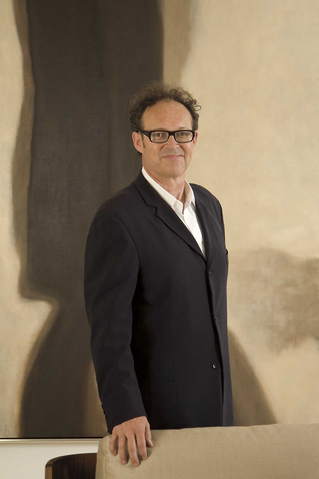
- Bill Peace photo by Ashley Hope.
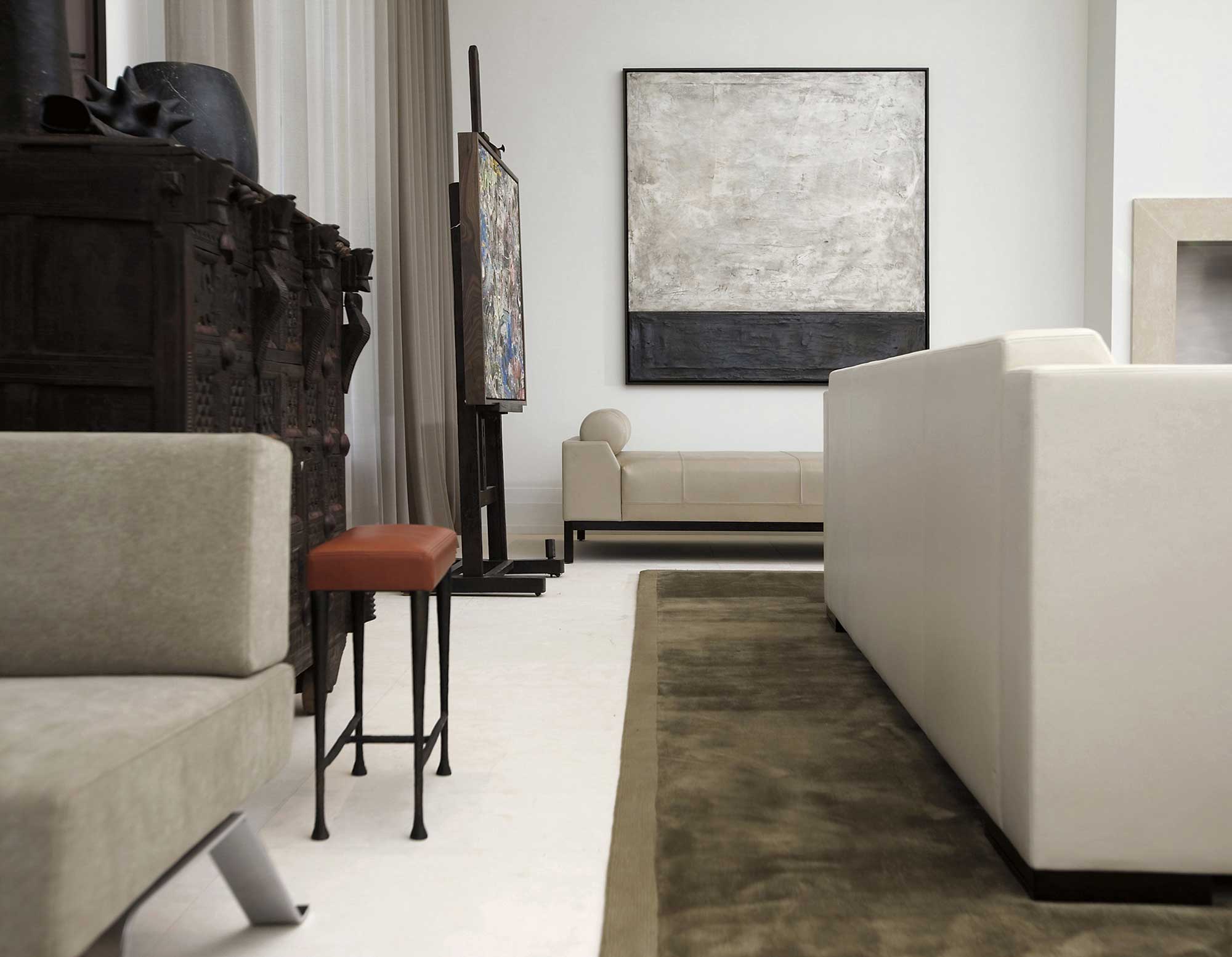
- With a vision to create a space that combined modern and rustic elements, Peace utilized a number of furnishings upholstered by Holly Hunt, a vintage Asian cabinet, and an eco-friendly soy rug by Tai Ping. The antique Italian easel, acquired from Robuck & Company, holds a 1970s Herb Creecy painting. Overall, the room’s warm palette and combination of textures make it modern yet approachable. Photo: Ashley Hope
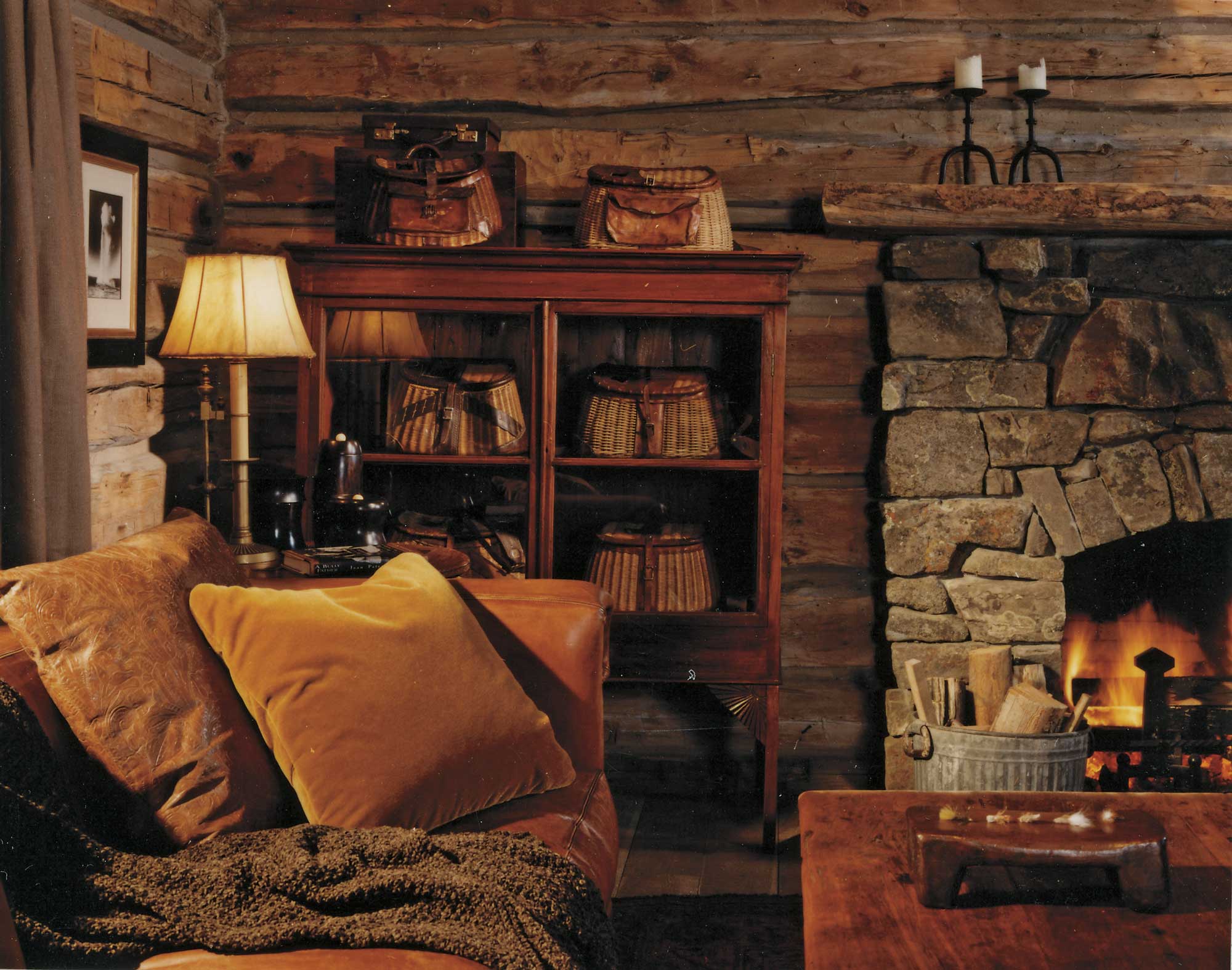
- This rustic Montana fishing cabin and office was once a schoolhouse. The sofa is by Ralph Lauren; the table is an antique from Asia. Peace used vintage fishing creels in a glass-front bookcase. The room’s fireplace, crafted from Harlowton stone, was added during the conversion of the structure. Photo: Roger Wade
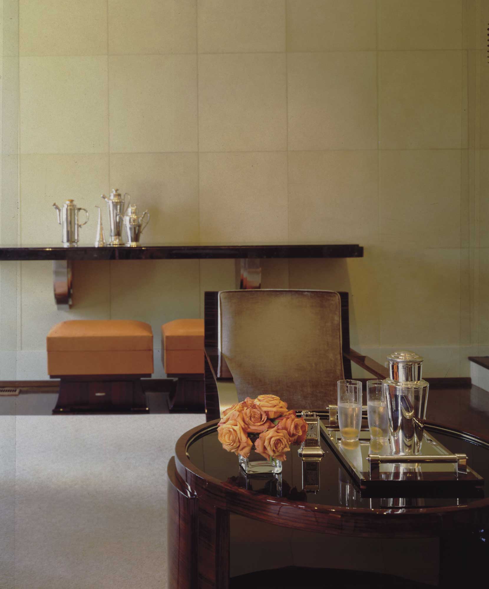
- With parchment paneled walls and a walnut floor, Peace furnished this room largely with period French Art Deco pieces acquired at auction in Paris. Photo: Deborah Whitlaw Llewelyn
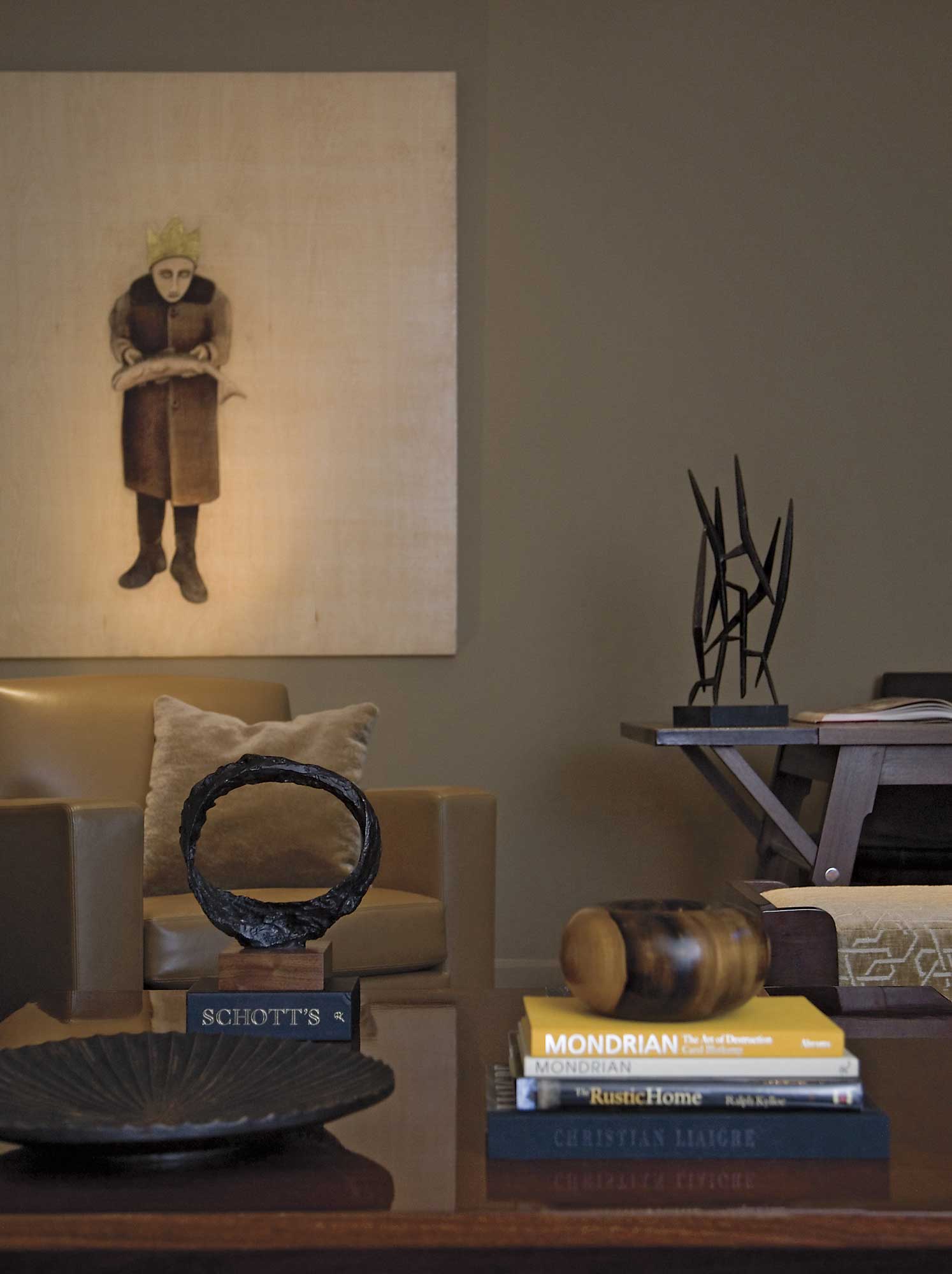
- Peace combined wood, iron, chenille and leather for this family study. The room features significant art, an eclectic mix of vintage and contemporary, including Fisher King by Tony Hernandez, which is oil and gold leaf on board, wooden bowls by Ed Moulthrop, a bronze platter and bronze sculpture. Photo: Ashley Hope
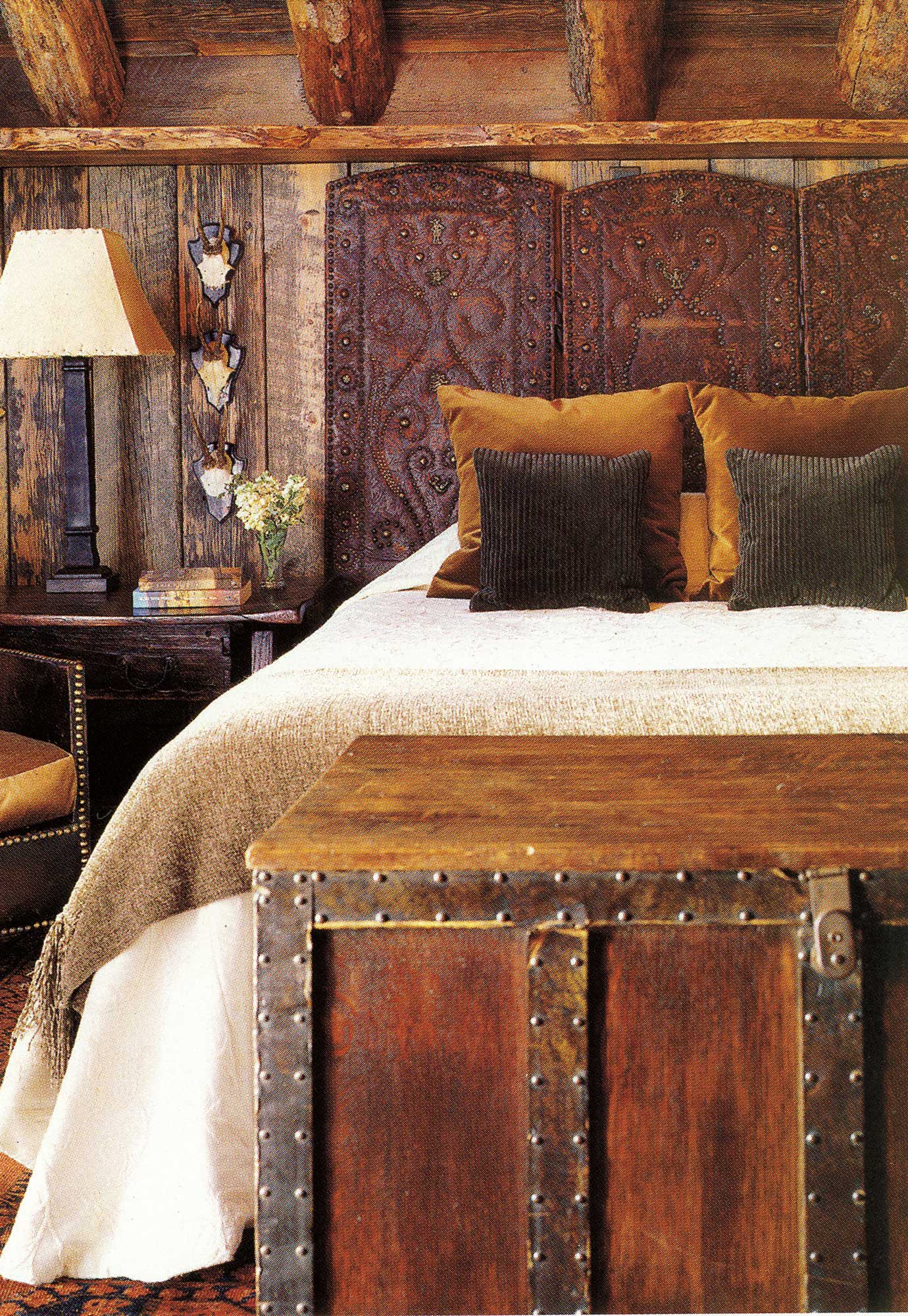
- The inspiration for Peace in this Montana bedroom was to create a space that was romantic, comfortable and luxurious. For the bed’s headboard, Peace used a vintage tooled leather screen. The heft of the handsome antique trunk from Robuck & Company is offset by silk and velvet pillows. Photo: Matthew Millman
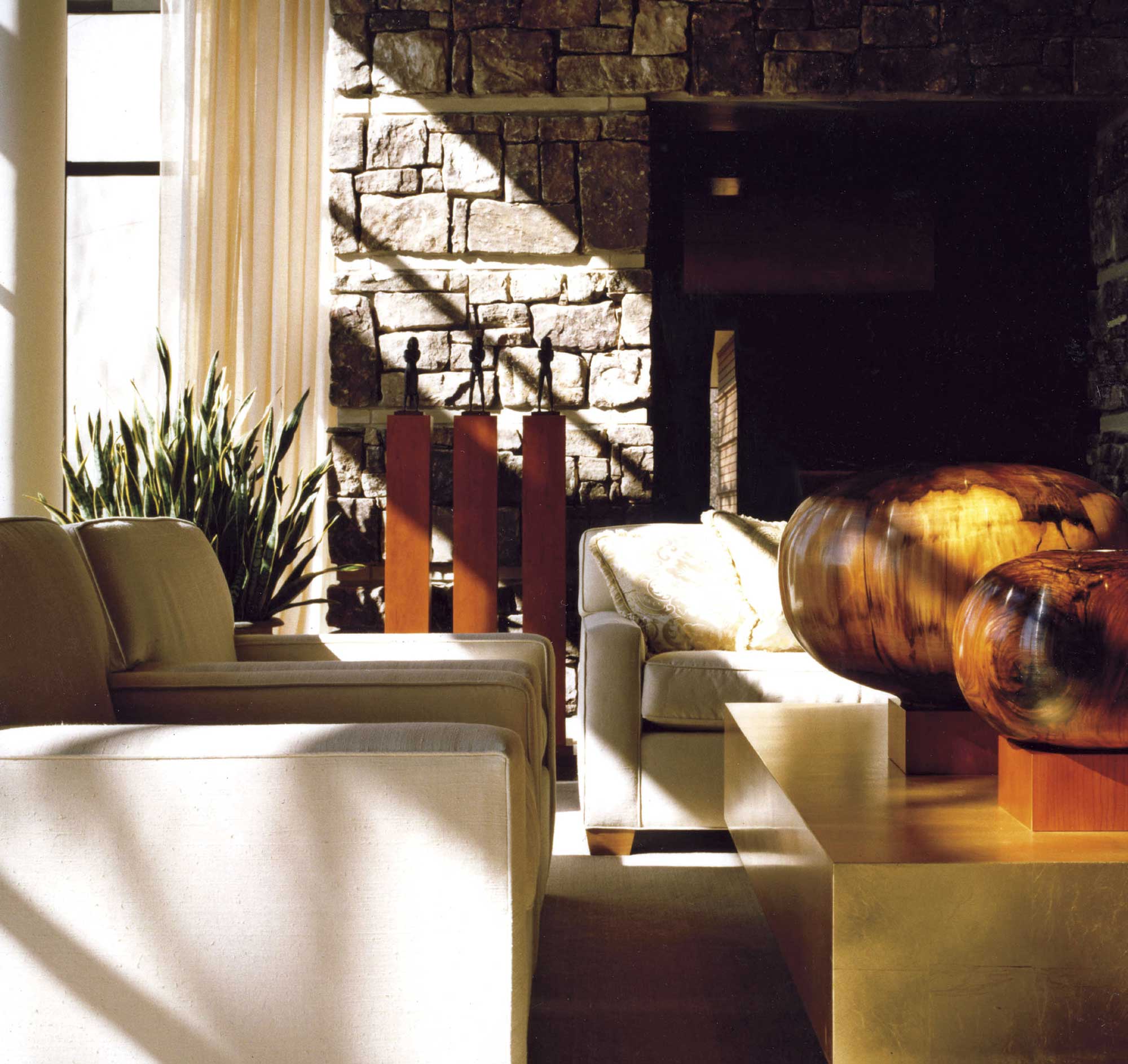
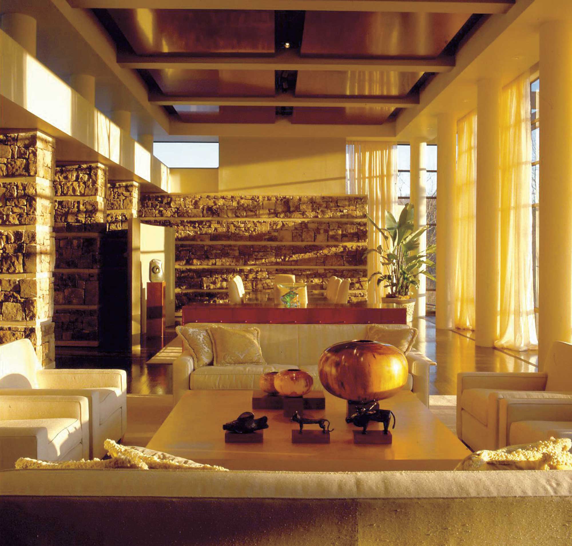
- The linen scrim draperies and polished wood provide an elegant contrast to the rustic fieldstone, making this room ideal for both casual and more formal entertaining. Peace designed it to be at once comfortable and inviting. Photo: Chris Little
- This rustic urban residence is set on the edge of a precipice, 800 feet above the Tennessee River. Peace combined local fieldstone and polished cherry to give the room a refined rusticity. Most of the furnishings, including the stunning gold leaf coffee table, were custom-designed by Peace Design. The chairs are by Jean-Michel Frank. The wooden bowls on the table are by artist Ed Moulthrop. Photo: Chris Little


No Comments