04 Aug Rendering: Architecture inspired by art
Frederick Fisher and Partners is known not just for the practice’s many museums, galleries, public buildings and homes for artists and collectors, but for the profound way in which art has influenced the firm’s thought.
There’s a photograph, taken in 1980, of 10 young Southern California architects standing in a semicircle, buffeted by wind and sand, on Venice Beach. One of them, Thom Mayne, had just concluded a pop-up gallery in his house where each of the rising-star architects had been given a weeklong exhibition. Mayne’s point was that the products of architectural design — the drawings and models, for instance — were objects of art. Venice, in those days, was ground zero for the Los Angeles art scene. The new SCI-Arc was right down the street, and still-seedy Venice was home to artists, many part of the Light and Space movement. Everyone knew everyone, and the energy was intoxicating.
When the photograph was taken, Frederick Fisher had two years under his belt working with Frank Gehry, another of the 10. Fisher had built his first house, which was commissioned by the publishers of WET magazine — the tongue-in-cheek house organ for the Venice art scene — and was opening his own practice.
In 1982 he was joined by David Ross and, shortly thereafter, by Joseph Coriaty. The three men have been collaborating ever since, now in a landmark building designed in 1955 by A. Quincy Jones for his own practice.
FFP began designing lofts, galleries and art exhibitions, then museums, starting with MoMA PS1 in Queens, New York, for which they were awarded the Brendan Gill Prize. “It was eye-opening for me to be able to engage in the world of the arts,” says David Ross of those early days. He’d been involved in corporate design, and joining Fisher was a life-changing move. “We did really inexpensive artists’ studios, $20 a square foot, and it was a wonderful way to practice the field of architecture.”
Today, Ross is more involved in the residential end of the practice. “I love the intimacy,” he says. “The clients become my extended family.”
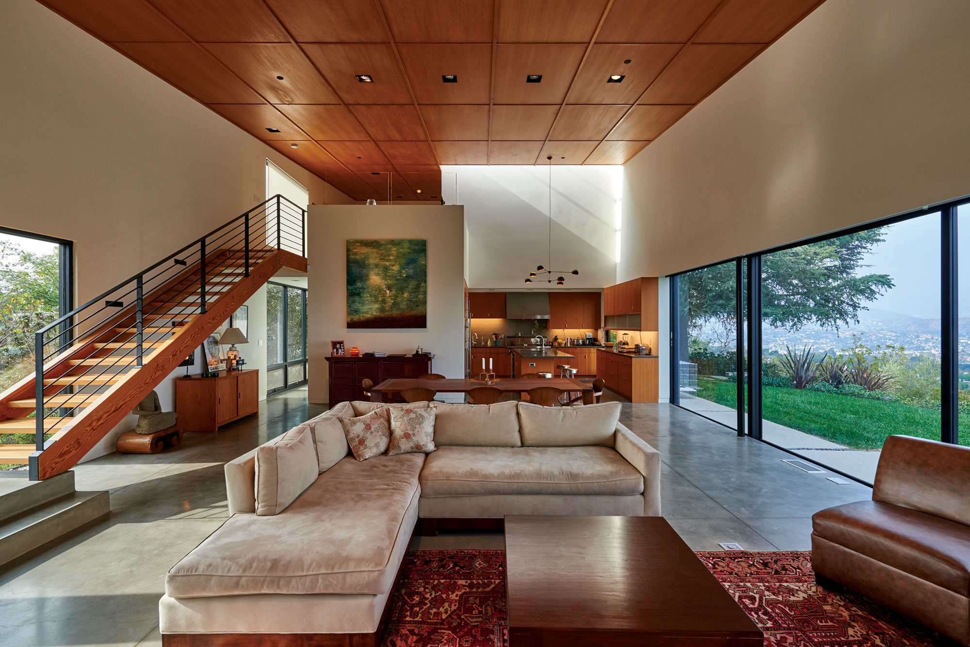
The houses are minimalist, elegantly simple shapes concerned with light and the blurred division between indoors and out. They tend to have ambiguous, opaque fronts that disguise the ease and openness of the interiors.
But don’t talk about style. “I don’t really like that word,” Ross says. “It’s not a style, it’s a way of thinking. There’s a simplicity that we’re trying to achieve. We create architecture, but we’re not trying to make an object so much as providing an experience for the inhabitant,” he says.
Ross is proud that a house built 20 years ago on Venice’s Abbott Kinney Boulevard remains timeless — it’s modern, but it’s impossible to pin down when it was built; it simply exists, impervious to changing styles.
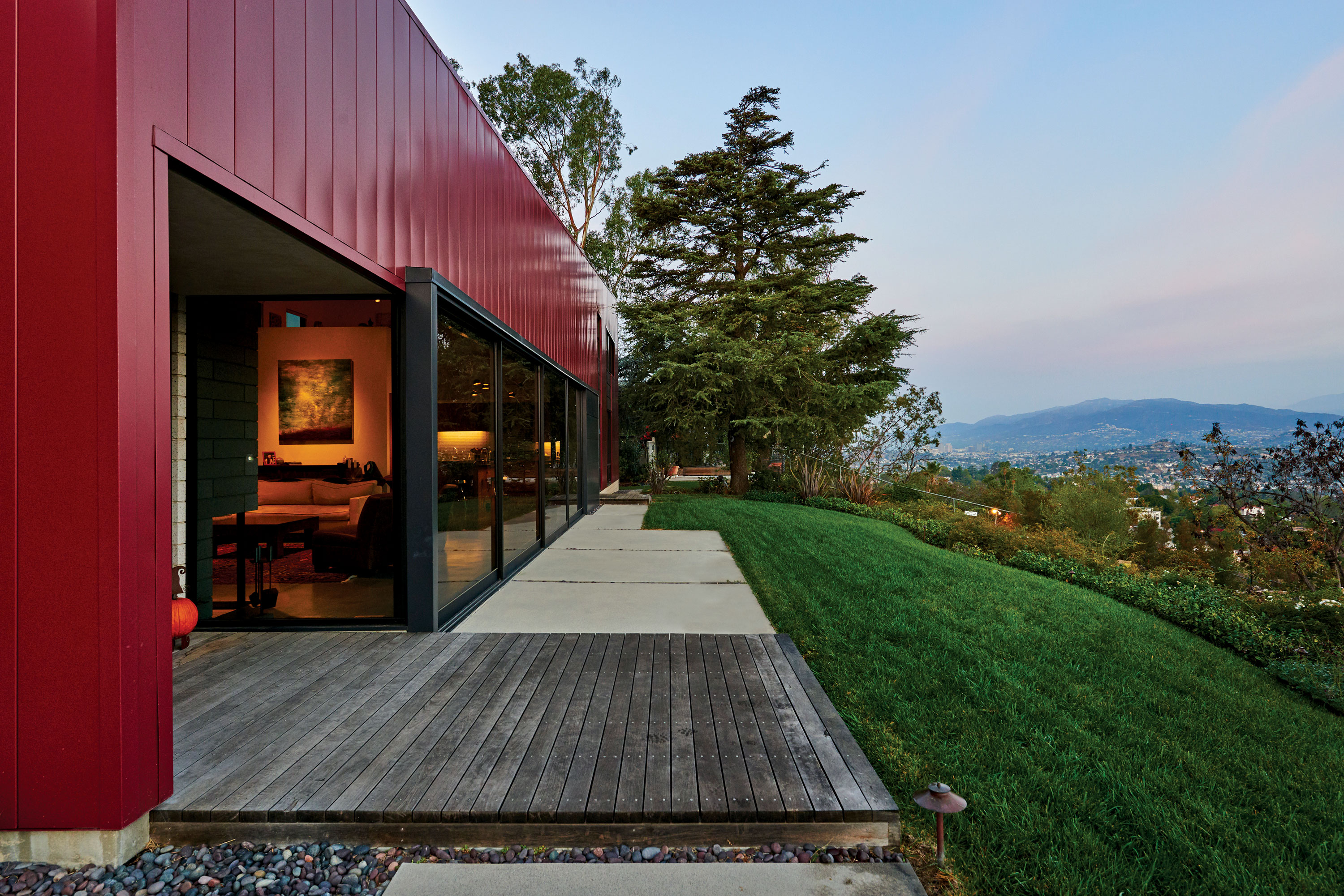
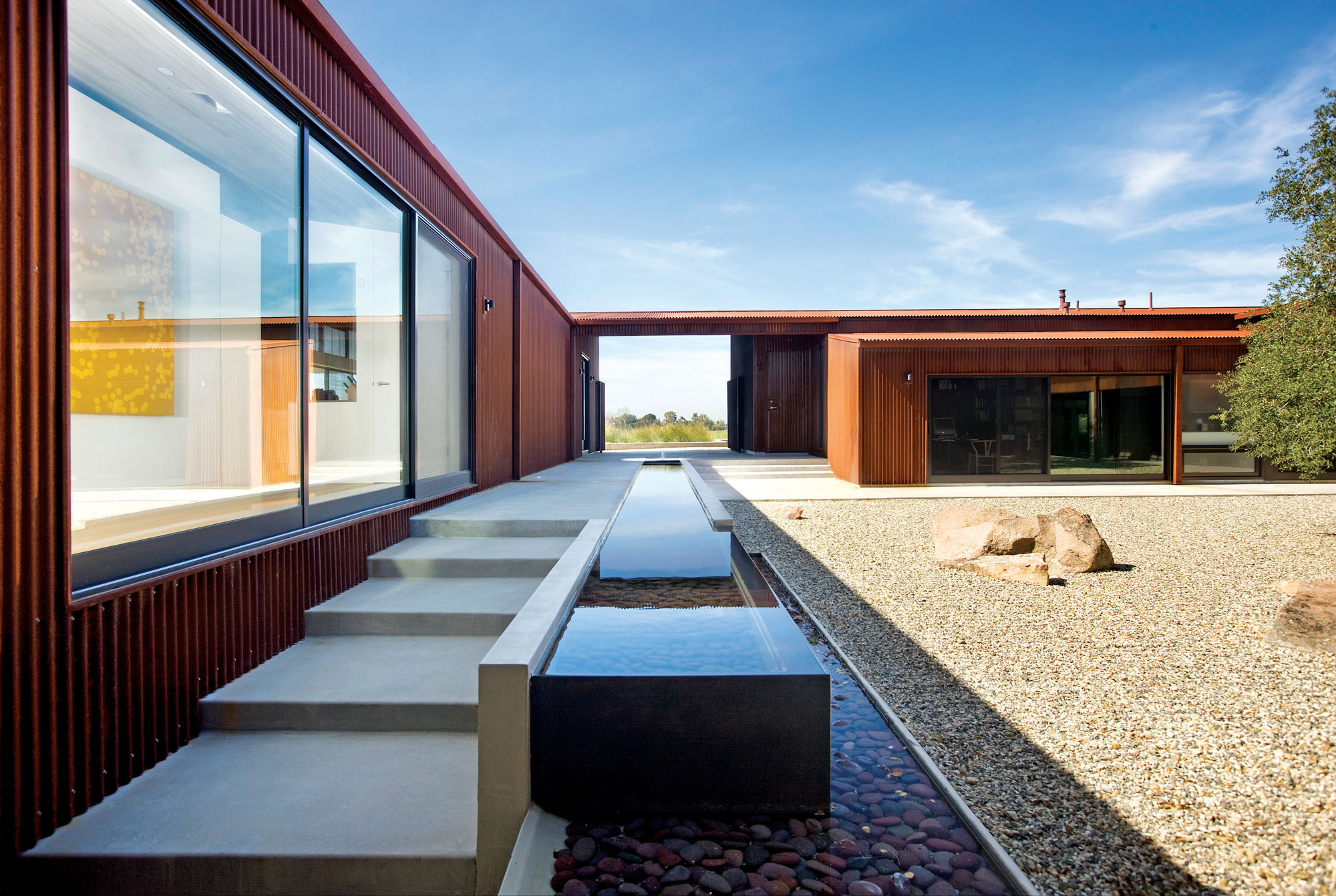
For a decade, many of the houses have been clad in metal panels, Cor-Ten or corrugated steel. “It was something that we explored,” Ross says.
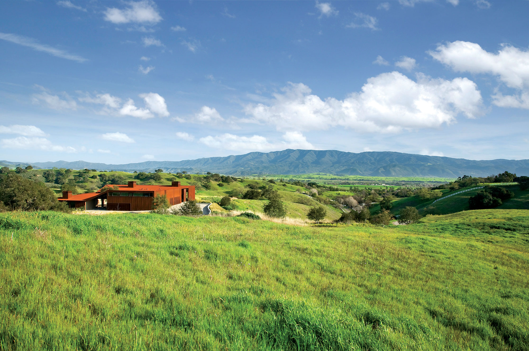
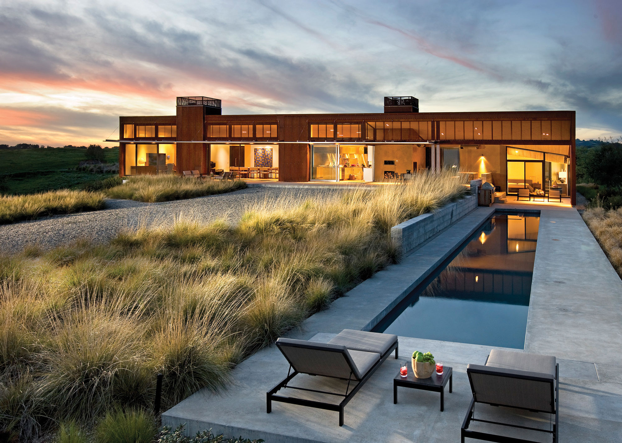
They’re often solar powered, with radiant slab floors. Air circulates so that even on a hill in the often-harsh heat of the Santa Ynez Valley, the owners rarely use central air conditioning. At night, lights within the house in Santa Ynez are filtered mysteriously through the metal envelope. “The façade was studied in a painterly sense,” Ross says. “Fred and I are interested in collage, and I’m interested in Minimalist artists like Richard Serra and the Light and Space artists. We wanted to create a sense of intrigue. The way the light goes through the perforated corrugated metal, it’s almost a gauze, and the entrance is a black hole. It causes a little anxiety. I have this favorite phrase, ‘seeing is forgetting the name of what’s seen,’ and maybe it’s okay not to know — there’s a sense of wonderment, of delight.”
Stucco has long been out of favor with architects, but Ross and his colleagues are intrigued by it. “We have a house in Napa where we’re exploring different finishes — how to make it more rough, how much aggregate is exposed. Another home, in Mandeville Canyon, will be stucco. Because Mandeville is a dark canyon, we’re using this idea of reflectivity. We’re exploring something almost like a Mary Corse painting; this idea of glass beads,” Ross says.
With both artists and collectors, it’s a balancing act to find the space for art without sacrificing light. “We’re doing something interesting now,” Ross says. “We’re trying to get clients not to use recessed lighting to illuminate the artwork.” The idea is to live with art as it has been lived with historically — slightly subversive in these days when art is displayed like trophies.
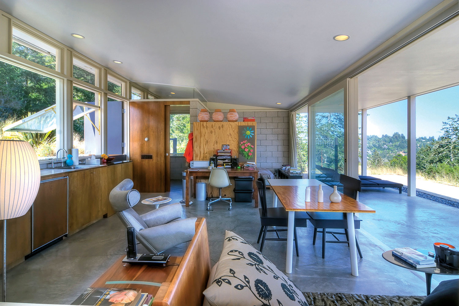
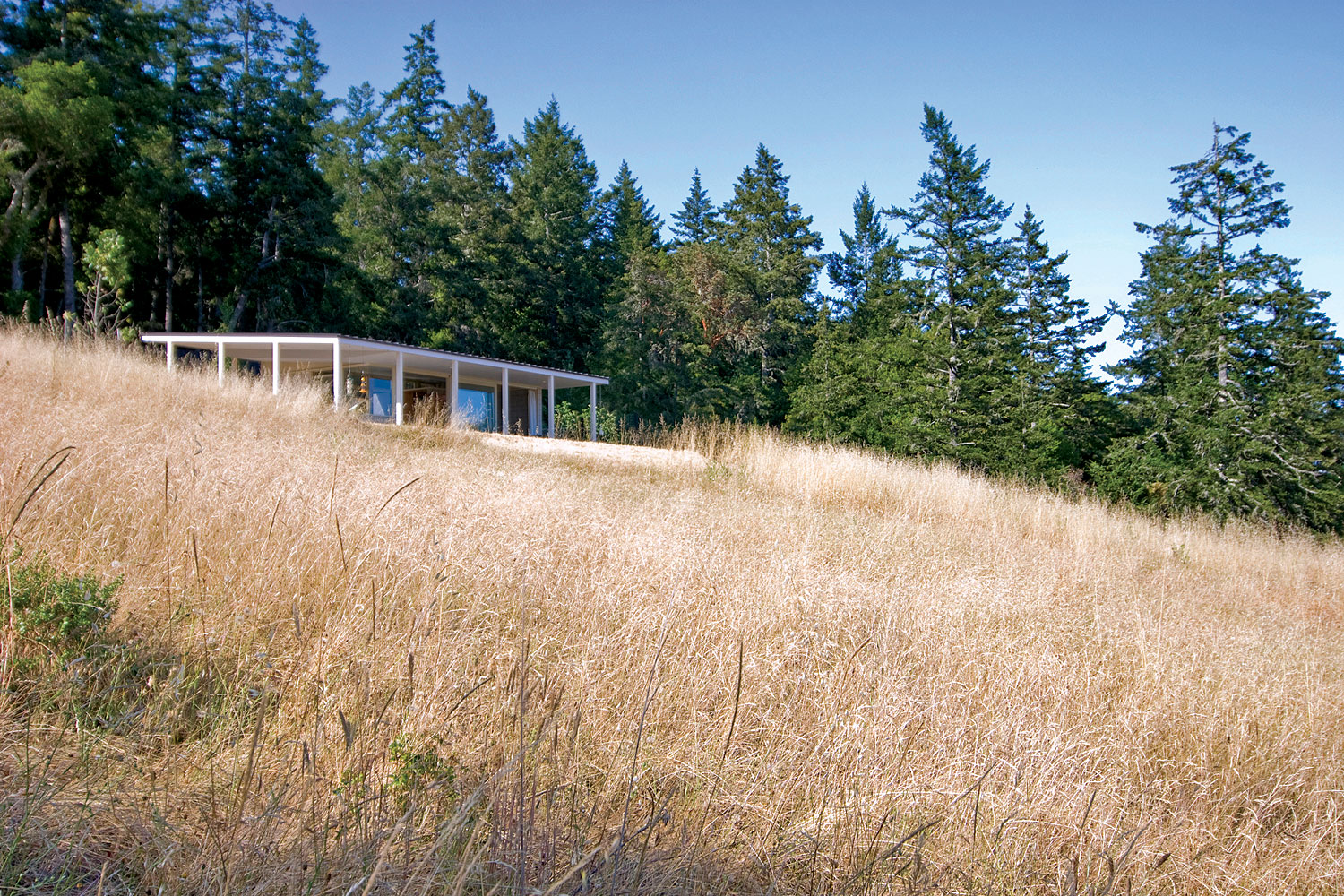
Ross would like his clients to leave a smaller footprint: smaller homes, larger gardens, solar energy and sustainable materials. One of his favorite houses sits on a 20-acre hillside on the Sonoma coast. It was built for a woman who was leaving an FFP-designed, 5,000-square-foot loft and wanted to scale down to 500 square feet. She has lived in it happily for 20 years.
“I actually like having a budget,” Ross says. “I like the idea of not having the most expensive materials. I’m happy with $2-a-square-foot white tile in the bathrooms. We sometimes do homes for people who want things because they cost more money, but the more I practice, the more I believe less is more.”
FFP designed the much-awarded Sunnylands Center at the Annenberg estate in Palm Springs (itself designed by A. Quincy Jones), among many other award-winning projects. Even though the houses are where David Ross finds the most happiness, he’s also working on a theater at a prep school and has designed four recent exhibitions in LACMA’s Resnick Pavilion. All the partners keep themselves stimulated with changing projects. Frederick Fisher has a book just out, Venturi’s Rome, a view of the eternal city through the eyes of the famous postmodern architect. It all keeps the thought process in motion.
- Walls of sliding glass doors connect the occupants with gardens and spectacular views of downtown Los Angeles and the San Gabriel Mountains.
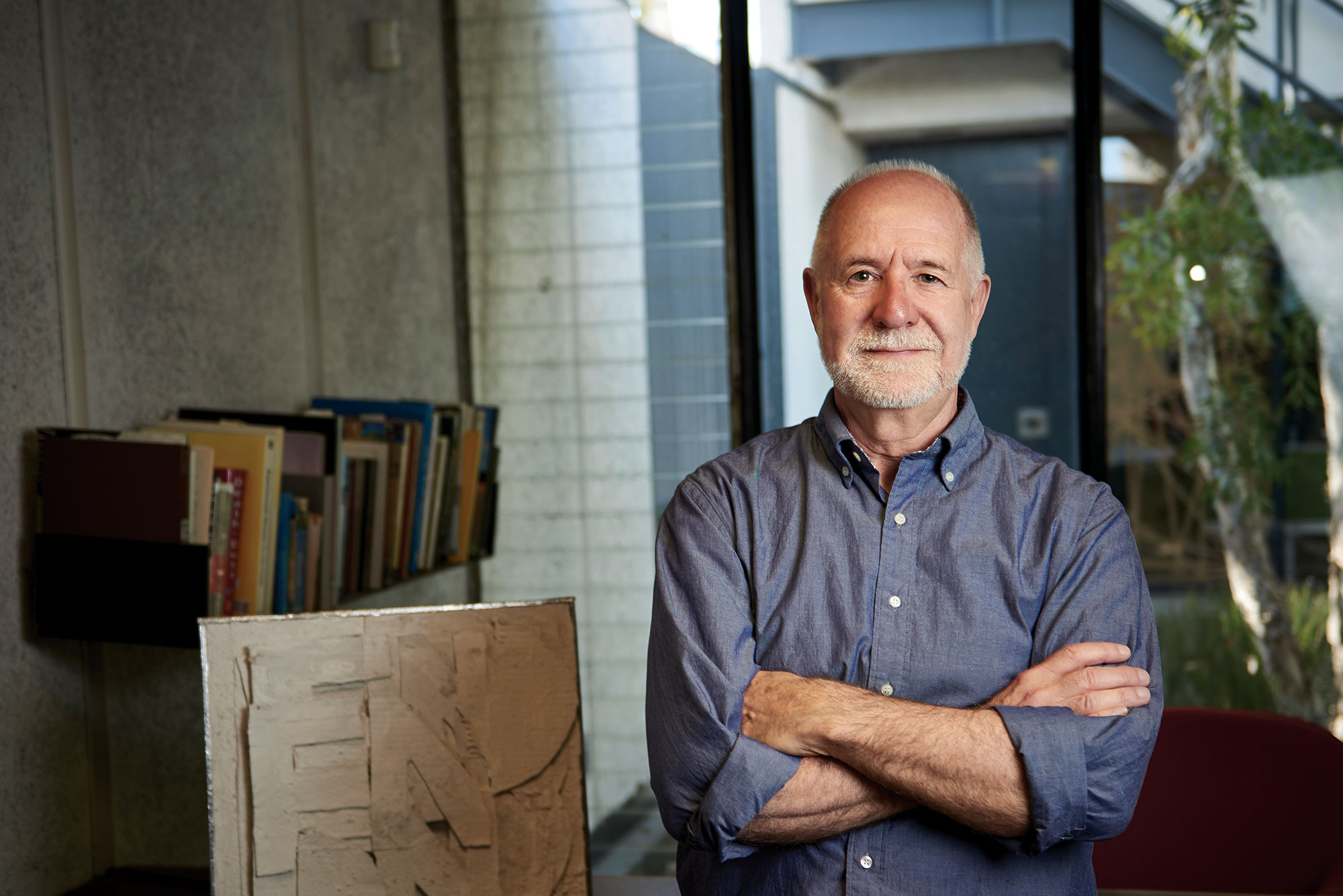
- FF&P’s David Ross. Photos: Takashige Ikawa
- The metal-clad exterior of this Santa Ynez Valley home evokes more functional structures, but for all the slightly primitive references, the light-filled home has a Zen elegance. Photo: Benny Chan
- The footprint is minimal and the walls of glass are an homage to the site on a hillside above the still wild Sonoma coast. Photos: Patrick Fitz
- The Cor-Ten steel envelope of this Santa Ynez Valley home has weathered into a rust-red that contrasts the green landscape. Deliverymen have mistaken the home for a warehouse.
- Nature taps residents on the shoulder as they cross the courtyard to reach other parts of the house. Photos: Jim Bartsch
- At night, even the lap pool takes on an air of mystery.
- The Occidental house is one of David Ross’s favorites. At 500 square feet, it balances light and beauty with life stripped down to the necessities.



No Comments