11 Jan Rendering: Hawkins & Associates, Inc.
When it comes to his approach to architecture, Jack Hawkins has nothing to hide. For instance, he doesn’t believe in hiding the “bones” of a structure unless it’s necessary. “An expression of structure is important to me,” he explains. “A lot of the time you’ll go into a home with an elaborate beam system, but it’s fake, not structural. If I’m going to express the structure, it’s the real deal.” Because of this ideology, many of the custom homes and commercial projects he designs take on an almost sculptural element, with the wood or steel spines exposed in an artistic manner.
And when it comes to materials, you won’t find Hawkins using faux anything. “I would never use a laminate that looked like marble, and I’m not using a tile that looks like steel or wood. It seems really common sense, but my industry is fraught with materials that are a lie; they may look great, but that’s so distant to me.”
With an undeniable contemporary slant, Hawkins’ designs fluctuate from project to project, depending on everything from topography to client desires. But one thing he does bring to each and every project is authenticity.
A Midwesterner by birth, Hawkins was educated at the University of Kansas, worked his first architecture job in Phoenix, Arizona, and then moved to his wife’s homeland of Australia. “I worked for a good firm there that exposed me to a different way of looking at things, from both a design and lifestyle standpoint,” he says. “They work hard, but they play hard too, and I tried to bring that back with me.”
It was the search for that kind of culture and the lure of Reno, Nevada’s contrasting landscapes that eventually led the architect and his family to settle there. He opened Hawkins & Associates, Inc. in 1994 and has since tackled projects ranging from mountain homes to urban redevelopments, each one stylistically different depending on the site. “The site dictates everything: the topography, views, microclimate and, of course, the clients,” he says.
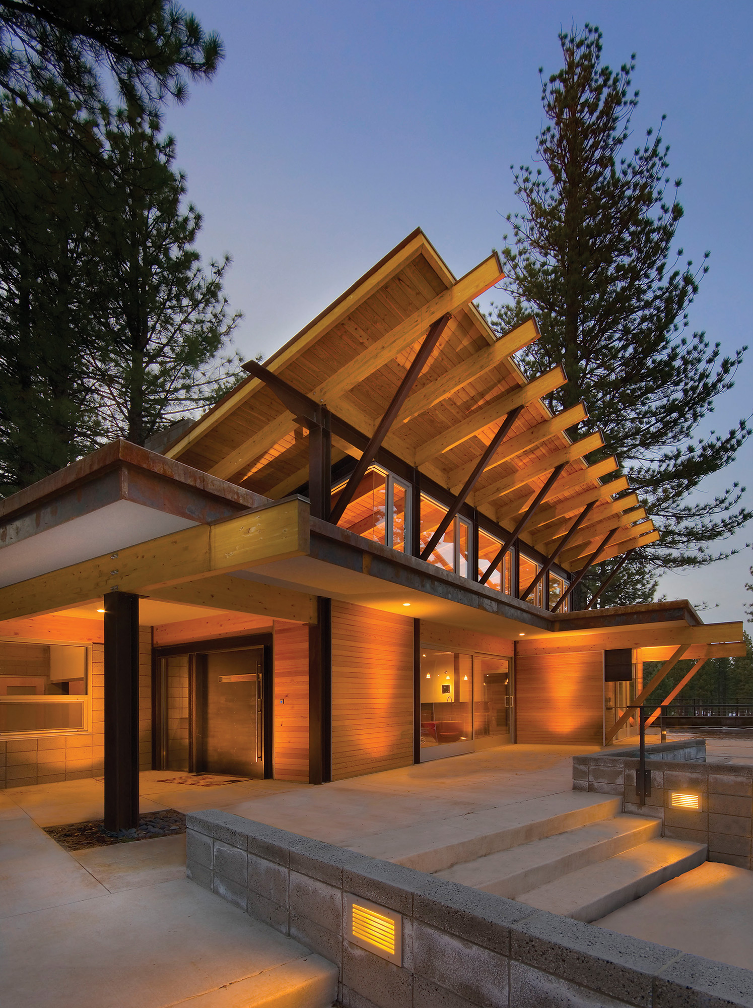
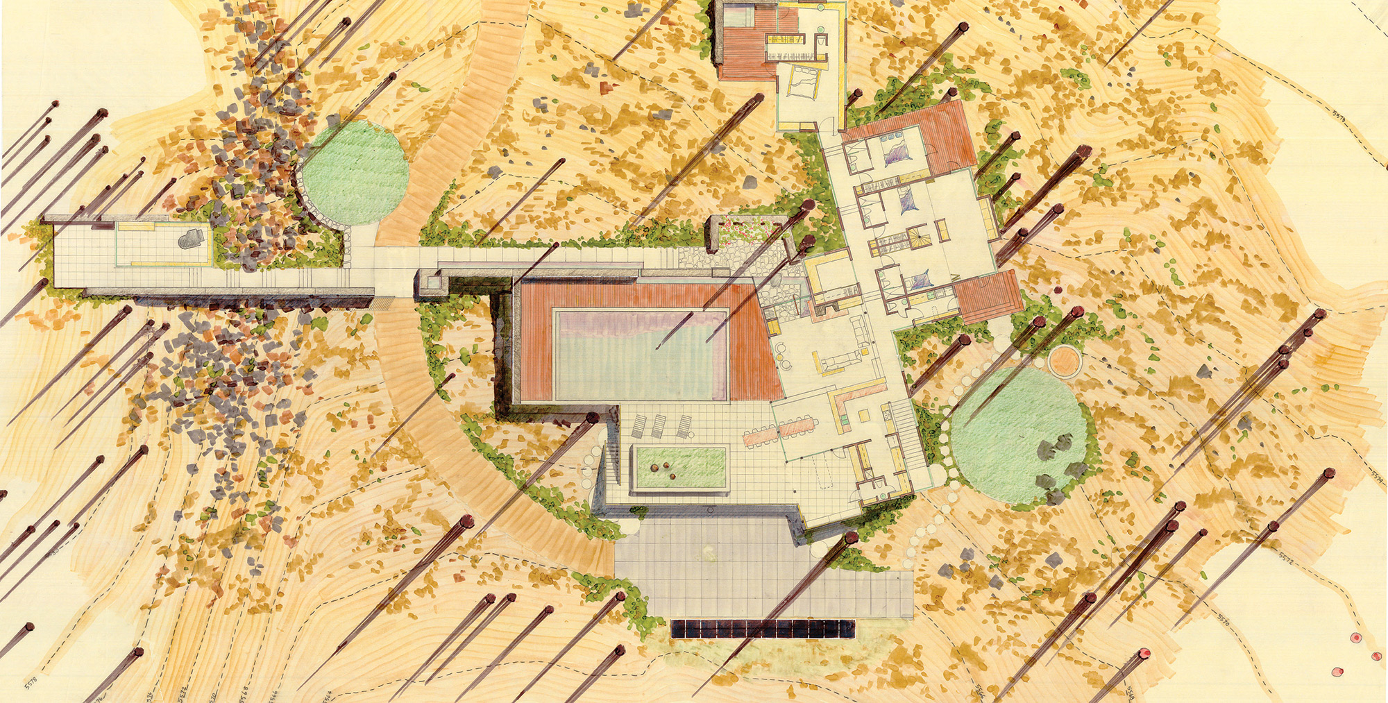
The Hawkins-designed Fyda Residence sits in a forest overlooking the Nevada desert. “We only took down two small trees, and we let the floorplan form around the others,” he says.
Hawkins used materials that fit in with the landscape, even as the home aged. “We wanted to use almost all natural materials and let them weather. We let the steel rust and develop a nice patina so it looks like it’s been there a long time,” he says, adding that they were also able to bury and hide the three-plus car garage with a downhill slope while keeping the home’s configuration visible.
The interiors utilize simple materials, with concrete and wood floors, exposed steel beams and sand-blasted, stack-bond concrete blocks that serve as interior and exterior walls. “We were taking a very utilitarian material and turning it into something beautiful,” Hawkins says. “It also added an indoor-outdoor design aesthetic, so there’s a cohesiveness.”
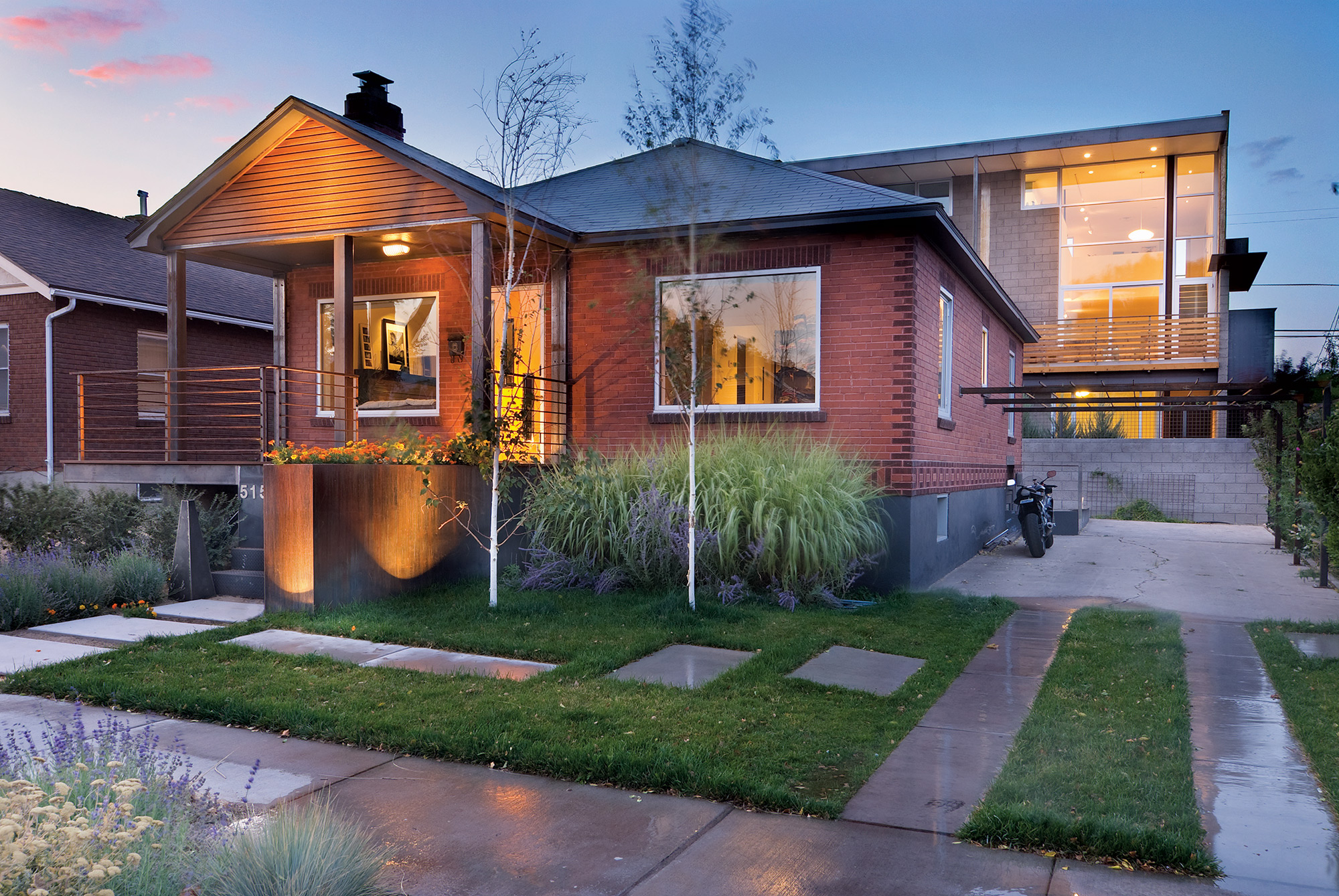
Another site-driven project was an urban infill development on a blighted block in a Reno neighborhood. He and his team remodeled three existing bungalows and added four contemporary, energy-efficient townhomes to the back of the lot; one serves as a 1,000-square-foot primary residence for Hawkins and his wife.
“The properties were all derelict, with no landscaping; the backyards were filled with old tires and trash,” he says. “We thought, ‘How can we redo the bungalow to function in a modern living situation; leave the character of the neighborhood; increase density; and create a nicer environment?’”
The alley-facing townhomes incorporate small, vertical floor plans that offer Sierra Mountain views. In his home, a two-story sliding garage door links the indoors to the outdoors, and the abundant use of south-facing glass is positioned to offer privacy and provide passive solar, with an overhang that protects the residence from the heat in the summer months. The kitchen, which is part of the living space, is small and functional with appliances hidden behind cabinetry, and the couple sleeps on a Murphy bed in the living room. “When you live small you have to have a lot of storage or it becomes cluttered,” Hawkins says.
Looking through his portfolio, each structure the architect has designed looks decidedly different but also decidedly modern. “I would describe his work as doggedly progressive and modern, but almost in a nefarious way,” says Brad Van Woert, principle of the Reno-based Van Woert Bigotti Architects. “He tricks people by following this modern archetype, but then he uses really nice, warm, inviting materials. To me that’s the secret to his success: he humanizes all his spaces.”
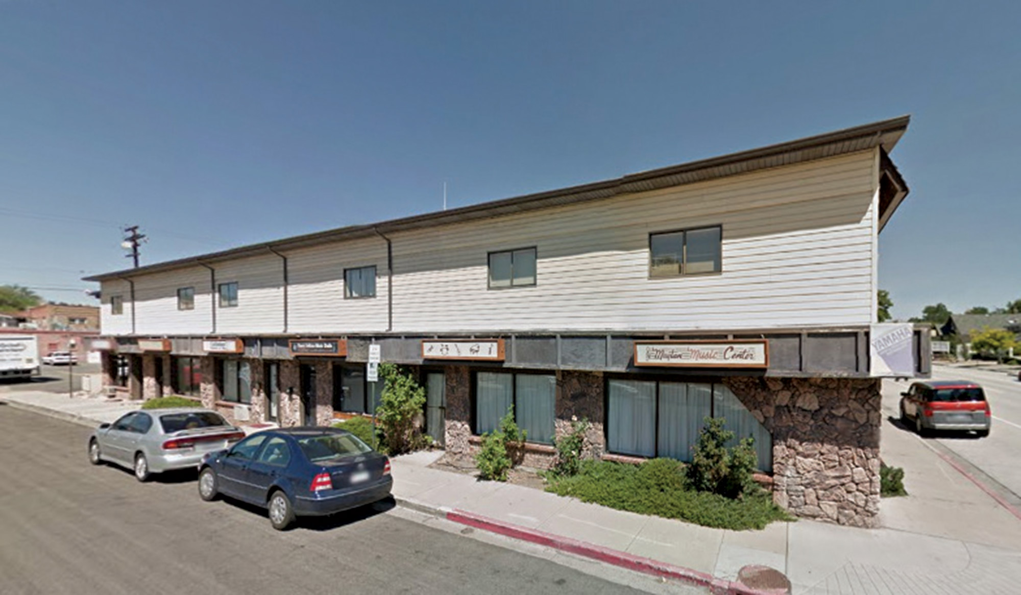
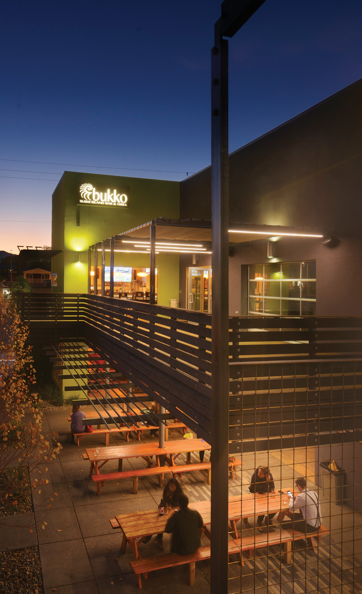
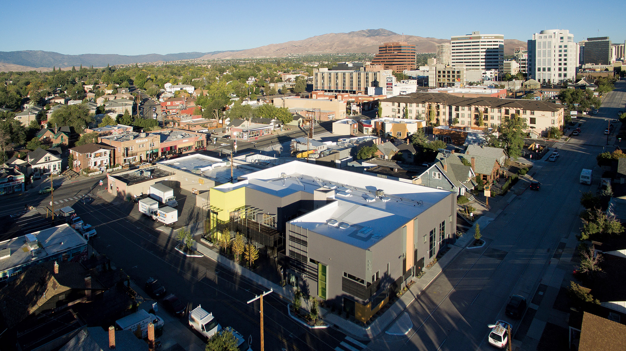
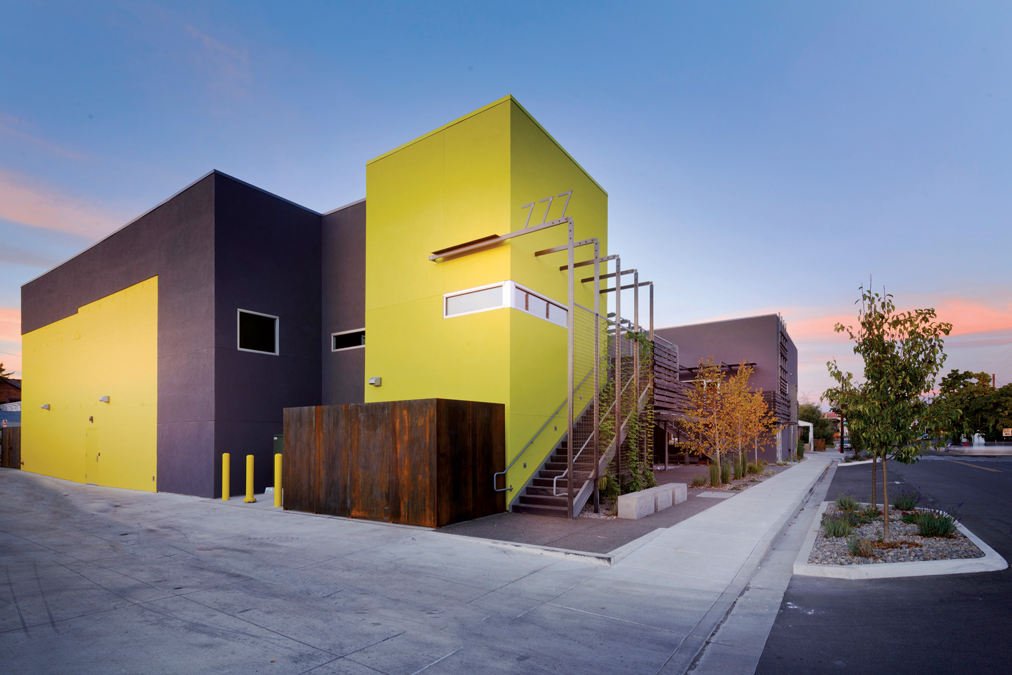
Humanizing a space was the challenge Hawkins faced during a recent commercial redesign in downtown Reno. He was asked to update an outdated building that housed a legendary music store for 60 years, turning it into a welcoming mixed-use commercial space to include restaurants and boutiques. Hawkins went with the simplicity of stucco siding to unify the overall project, and then he used color to break it up. He also had to convince the owner to take away square footage in order to add a landscaped courtyard. “It seems counterintuitive, taking square footage away, but the urban courtyard with green space created more light and a more leasable project.”
From forest to urban, residential to commercial, Hawkins brings an authentic touch to his projects that are at once a reflection of the landscape and also of an honesty in the home’s material palette.
- The home incorporates a mixed material palette and details of exposed hardware. Photos: Greg Anderson Photography
- A conceptual drawing of the Fyda Residence shows how the unique shape of the home was designed to fit into the forest.
- Architect Jack Hawkins.
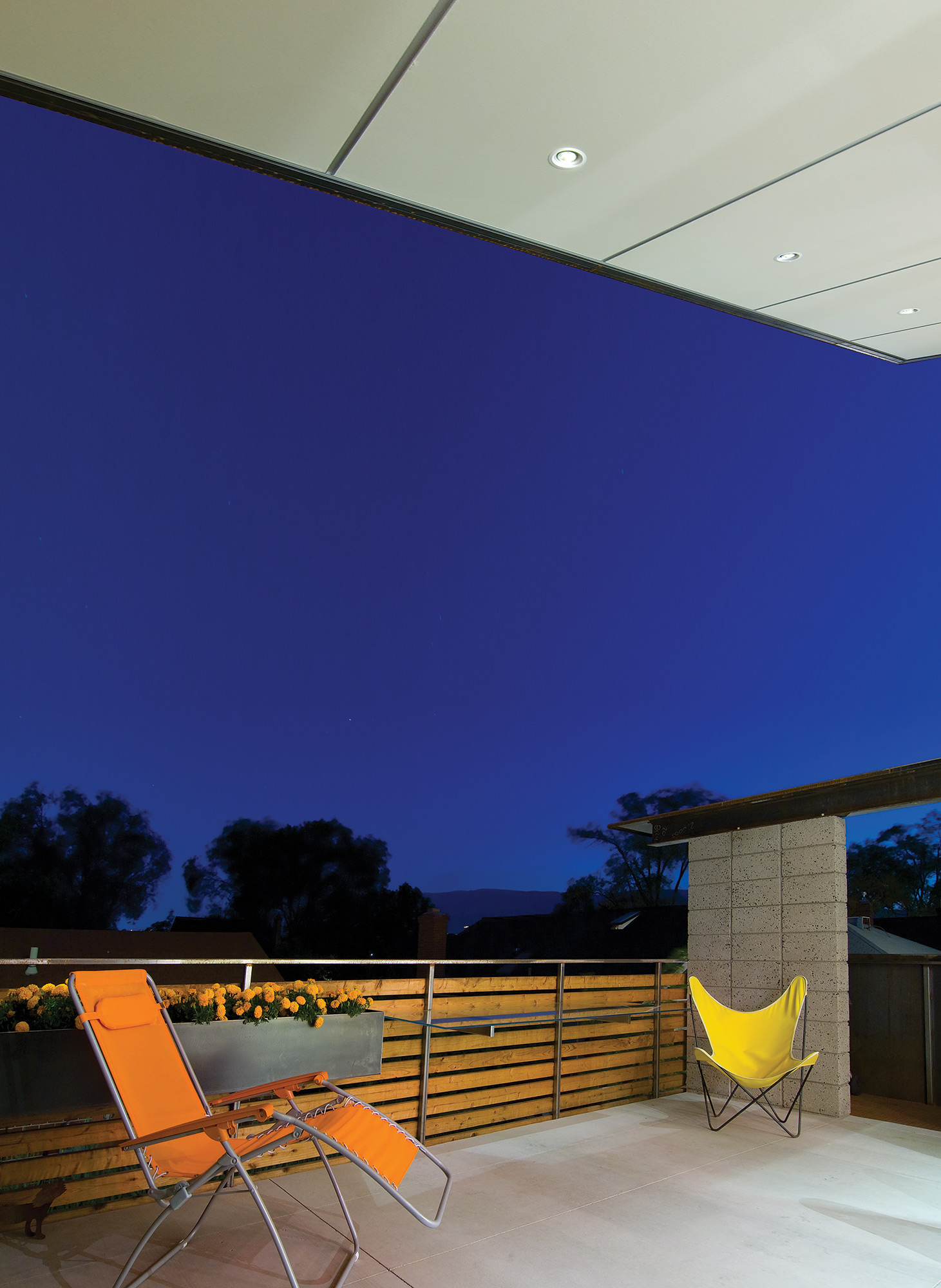
- Large patios were added on the townhouses to create outdoor living spaces fit for the climate in Reno, Nevada.
- The 777 building before it was revitalized. Photos: Asa Gilmore
- Hawkins minimized the structure’s square footage to add an urban courtyard, which enhanced the overall setting.
- The townhouses feature an open floorplan that extends to the outdoors.
- The mixed-use development project is located in the midtown area of Reno.
- An updated 1930’s bungalow sits in front of a modern townhouse in a Hawkins & Associates’ urban renewal project.
- Architect Jack Hawkins revitalized 777, an outdated commercial space that now houses retail stores and restaurants.





No Comments