01 Feb Rendering: Quality of Experience
Mike Mora and Joe Herrin, the creative suns of Seattle’s Heliotrope Architects, like to talk about “quality of experience” in architecture. Herrin tries to explain. “It’s more than a series of rooms that satisfy the programmatic requirements … ”
But he’s already drifting towards archi-jargon, and anyway, words hardly do the work justice. It’s when you visit a new house or renovation Mora and Herrin have designed that you understand, perfectly, “quality of experience.” They’ve just completed a $600,000 makeover of a 1957 mid-century Modern in the suburban woods east of Seattle. Flanking the entryway is a cedar-screened courtyard. Its gate appears to be a near-seamless part of the screen itself, only there’s a mysterious pencil-size steel rod peeking between slats. Slide it, the gate smoothly swivels open and the rod reveals itself as a piece of a steel frame bracing the gate. And you experience a frisson of delight in the whole system’s integral logic. Mora and Herrin designed it themselves. A $3.99 Home Depot latch would have done the job, but minus the delight.
“We rarely get the kind of commissions where you can custom-design everything,” Mora says. “But I think these details count, if they work and last; and if there’s a surprise factor — you don’t see it till you’re there.”
“It forms part of your first impression as you begin to experience the house,” Herrin adds.
“They really think about these things,” says Rysia Suchecka, an interior designer who hired Heliotrope to create her own island residence north of Seattle. “They design houses so that as you move from one room to another, there’s always an experience in how the spaces open and terminate. It’s not just a series of mole corridors and doors.”
Mora and Herrin are both in their mid-40s, and both alumni of NBBJ, a Seattle-based design colossus with a global reach. When Mora departed to establish his own firm in 2000, Herrin rented a desk to work independently in his office. “Sort of like dating,” Herrin jokes. “We saw we had shared goals, and we could work together.”
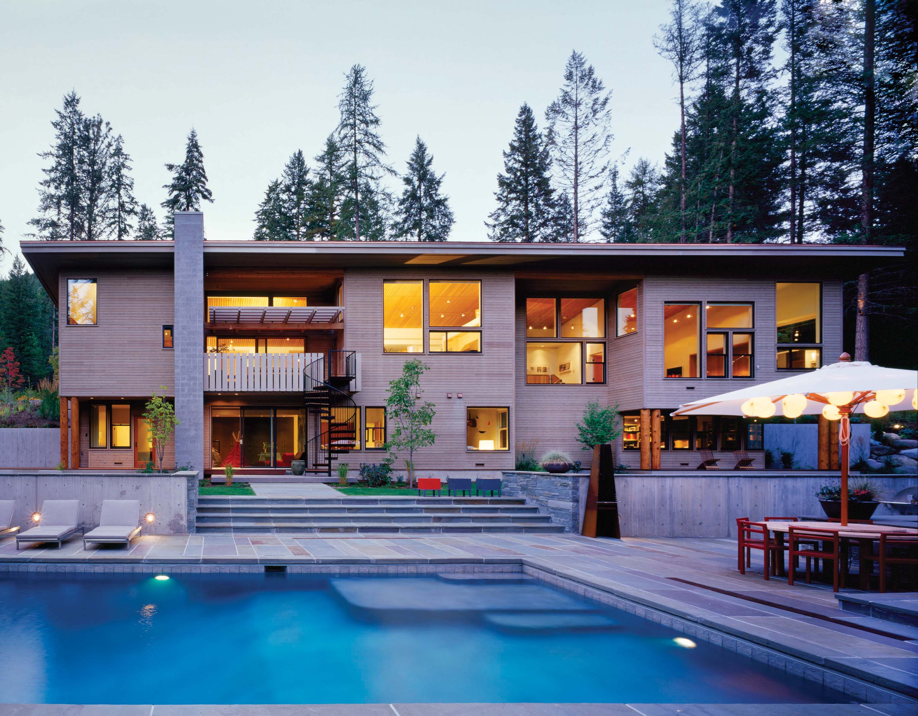
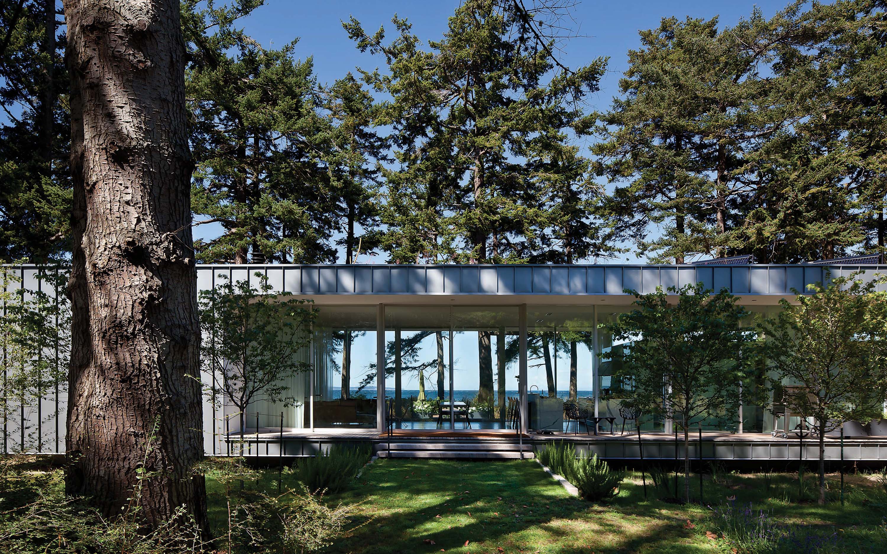
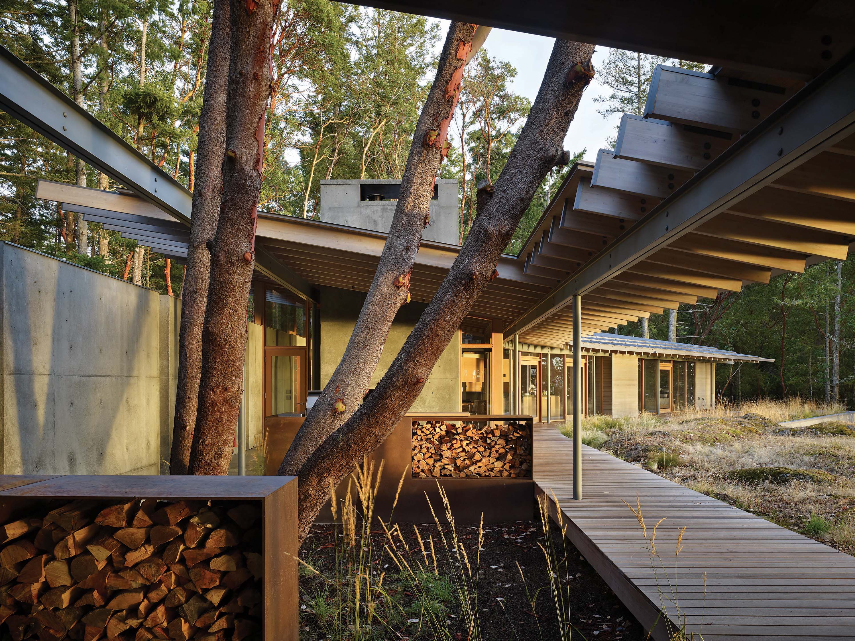
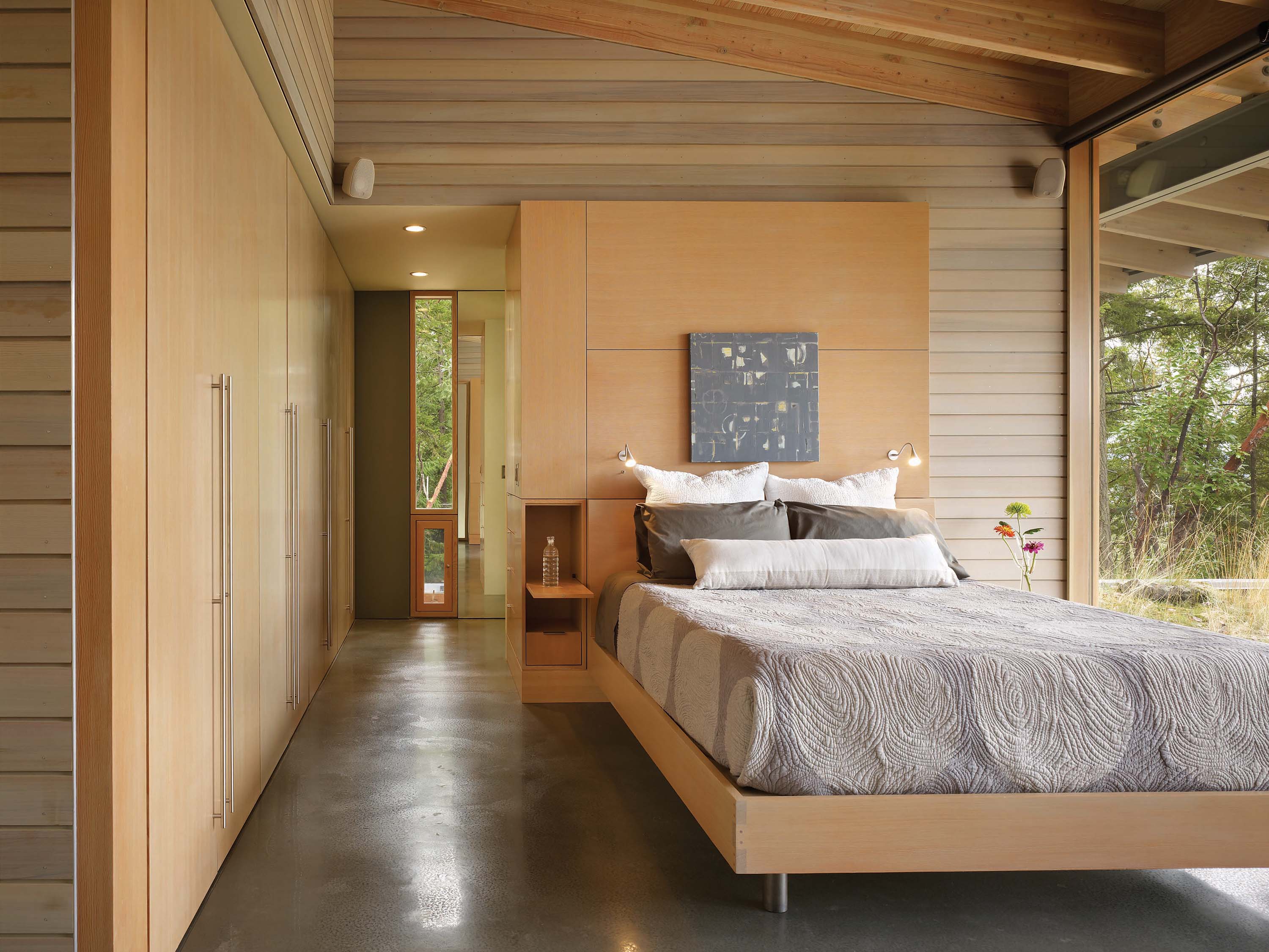
For a small partnership — five people work in an office above one of Seattle’s oldest pubs in the Ballard neighborhood — Heliotrope has gathered a considerable galaxy of recognition. The minimalist North Beach House they designed for Suchecka and her husband won a 2011 National AIA Housing Award. The Suncrest House on the same island won a Washington AIA Merit Award a year earlier. Interestingly, the two houses don’t even look like third cousins. North Beach comprises the least architecture possible, a transparent boxcar magically levitating a few inches above its beachfront site. Suncrest wraps itself into its site, as solid and eternally anchored as an erratic hammered in by the last retreating glacier.
Look at their projects, one after the other, and it’s almost impossible to find stylistic fingerprints. Each design is driven as purely as possible by its site and the client’s quest for a particular quality of experience. Suchecka essentially wanted a pavilion open to the forest and sea instead of an enclosed house; only the threat of rotten weather convinced her to grudgingly accept walls. Still, the house feels miraculously open. When her grandchildren visited, they said they felt like “free birds” fluttering through the glass-walled living room. A Montana client had a need for a vast music studio as part of his residence. Mora learned he’d grown up on a farm, so the house assumed the form of a smart, crisply articulated barn, with an inkling of nostalgia in the textures of its reclaimed timber frame and cross-braced cedar cladding.
Sometimes, Mora says, a client will come to them saying something like, “I want a Northwest Cape Cod.” Mora and Herrin will then go to work probing the client’s personal history and psyche, trying to learn just what it is about the style that triggers an emotional response. Mora explains it as creating an environment that “frames someone’s life, but doesn’t overpower it.” And at the same time, fashioning an expression “that looks at home in the 21st century.”
“From a marketing standpoint,” Herrin says with a trace of a sigh, “it would be easier if we had a consistent ‘look’.”
The consistency appears in the well-tailored details, the little things that quietly provide pleasure across years of use, maybe even things that give insight into the nature of space or environment without conscious thought.
That suburban house they just finished includes a bedroom for the family’s four-year-old. The walls are pink, the tiny client’s own choice. But there’s also a window that stretches all the way to the floor, something a child wouldn’t think to ask for, offering a kid’s-eye view of the forest and the dramatic ravine outside. “Most of our work seeks to establish a strong connection with the site, with nature,” Herrin says. “We believe that can make a difference.”
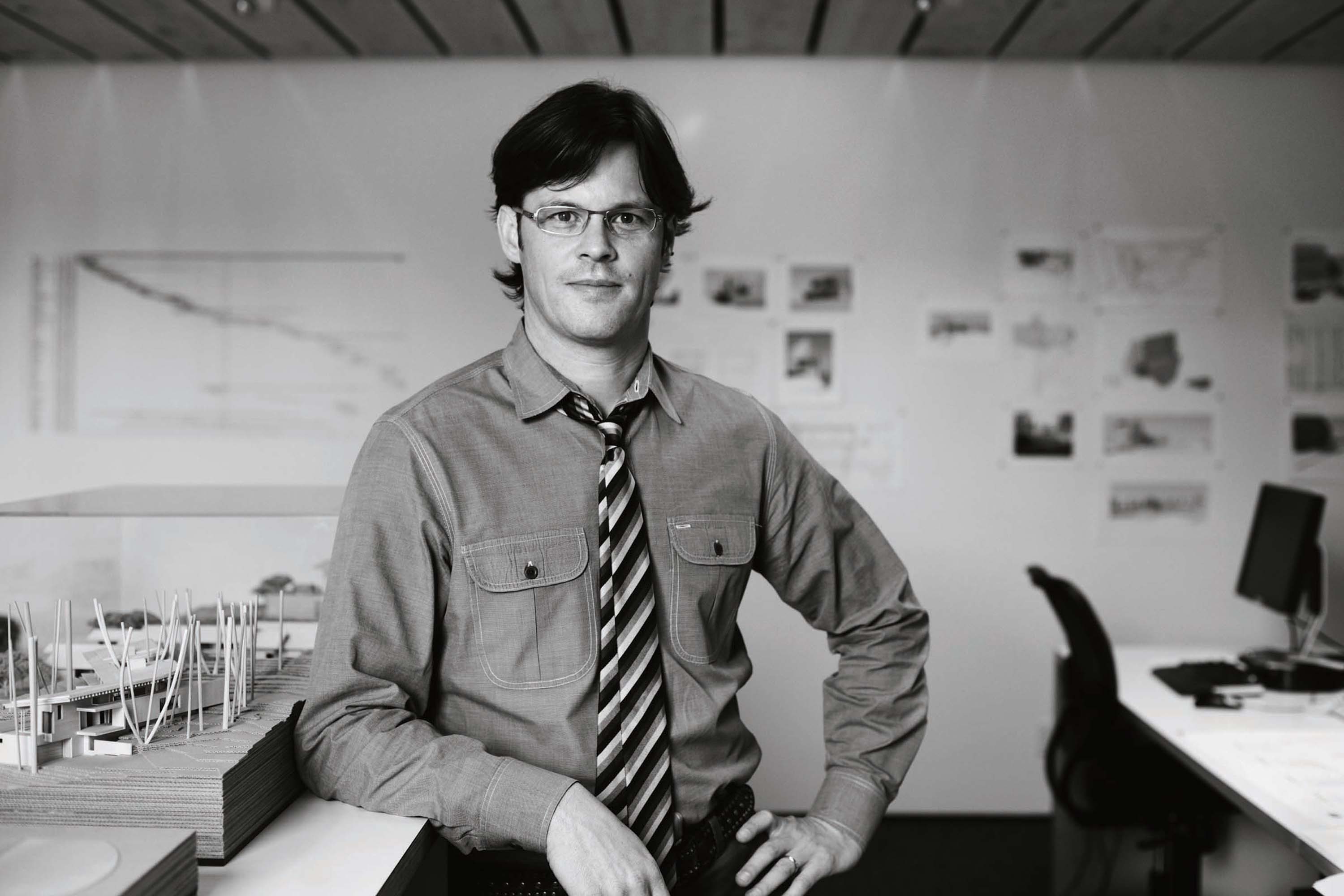
- Joe Herrin
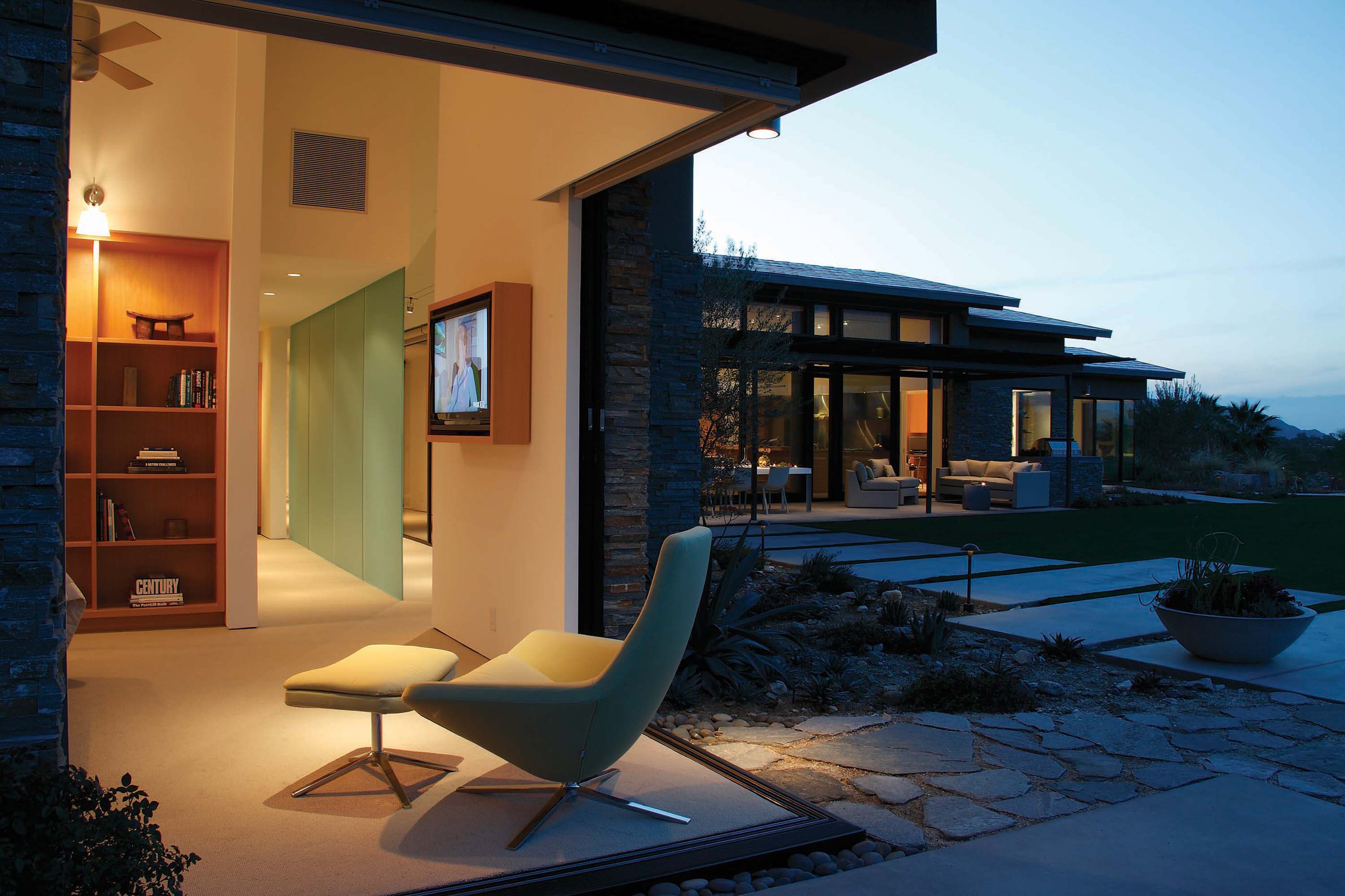
- A house in Palm Desert, California, adroitly blends sophisticated mid-century Modern with inspiration from the classic West Coast ranch style.
- Mike Mora
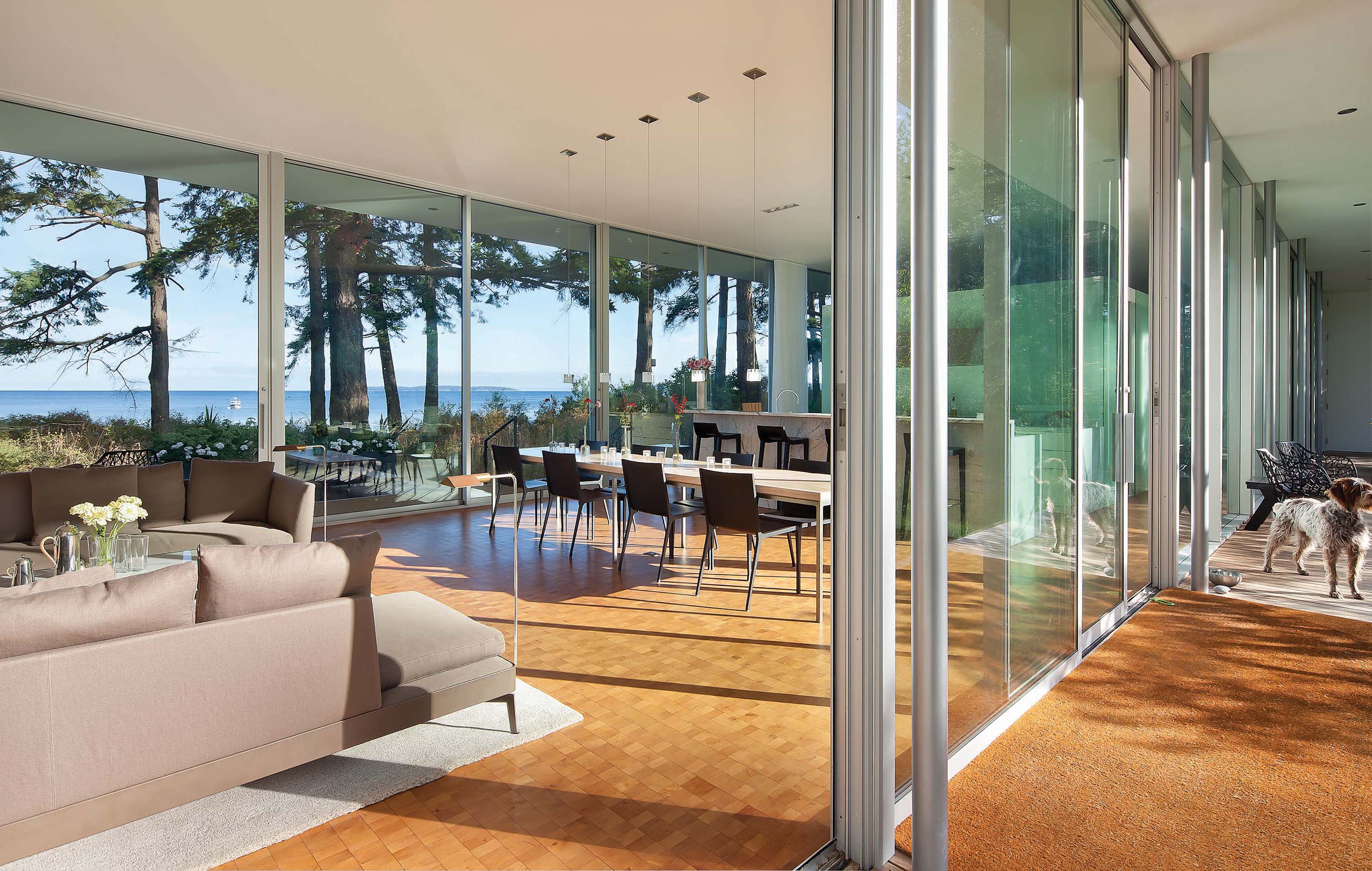
- The North Beach house in Washington’s San Juan Islands was intended as a minimally invasive presence in the landscape.
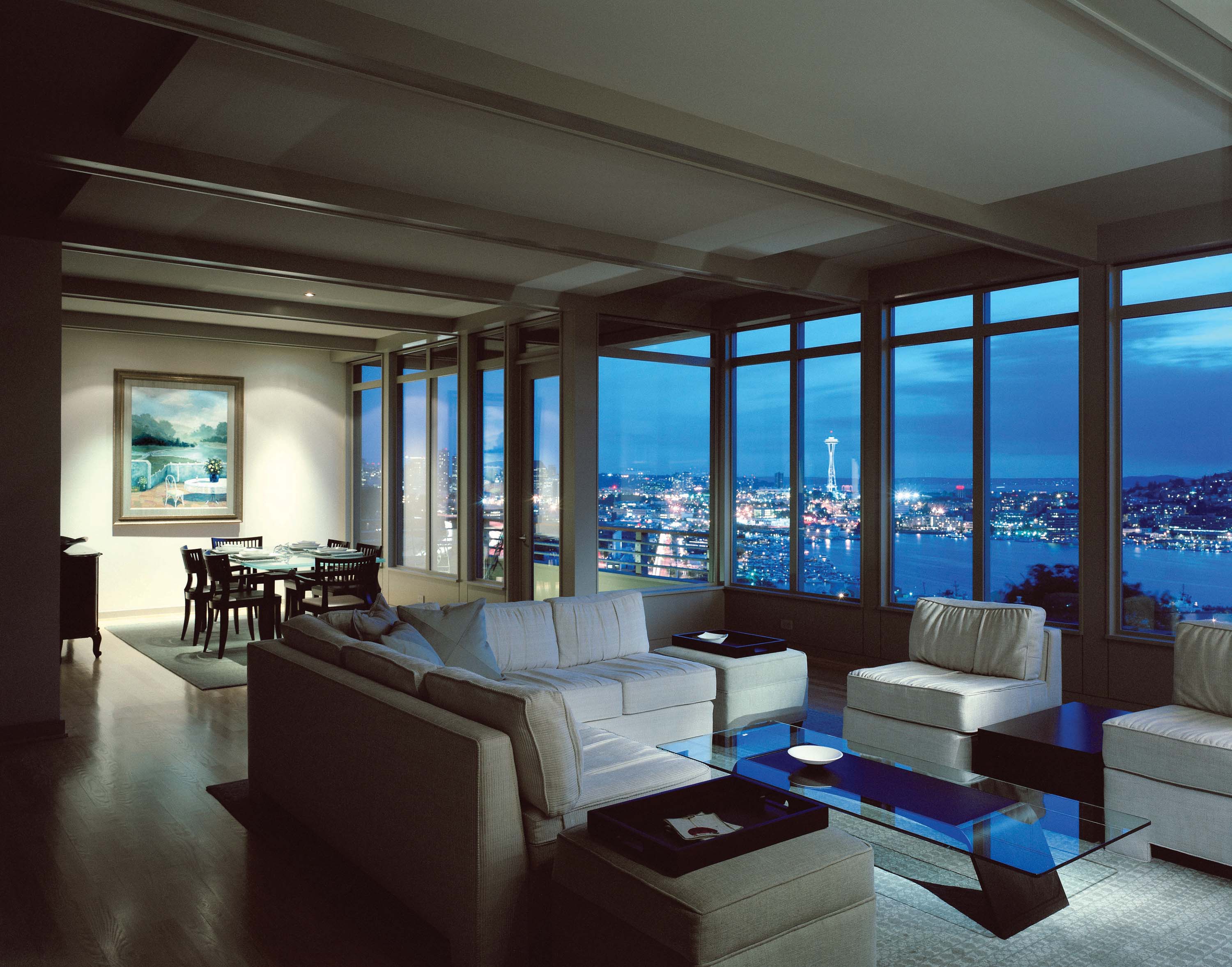
- A thorough “gut-nenovation” of a 3,000-square-foot condo overlooking seattle’s Lake Union retains its distinct mid-century Modern character.
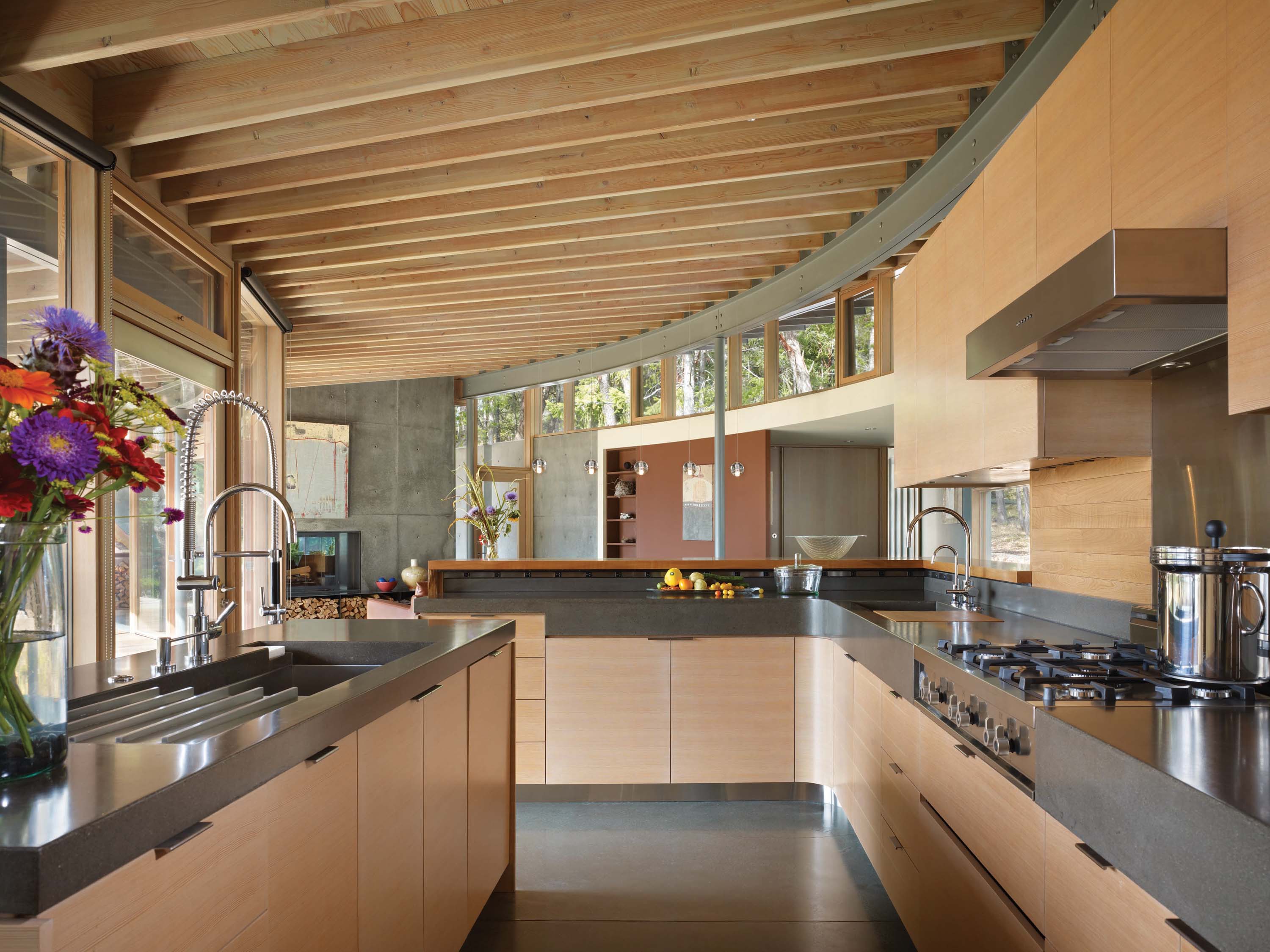
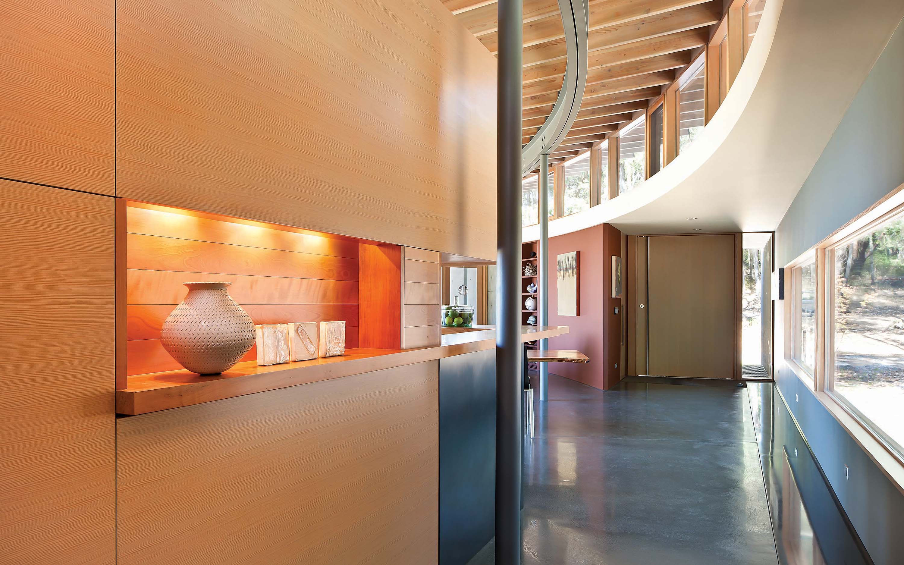
- Suncrest’s vivid contrast of wood and concrete slab walls creates textural interest at every turn.
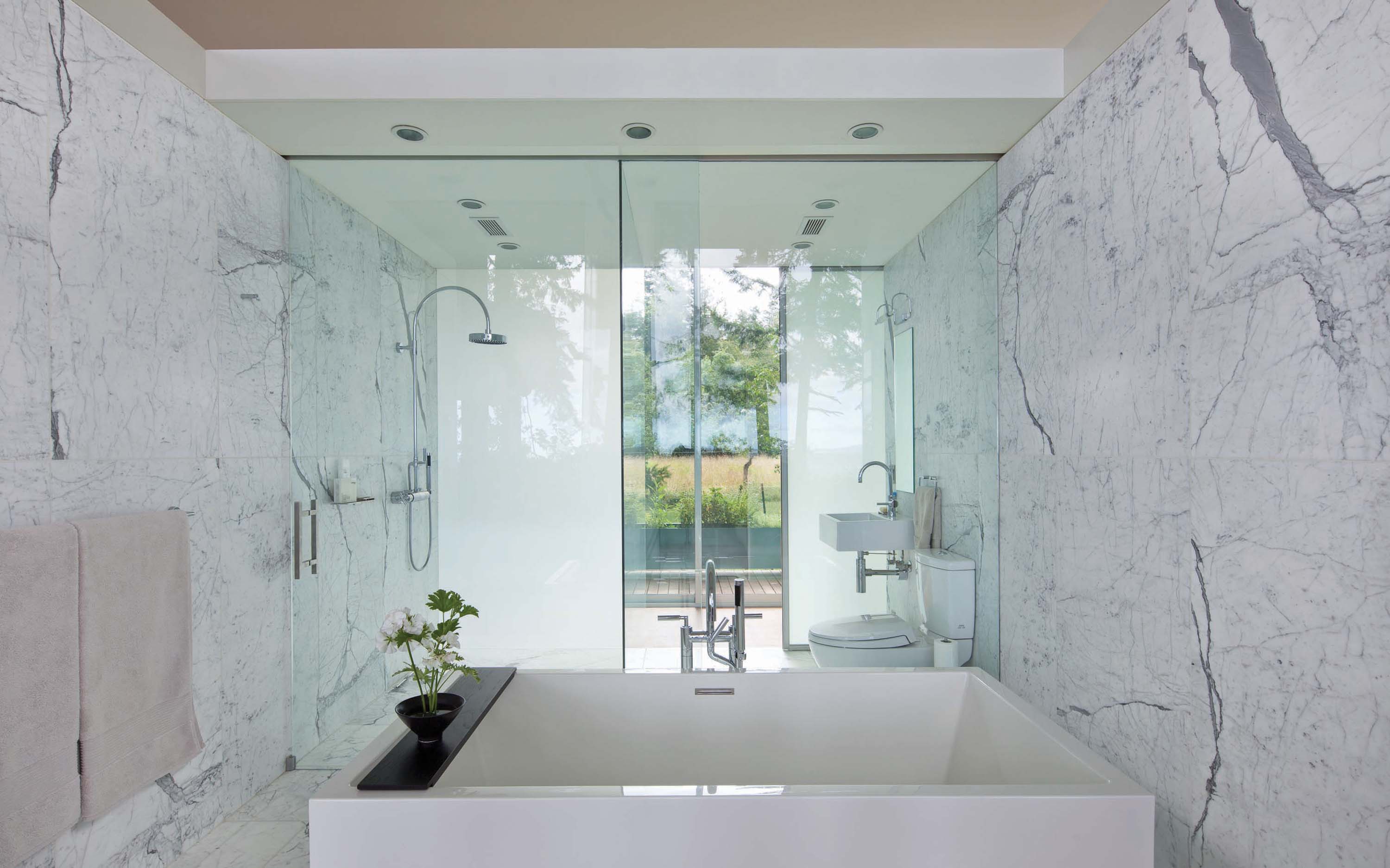
- The master bath features glass walls onto the hallways, but the European-born owners say they are not hung up on American concepts of privacy.
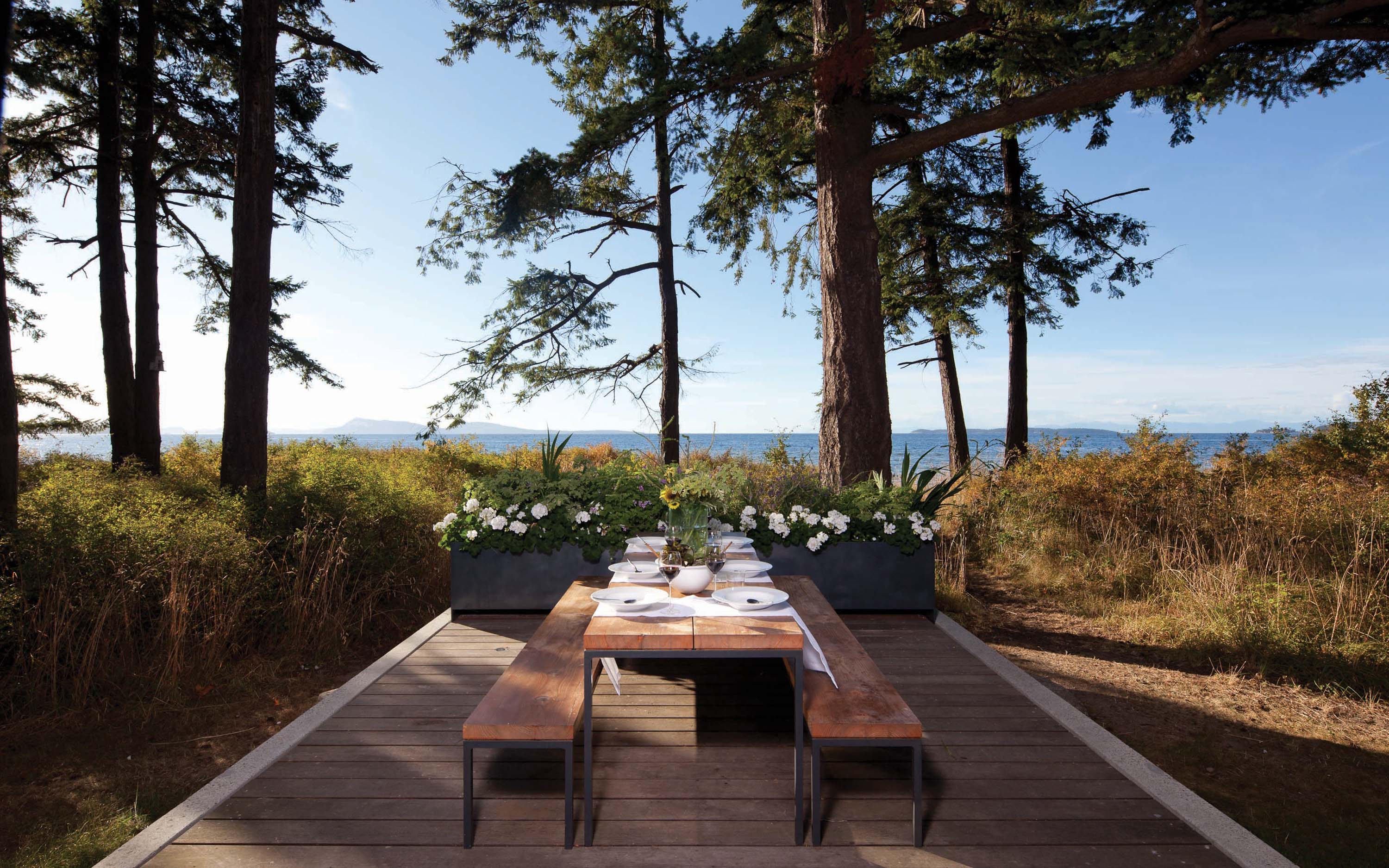
- The summer dining room occupies a finger-like terrace pointing out at the strait of Juan de Fuca.
- The North Beach house is pavilion-like in its transparency and simplicity
- “Suncrest,” a 3,000-square-foot residence on Orcas Island, Washington, curls around a rock and assumes a shape that maximizes views while it minimized tree removal. the long, boomerang-like plan assures that every room enjoys an ocean view.





No Comments