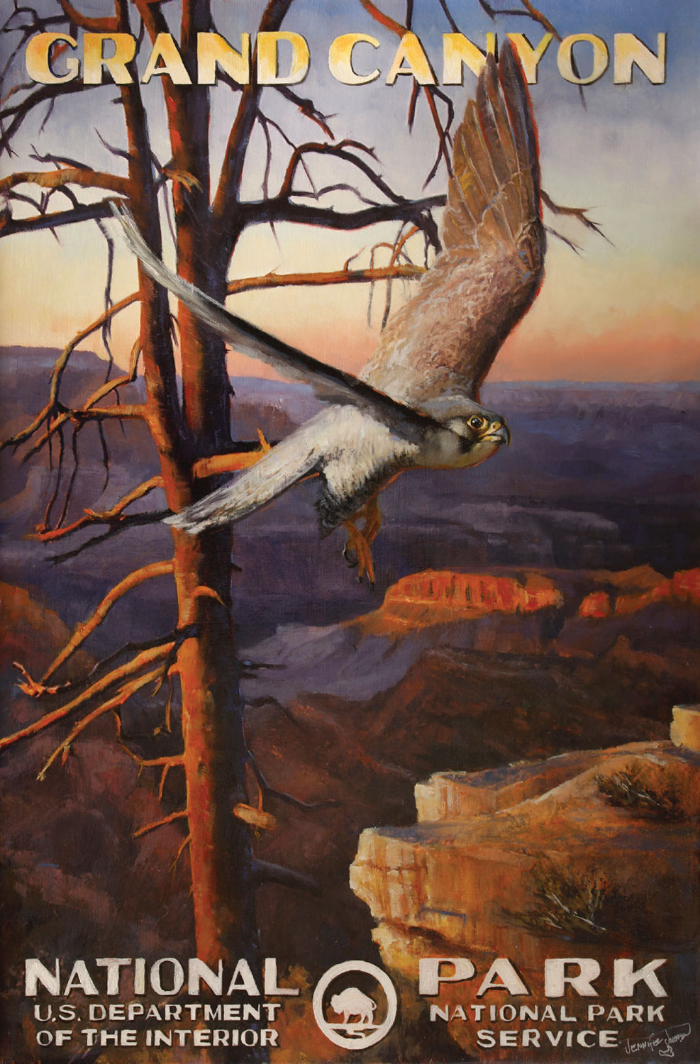
11 Jul Artists Spotlight: Jennifer Johnson
Jennifer Johnson’s vintage poster paintings embody the deep-seated relationship Americans have with their national parks. As a child, Johnson grew up visiting, exploring, and camping in all of the national parks with her father, a plant pathologist for the National Forest Service. Her attachment to the parks became an integral part of her artistic process, culminating in her recent body of work.
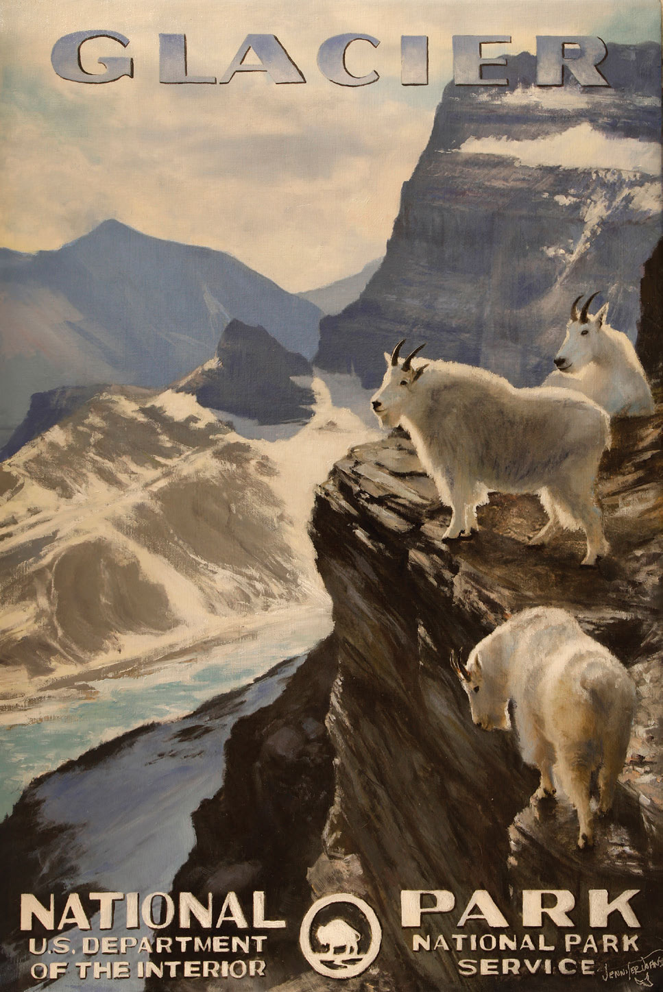
Glacier Billies | Oil on Canvas | 36 x 24 inches
“This was a two-year process for me to see how the market would accept these paintings,” she says. “I brought one piece to the C.M. Russell show in March, and I could’ve sold it 20 times. That’s when I realized this was going to work.”
As a plein air artist, she always tried to incorporate wildlife into her work, and as a graphic artist, she became fascinated with typefaces. “I wanted to bring back that nostalgia of the national park posters,” Johnson says.
During the Great Depression, as part of the New Deal, the Works Progress Administration hired unemployed artists, musicians, actors, photographers, and directors for large-scale public works projects. Part of that included commissioning 14 posters that celebrated the national parks, including Glacier, Yosemite, Mount Rainier, Grand Teton, and Yellowstone. From 1935 to 1943, about 1,400 posters went into circulation. Few of those still exist, as many of them became drawer liners or found other uses during hard times.
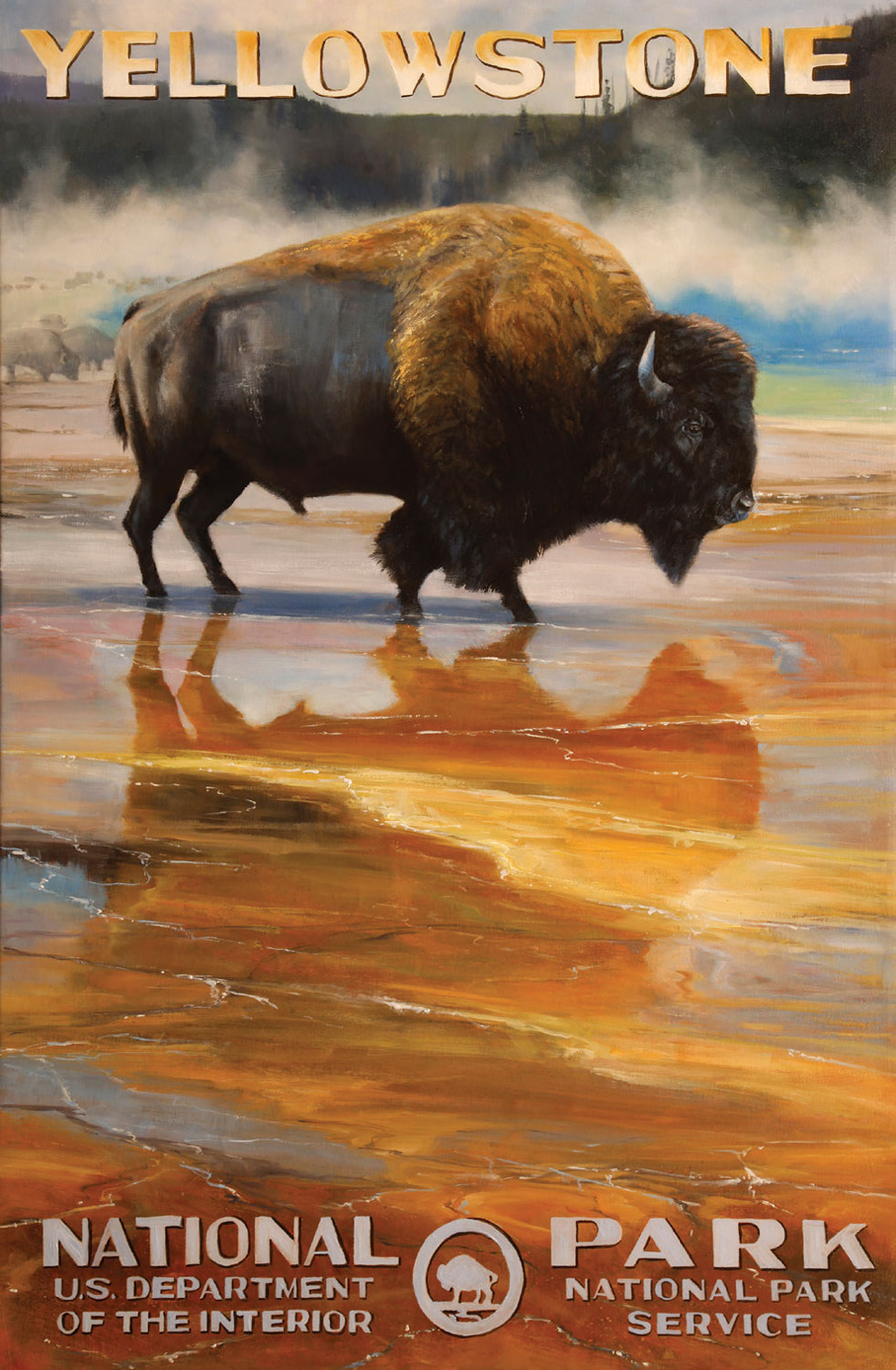
Grand Prismatic Bison | Oil on Canvas | 36 x 24 inches
“I collected postcards with images of the original posters, and when I was trying to come up with a new body of work, I found myself going back to those posters — the typography intrigued me,” Johnson says. “I’m copying that style to bring back the iconic national park look. The typeface was obviously hand-drawn, as clean as they could be, but the focus was on the image.”
Johnson uses a combination of her memories and her father’s old slides to create the landscapes for her paintings. She’s careful to incorporate appropriate wildlife into them as well. She’ll come up with a sketch and then work the composition around, using typography that’s indicative of the era.
“Sometimes, I can push the limits on composition because the type will carry the piece,” she says. “For instance, I have a Glacier piece that wouldn’t have worked; it wouldn’t have been a balanced composition without the type. I try to keep the typography secondary, but it usually mimics the color theory of the piece. I want the viewer to know the piece is from Glacier with its iconic wildlife, so it’s really a challenge — getting it all working together as one.”
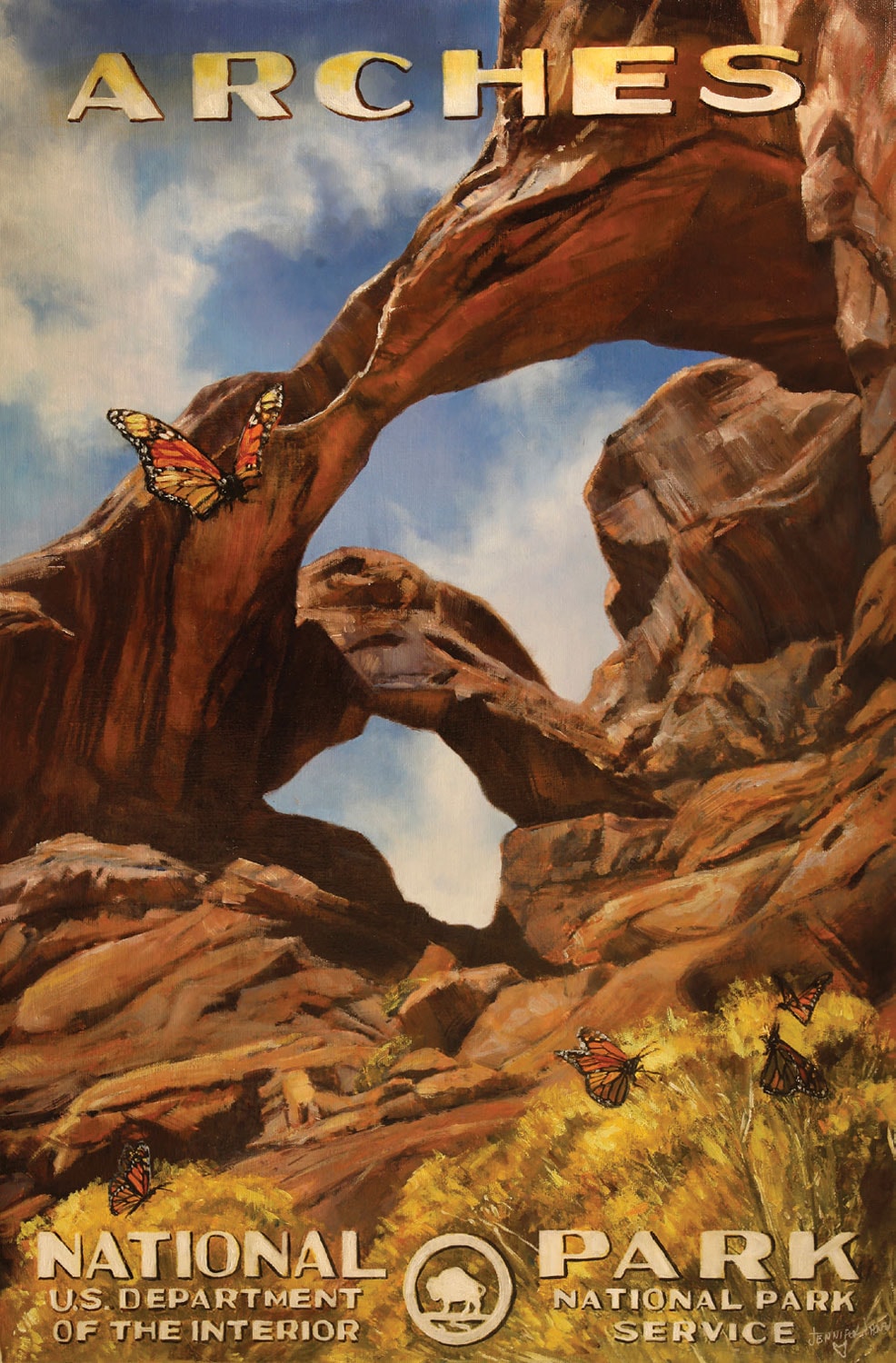
Arches and Wings | Oil on Canvas | 24 x 16 inches
 The original posters, silkscreens using a four-color process, may have been the inspiration, but Johnson takes them further with oil paint. Each painting is individual and unique. “I’m taking a twist on the printed posters,” she says. “I’m creating a beautiful landscape with a grizzly or moose, instilling the viewer with a nostalgic feeling, but it’s still an oil painting, and I can express myself as an artist.”
Johnson will be the featured artist at Beartooth Gallery Fine Art in Red Lodge, Montana, during the Wine and Dine Event, August 23 and 24, and Gallery Wild in Jackson Hole, Wyoming, will show her work September 13 and 14. Both galleries represent her work.


No Comments