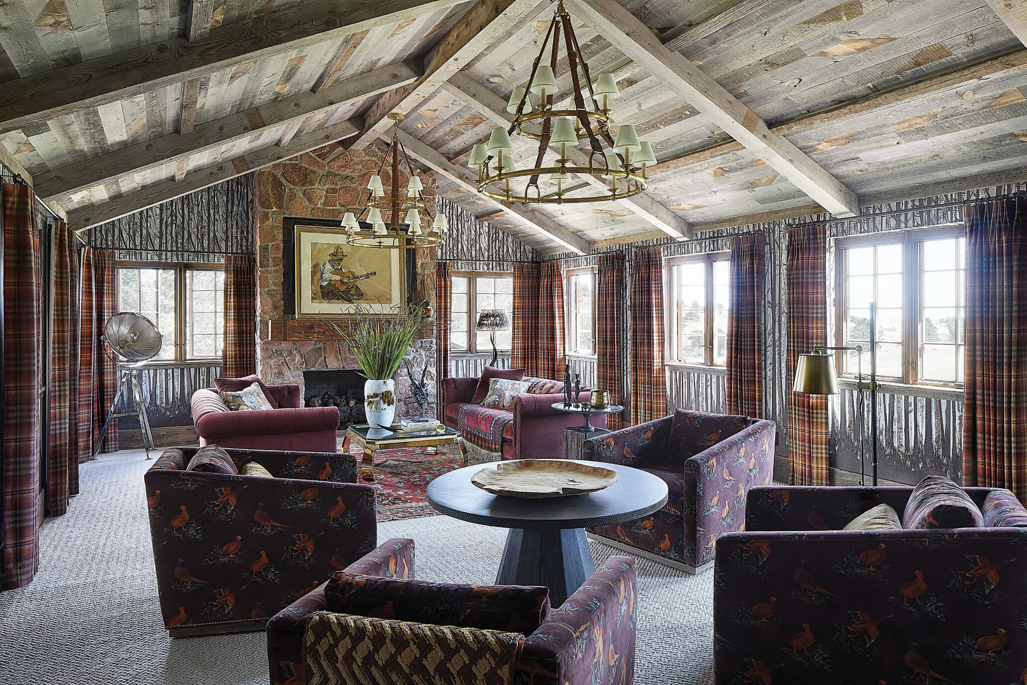
07 Nov Designing the West: Classic with a modern twist
According to Andrea Schumacher and her interior design team, designing a home is like curating an art collection. Schumacher selects each furnishing and decorative element for its outstanding nature and contribution to the collected space. Many items are custom designed to achieve the exact look and required scale. “It might be an antique piece that I retrofit with textiles, hardware, or perhaps, a Caesarstone top added to a console; it depends on the piece,” Schumacher says. “Sometimes the room needs a showstopper that absolutely makes all the other elements come together.”

In the cherished dining room of an 1886 homestead, the client’s burl-leg table and hickory chairs complement a late 19th-century Chinese buffet and a Yoruba beaded headdress from Nigeria above the fireplace mantel. The library chairs were reupholstered in a delicate chinoiserie toile on glazed linen fabric. Photo: William Abranowicz
Schumacher maintains offices in Denver, Colorado, and Santa Barbara, California, and she describes her design approach as client-centric. “Generally, we gravitate toward modern mixed with classical. We love clean-lined upholstered goods mixed with found objects or antiques to create an interesting and collected look, but we are careful not to impose our own ideas. We are interested in extracting the clients’ thoughts about how the spaces should look and feel; then we take inventory of the things in their home that can be incorporated into the design to tell their story.” These items often come from their travels or beloved art pieces they’ve acquired. In this way, Schumacher creates “sumptuous and imaginative interiors that are a true reflection of our clients’ aspirations, lifestyles, and personalities.”
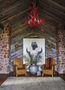
At the entrance of the Wyoming ranch, a shed-antler chandelier becomes the focal point with its eye-catching, fire-engine red lacquer finish. A pair of antique ram’s head sconces add a vintage touch. Photo: William Abranowicz
By thoughtfully combining classical and modern elements, she achieves a look that avoids being trendy. “Our signature style revolves around creating bold concepts infused with both glamor and warmth, seamlessly blending the charm of the past with a passion for contemporary design,” Schumacher says. A look she loves to use is a modern sofa with an antique coffee table, perhaps adding a new top so that it relates to the sofa.
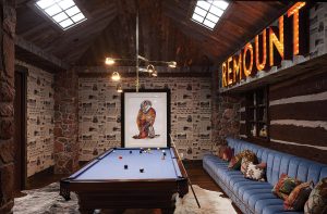
This original cabin’s walls were covered with a custom wallpaper printed from a 1960s Laramie Boomerang newspaper article about the ranch. The custom blue banquette with nailhead trim ties in with the pool table. Photo: William Abranowicz
“I am not one who goes to a showroom and chooses case goods that are all the same color. Why would one hire a designer if that’s what they wanted?” she asks. Instead, she might have an antique sofa covered in one fabric, accented by a contrasting welt. Then, she’ll add pillows with complementary patterns on each side, such as a floral on the front and a stripe on the back. The multiple fabrics work together to create a look that is entirely custom and adds something special to the room.
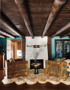
A sheepskin rug adds coziness to an intimate seating area near the wine cellar. Photo: William Abranowicz
Schumacher splits time between her homes in Denver and Santa Barbara, though she spends most of her time in Colorado when her sons are in school. Then, she is just a short plane ride away for her clients in California.
Acknowledging that geographic locales dictate design, she speaks of the differences when creating an oceanside versus a mountain home. “While the investigative process is the same, the materials we select are different. You want a home by the ocean to be light and breezy; heavy wool drapery would not work. Materials are lighter and brighter. For instance, I would never select mohair for a sofa at the beach; it’s much too hot.”

Andrea Schumacher Interiors integrated the kitchen and living room in the remodel. Every inch of the main living area received lavish treatments, including the ceilings clad in Phillip Jeffries grasscloth wallpaper and draperies edged in faux snakeskin. The kitchen’s custom range hood is brushed stainless steel.
Climate dictates the design as well. “Obviously, living spaces are year-round in Santa Barbara, so you can create more indoor-outdoor spaces since you don’t have to bring outdoor furniture inside for the winter,” she says.
Whether indoors or outdoors, Schumacher often uses Sunbrella fabrics, which were developed to withstand the sun and other harsh elements. “I use Sunbrella fabrics indoors and outdoors all the time because of how hearty they are with pets and kids,” she says. “They even have a velvet fabric now that can be used inside or out. It stands up well for everyday family living.”
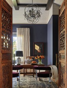
A pair of 1970s Milo Baughman crushed velvet chairs infuse an office with timeless style. Antique Chinese doors lined with glass give the space privacy while offering a harmonious balance of light.
She also loves pulling a material found on a home’s exterior and repeating it inside. “It’s like an embrace,” she says. “We did a ranch home where we took some of the exterior flooring and had it continue into the entryway of the interior, making the two spaces come together. We’ve also used rock from the exterior of the home and brought it inside as the fireplace stone. I feel it is important for the exterior and interior spaces to relate in some way.”
Schumacher developed a wallpaper line, Liesl, which is featured in several designer showcase homes in Palm Beach, Florida; Dallas, Texas; and Denver. Liesl, her grandmother’s nickname, was born in Vienna and studied art with Fernand Léger in Paris and Moses Soyer in New York. She was known for her intaglio printmaking and her paintings of landscapes and animals. She also wrote and illustrated children’s books.
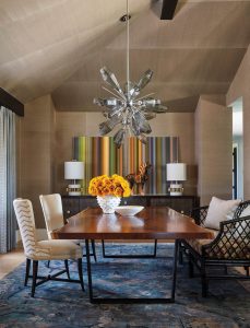
Two handblown chandeliers by Hammerton Studio bridge the gap between vintage and contemporary. When lit, the Aalto Starburst Chandeliers, inspired by Sputnik, envelop the space in a mesmerizing play of shadows. A Lee Jofa rug introduces a contrasting color to the room. Photos: Roger Davies
Her grandmother taught Schumacher art. “We spent time together in her art studio until I was 16. She taught me how to draw, and about perspective and other disciplines. When she passed, she left me 100 pieces of her work. One day, it dawned on me: I could reinterpret her art as wallpaper,” she says. With a flatbed scanner, Schumacher turned her grandmother’s artwork into digital images and created patterns. “The first collection debuted this spring at High Point Market, where designers gather to view new products. I also used it in the design of a bathroom at the Kips Bay Palm Beach Decorator Showhouse and in a dining room in a recent designer show home in Denver,” she says.

Schumacher earned a bachelor’s degree in interior design from Colorado State University, a certificate in universal design from the Graduate School of Design at Harvard University, and attended graduate school in architecture at the University of Colorado. She is often asked to speak on design panels, and she wrote a book, Vibrant Interiors: Living Large at Home. She recently had a book signing event with celebrity designer Thom Filicia, one of the original cast members of “Queer Eye for the Straight Guy,” from 2003 to 2007.
Shari Morrison has been in the business of art for more than 40 years. She helped found the Scottsdale Artists’ School and the American Women Artists and directed the Santa Fe Artists’ Medical Fund for some years.
Q&A Interior designer Andrea Schumacher shares design tips for well-curated spaces.
Is it important to have matching items in a room?
- For all intents and purposes, it is important to have a thread of things that “match,” although that might not be the right terminology. In other words, a completely mismatched room without thoughtful consideration can be absurd. For a room to feel easy on the eye, it’s important to have some sort of commonality. That doesn’t mean you can’t find odd or esoteric objects to display. It just can’t be without thoughtfulness and consideration as a whole. I believe you can tie things together, whether it be with a genre of furnishings or with color. There are several ways to pull a room together that feels like it flows and also adds some character.
Can one use too many prints?
- This is a personal preference. Everybody has their own tolerance for patterns. In my personal opinion, it’s best to use large prints complemented with small ones or maybe stripes. Alternatively, pattern-on-pattern can work well in a room, for example, where the walls and the drapery are the same fabric.
How can one use color so that it doesn’t overwhelm a space?
- I believe you can saturate a room in a rich color, but it should be adjacent to another room that is somewhat simplistic, with maybe a hint of that color to lead it through the space. Nobody wants to feel like they’re living in a circus! An easy way to add color is to keep the larger items in the room neutral. For example, the walls and the larger, upholstered goods can stay in neutral form while adding pops of color with art, pillows, and rugs.
Is there a simple way to make a room’s design seem timeless?
- Yes. Buy what you love, don’t follow trends, and incorporate classic pieces.
You suggest writing down five things you love before starting a design. Why is this?
- It’s important to identify why you like something that you’re drawn to. Is it the color? Is it the style? Is it the period? Once you identify what it is you love, it’s easy to inject that into your interior. One example may be that you are in love with a specific piece of art that has 15 colors in it. Perhaps you don’t know why you love that piece of art. Write it down and dig deep. Utilize those colors to inform other decisions in your home.
Shari Morrison has been in the business of art for more than 40 years. She helped found the Scottsdale Artists’ School and the American Women Artists and directed the Santa Fe Artists’ Medical Fund for some years.


No Comments