19 Oct High on Austin
Adesire to make the change of address full – time, and when an adjacent two – bedroom, 3,000 – square – foot condo was listed, they snatched it up. “This was a chance for us to create a much bigger space that we could share with others,” says the wife. Austin, Texas, has been on a roll, bewitching visitors eager to soak up the capital city’s Hill Country setting, energetic civic personality and near – constant atmosphere of celebration. But one couple saw the central Texas city’s assets from afar in their Manhattan apartment and wanted to move here, too — not just to take advantage of Austin’s many blessings, but to add to them. The philanthropic and purpose – driven couple saw relocation to Austin as a way to do some serious fundraising for the opera, the ballet, the library and other nonprofits.
The first step was to test the waters: They purchased a two – bedroom condo on a top floor in a prestigious high – rise on Lady Bird Lake, a scenic waterway that wends its way through the middle of town. The strategy confirmed their desire to make the change of address full – time, and when an adjacent two – bedroom, 3,000 – square – foot condo was listed, they snatched it up. “This was a chance for us to create a much bigger space that we could share with others,” says the wife.
To envision a place commensurate with their mission, the couple sought the help of Austin interior designer Mark Cravotta, who had completed other projects in the building, including the couple’s original pied – à – terre. When the homeowners queried him about ideas for merging the two spaces, though, Cravotta’s response was: “We need to bring in an architect.” Although the second condo was a mirror image of the first, conjoining them was burdened with functionality issues that only an architect could address. “We needed someone who could redefine the two condos as a single home,” says Cravotta. Fortunately, the designer knew exactly who he wanted on his team, and the homeowners agreed: Austin architect David Webber and Austin builder David Wilkes.
Webber had recently completed the building’s penthouse and is well known for his repertoire of Modernist projects that range from muscular to structures that seem light as air. The range of virtuosity would hold him in good stead on this project, where elements of both were key. “The big challenge,” says Webber, “was that Mark Cravotta did such a beautiful job on the first condo, it meant we had to merge as well as redefine.”
Webber’s strategy incorporated grand gesture, but also nuance. To heighten the architectural integrity of the large space wrapped with floor – to – ceiling windows on three sides, Webber established a motif that proceeded from the kitchen in the original condo: A series of eight bleached American black walnut walls — like staggered floating planes — mark off space and functionality in the 6,000 – square – foot residence. Some of the 14 – inch thick slabs engage with other walls; others are freestanding. Two enclose the powder room; two more the coat closet and bar on the other side; another marks the catering area. At the end farthest from the kitchen, a walnut wall anchors the dining room.
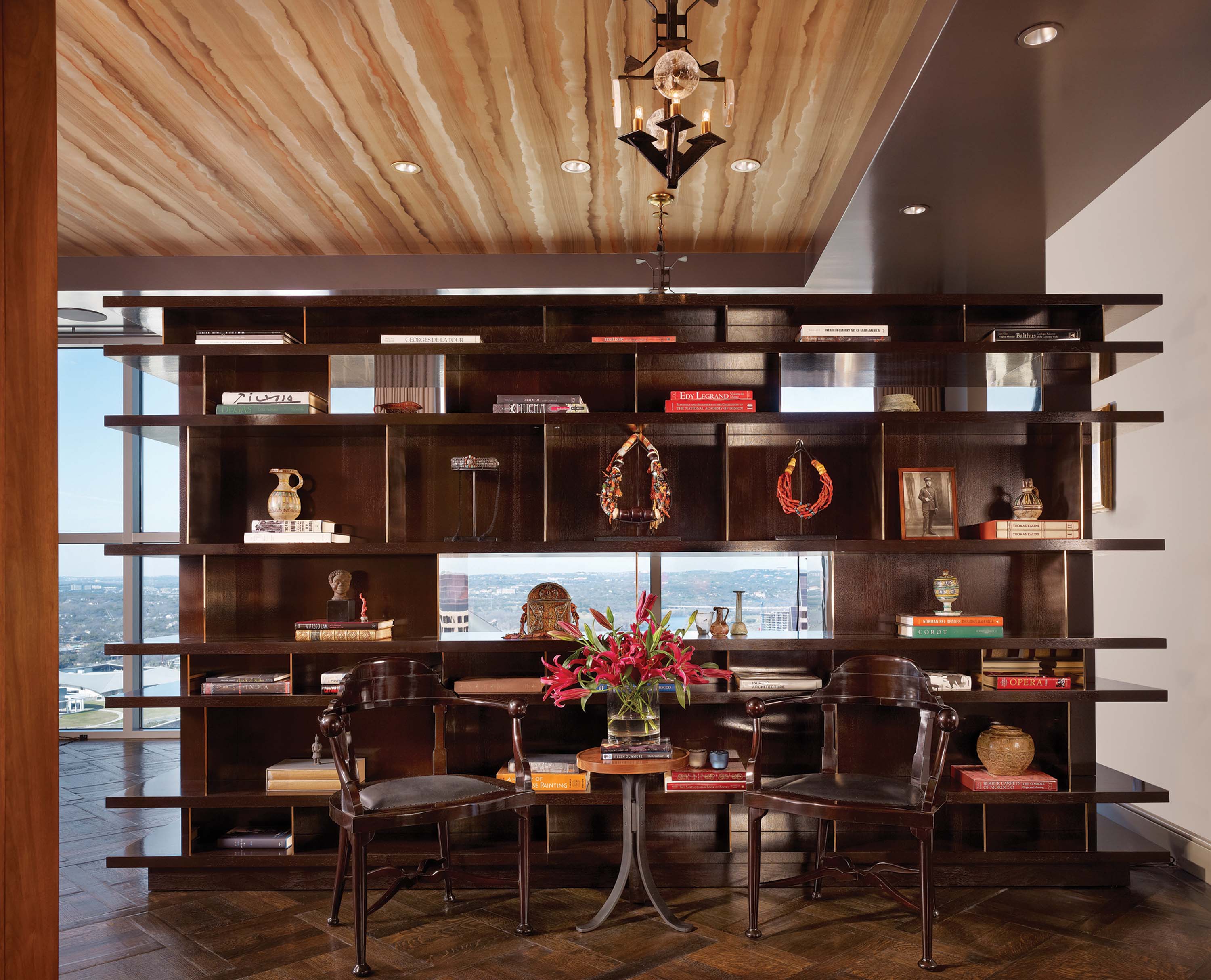
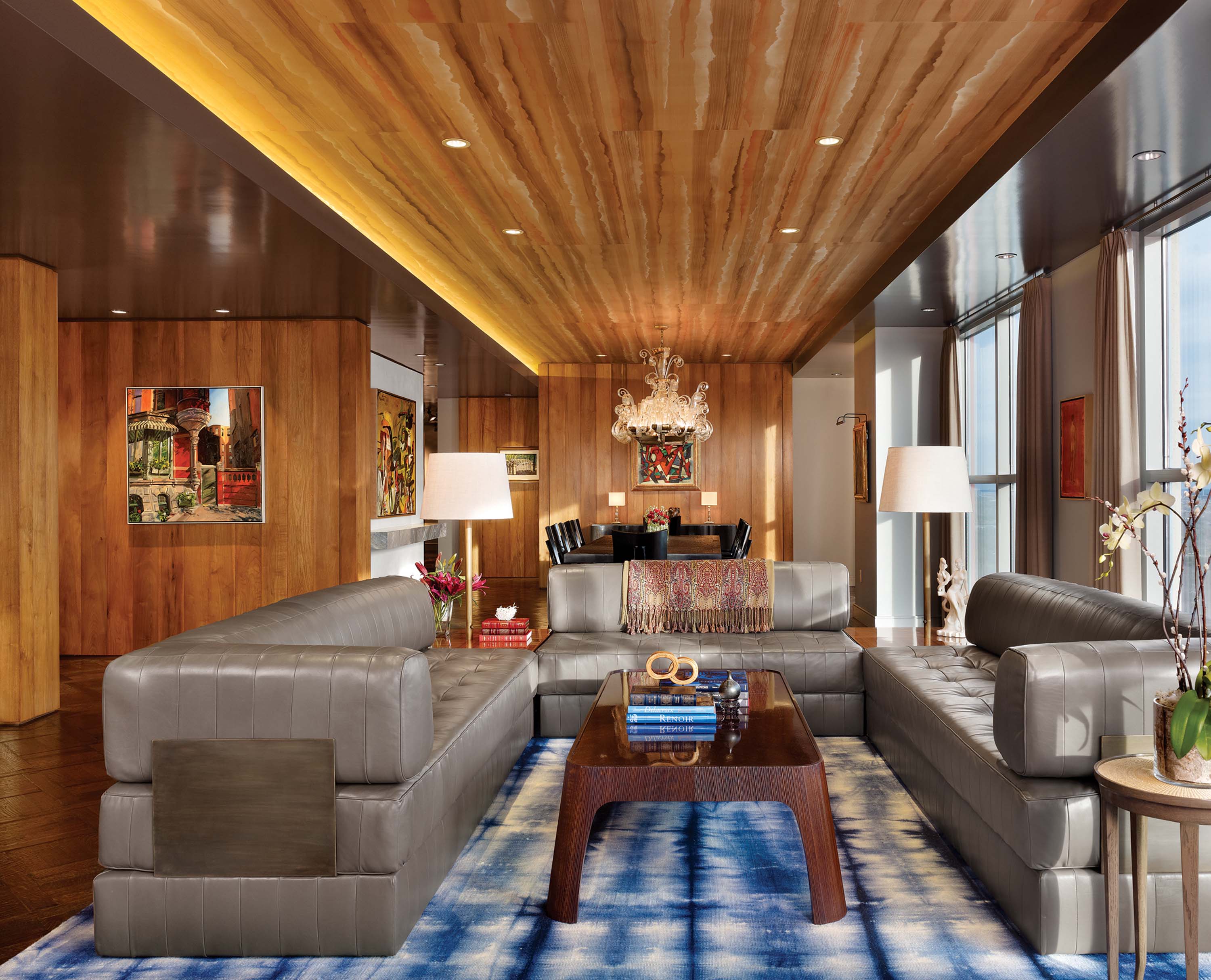
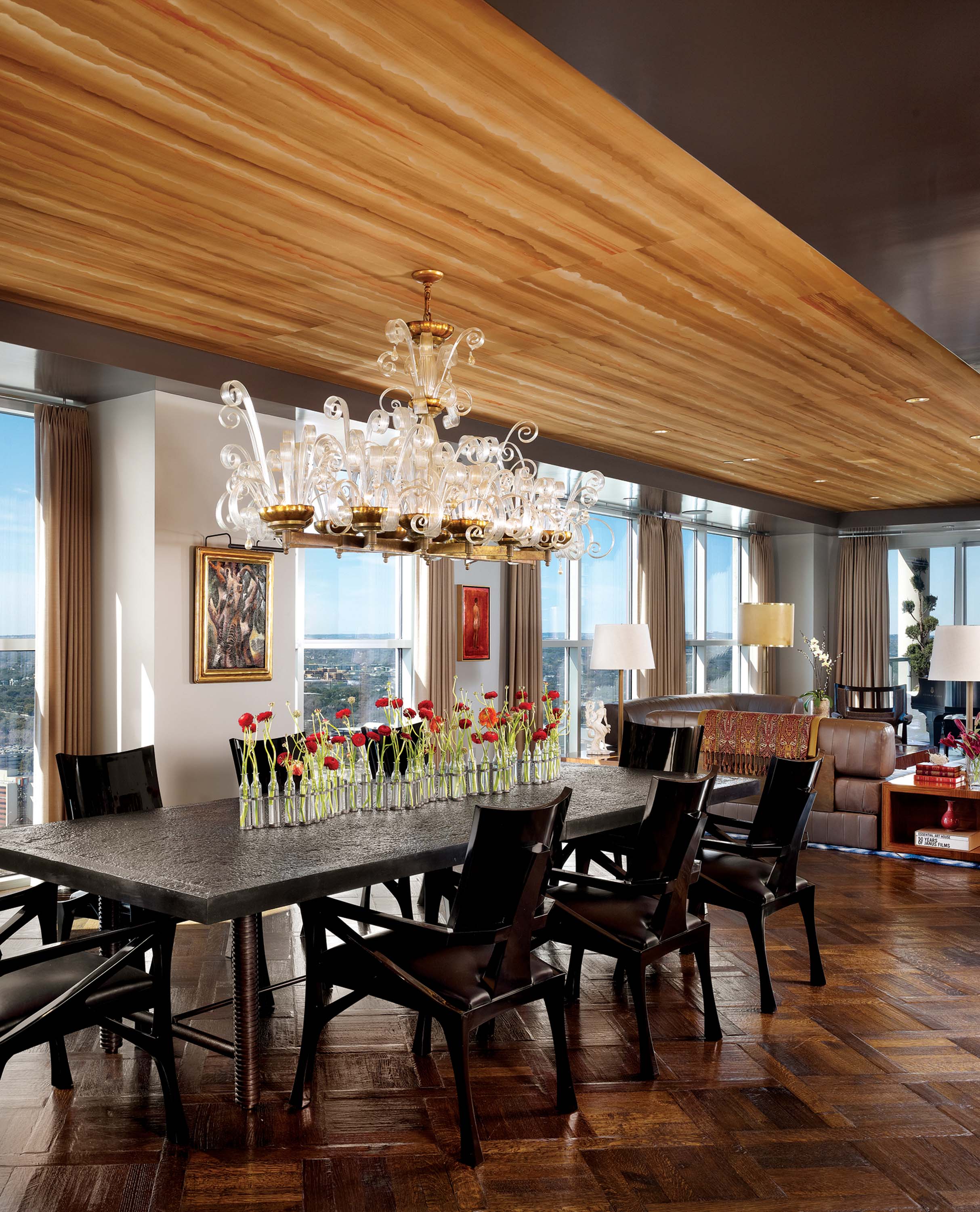
Foundational elements, including the floor, also provide continuity. “The couple had always lived in old buildings,” says Cravotta, “and the floors here are a nod to those great structures.” The designer used a Marie Antoinette parquet pattern, beveled on site with an oil – and – wax finish to give them the chatter of longevity. Overhead and encircling both condos, is a glossily reflective dark grey soffit. “It adds dimension to the 9 – foot – tall rooms,” says Webber. The soffits frame the rest of the ceiling — hand – painted paper – backed silk wallpaper that stretches from the entry all the way to the dining room.
Cravotta also designed furniture for the homeowners, including the living room’s grey leather sofas, a floating bench and bookcase in the entry, the dining table and cocktail tables. “We didn’t want any antiques,” says the couple. Instead the furnishings in their new residence are unique to them, an exercise that confirms the couple’s commitment to a new life: “We feel like Texans, now,” says the husband.
Even so, as personal as the merged condos are, the space was really created for the pleasure of visitors. “We only have two bedrooms here,” says the wife, “because we wanted to leave as much space as possible for other people to enjoy.” Apparently the word has gotten out, too — an invitation to an event at this quietly luxurious condo is the hottest ticket in town.
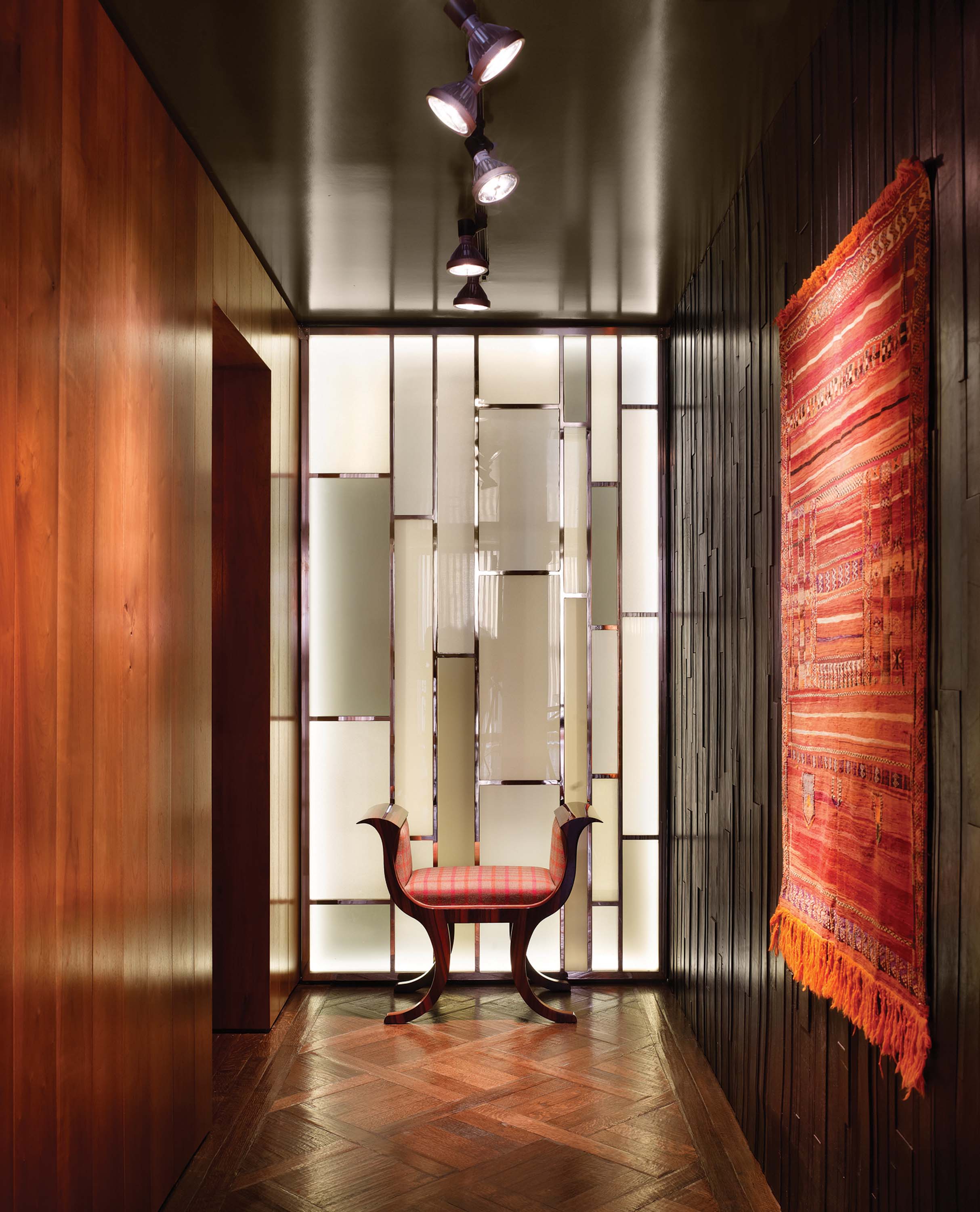
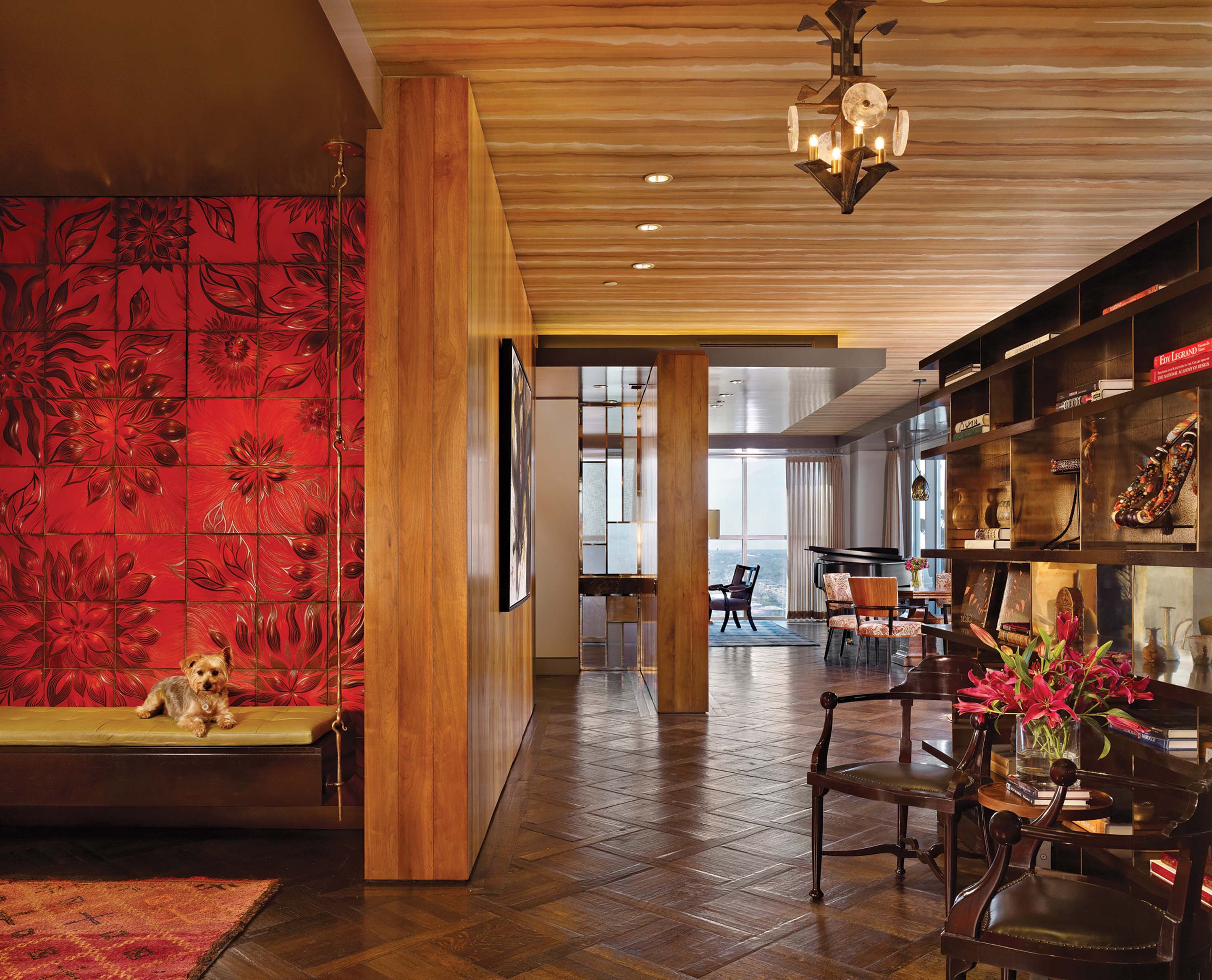
“We love texture,” explains the homeowner about the complex and luxe finishes. Cravotta accommodated them, venturing far beyond glossy paints and silk ceilings, into the unusual, such as the molded red floral ceramic wall in the entry and a hallway with walls upholstered in black leather strips of random length and thickness. It is difficult to ignore; a guest at one of the philanthropists’ soirees was spotted leaning over to sniff the wall’s craggy surface.
- Mark Cravotta and architect David Webber designed the bookshelf which serves as a divider between the entry and a sitting area and offers a glimpse of Austin’s lake through a strategically placed window.
- An indigo tie – dyed flat weave rug by J.D. Stern anchors the living room’s seating area and is an informal antidote to the dining area’s 8 – foot – long brass and Murano glass vintage chandelier.
- The formal dining table seats 10 and is fashioned from antique shipyard steel; the legs are screw shafts from industrial machinery.
- Two 1905 Venetian chairs offer seating convenient to the entry under watch by Extra who likes to relax on the floating bench. Overhead, a vintage iron and rock crystal pendant illuminates the room.
- In the bedroom, Cravotta tempered the traditional pink floral paper – backed fabric with a Modernist pendant carved from a tree root.
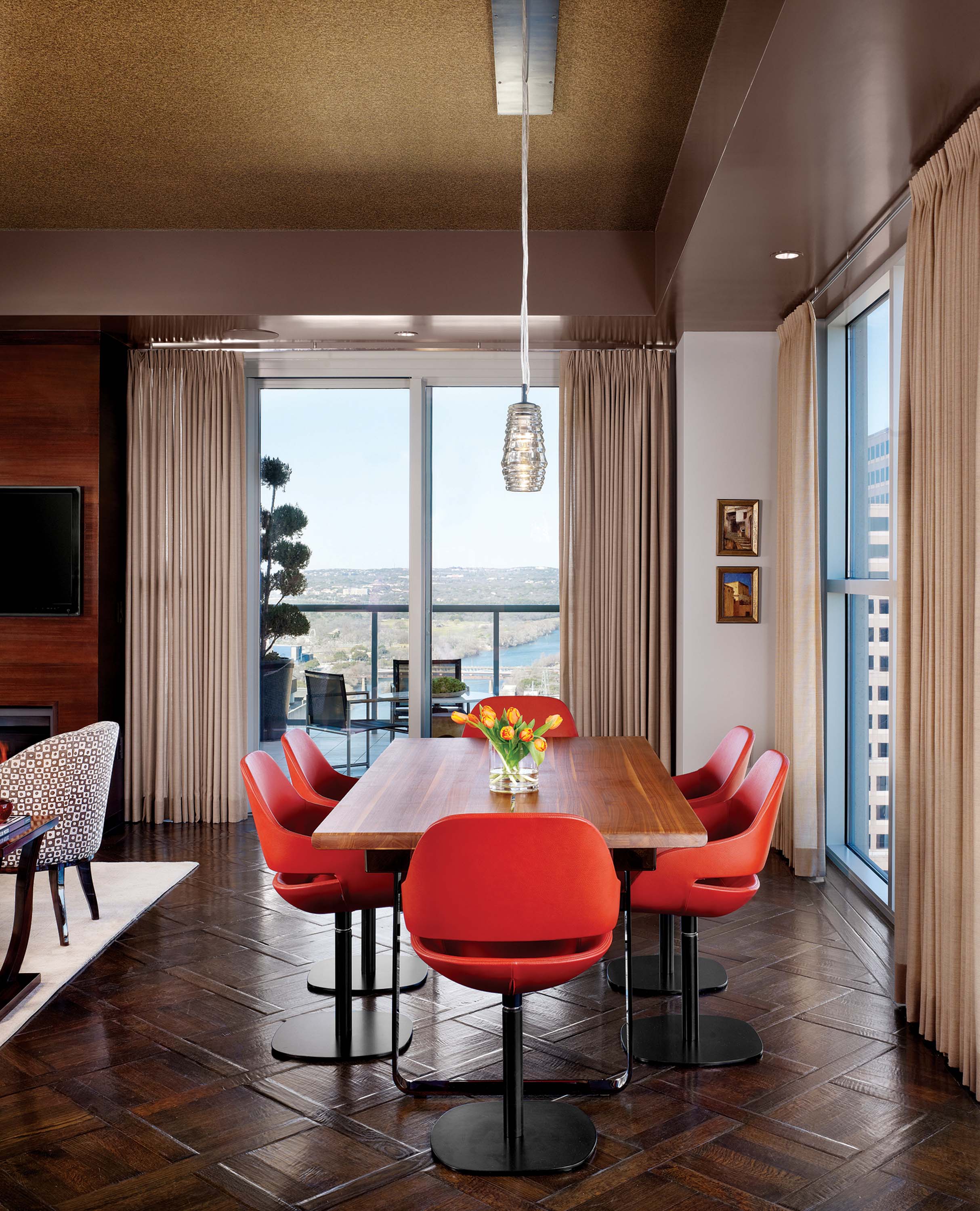
- In the original condo, the couple set aside space for casual dining which opens to a family room and the kitchen.
- The couple are serious wine collectors; designer Cravotta carved out space for a wine room near the entry to the renovated condo.
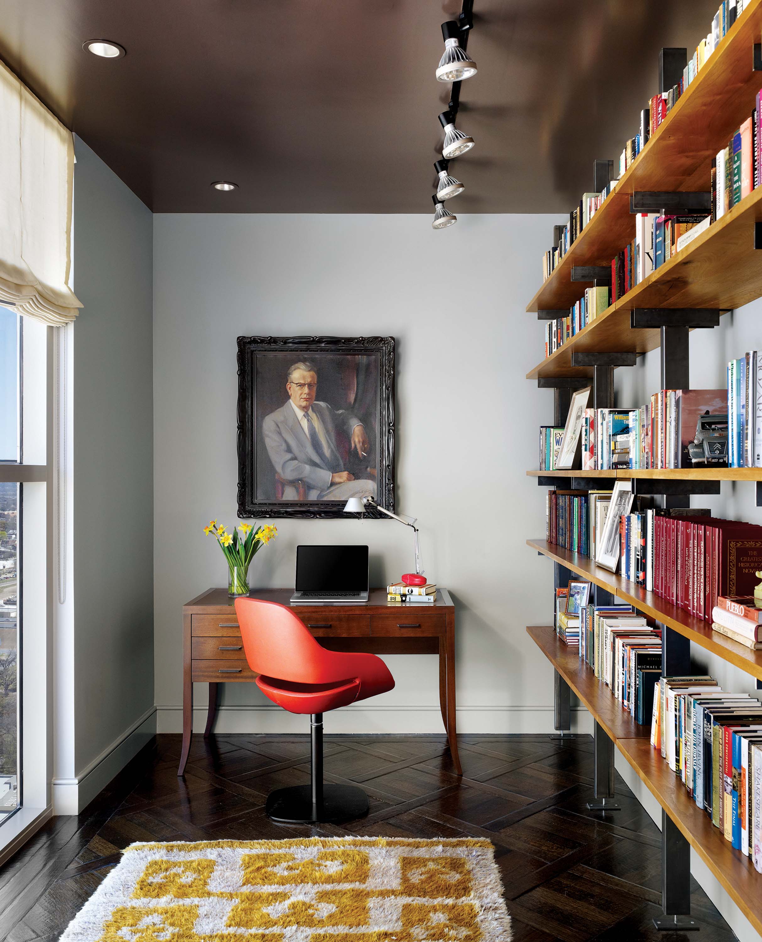
- A saffron – dyed turn – of – the – century tribal rug enlivens a study next to the kitchen.
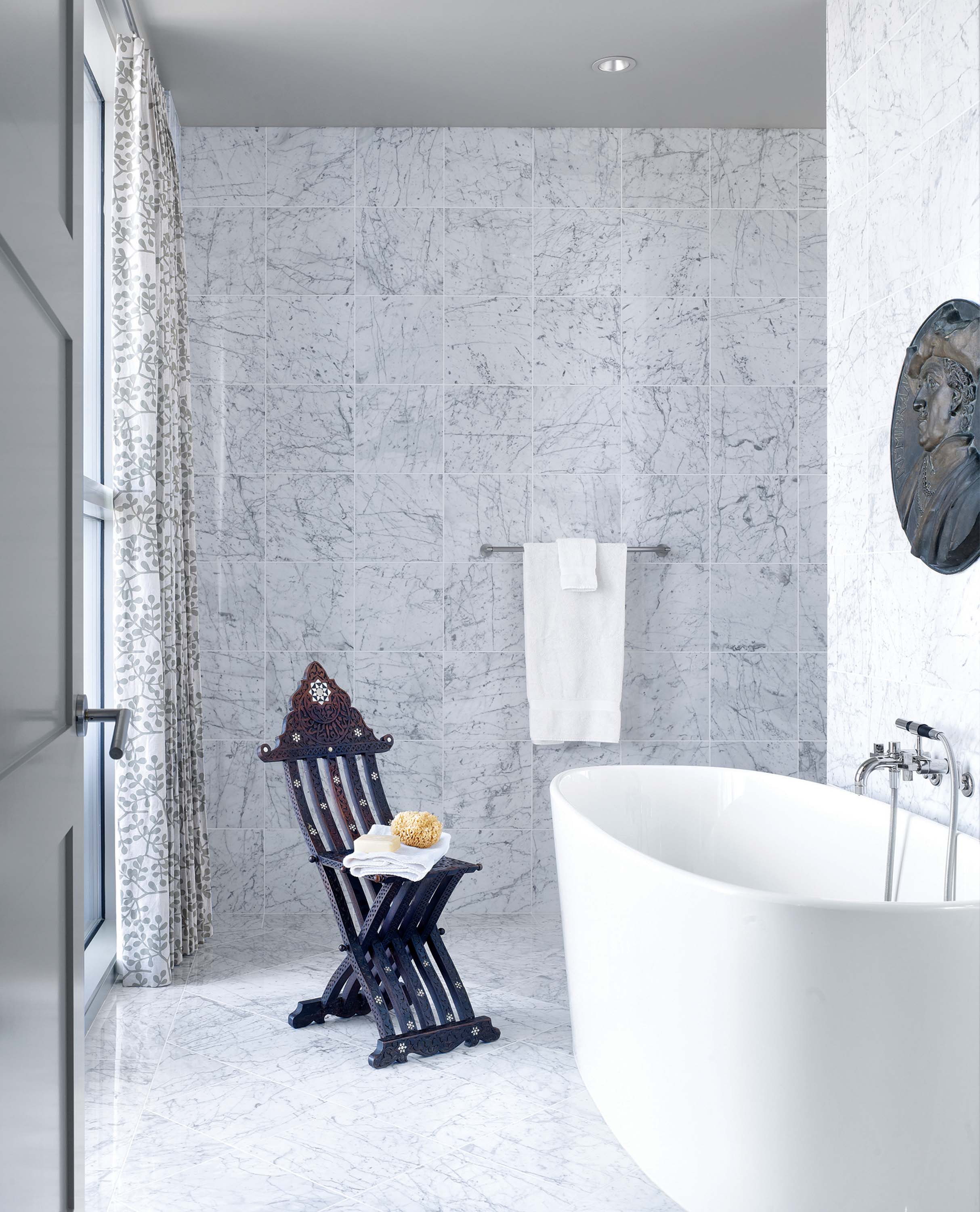
- The floral theme continues in the master bath’s curtains that frame the urban skyscape in the marble – walled master bath.




No Comments