04 Aug Montana Modern
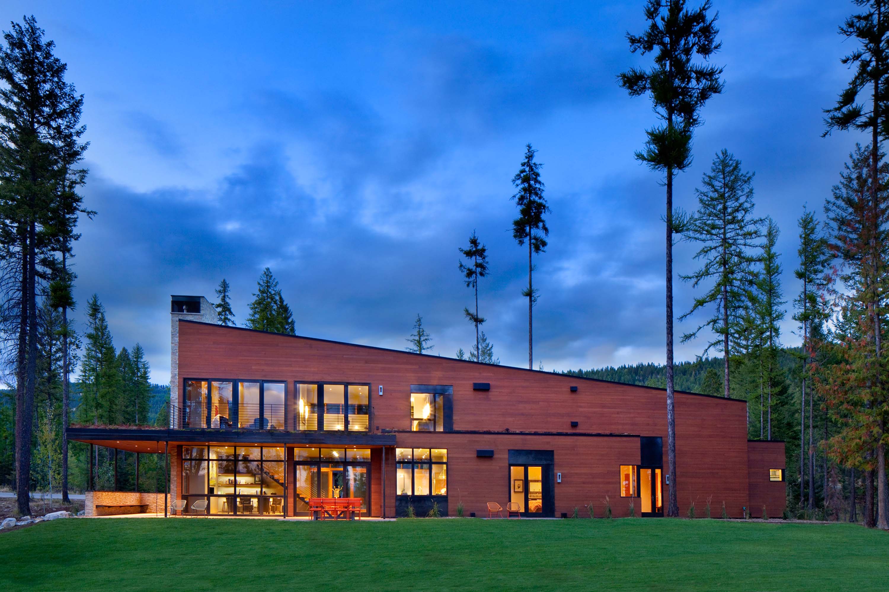
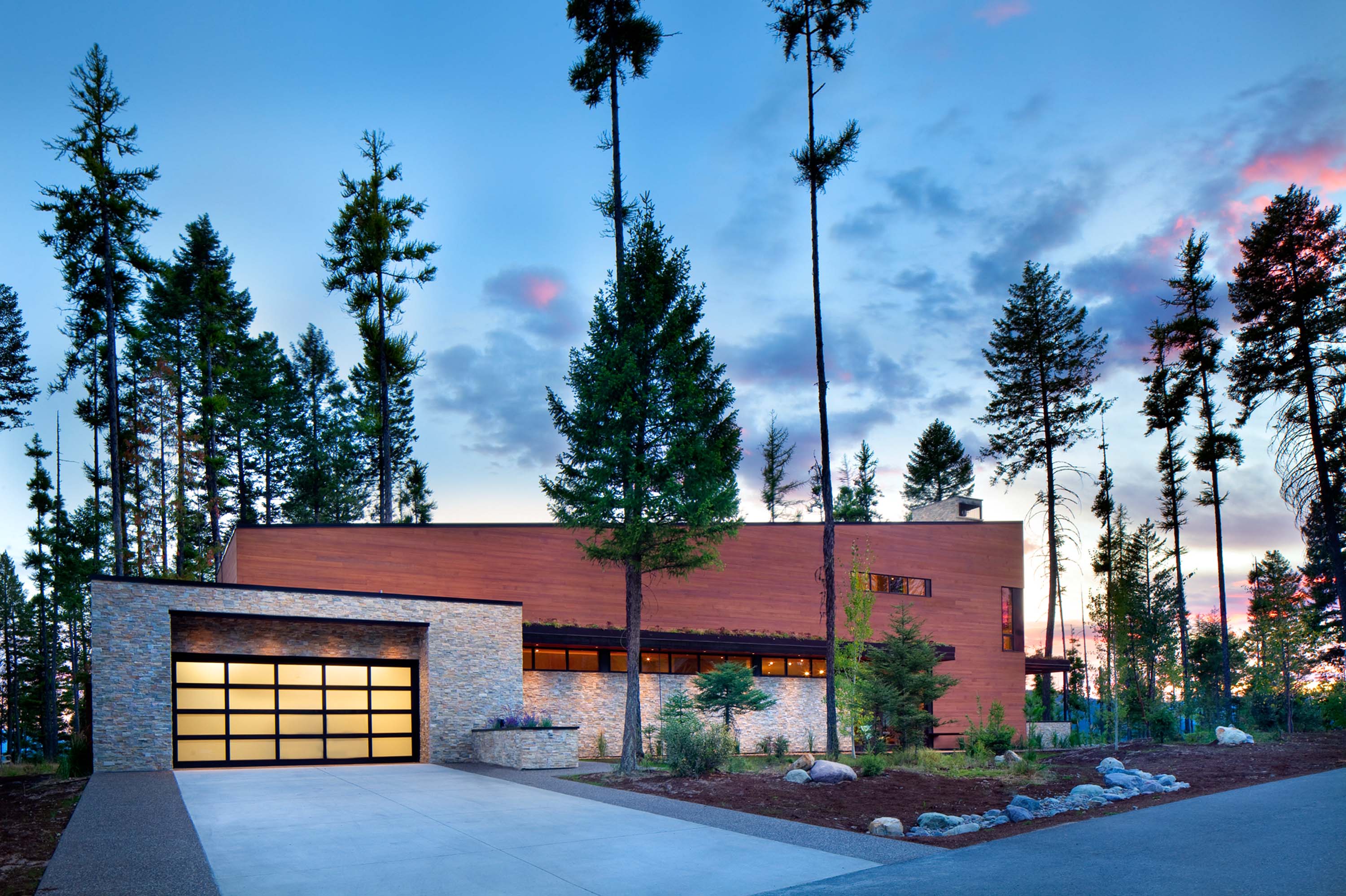
NESTLED OFF BIG MOUNTAIN ROAD, in Whitefish, Montana, Haley’s Hideaway is a compact, two-bedroom home that measures a modest 2,500 square feet. A striking alternative to the region’s larger, traditional timber homes and antler-and-plaid-clad interiors, the house’s minimalistic, modern vibe is extraor-dinary and different. Its contemporary design complements, rather than clashes, with its environment. It’s what some like to call, “Montana Modern.”
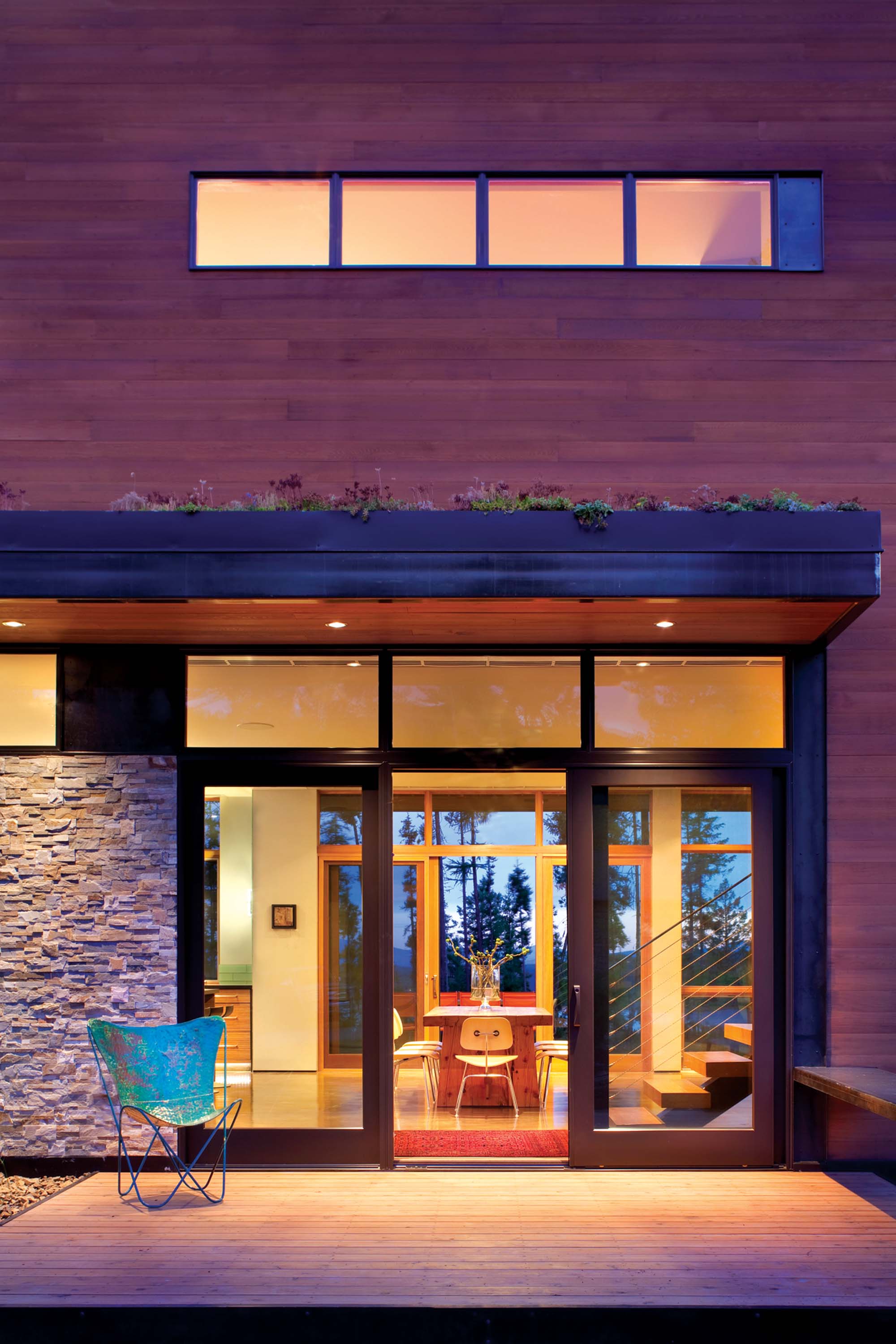
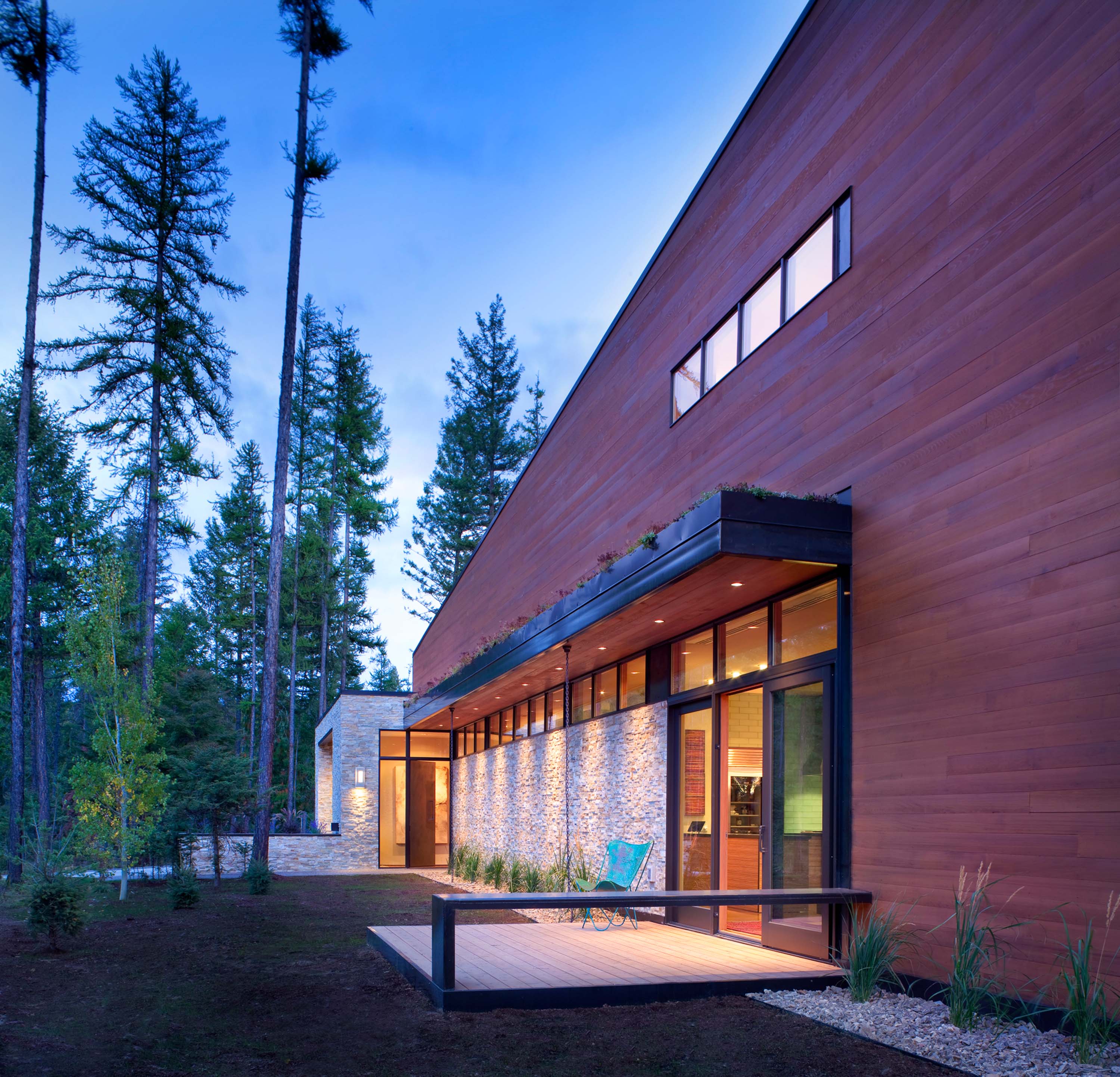
A stunning combination of cedar, aluminum and split-face stone, the home’s façade is designed to not only contain what’s inside it, but also to magnify its surroundings. Its tapered roof gently pitches up to meet the sky, creating an attractive, contemporary contrast to a rugged backdrop of jagged peaks and trees.
“Montana Modern is different than traditional contemporary,” explains David Koel, the architect of Haley’s Hideaway and Associate Principal of CTA Architects Engineers. “For me it involves creating a big contrast — angles that reflect our mountainous region and large pieces of glass, steel and timber that are rough and raw, like the environment.”
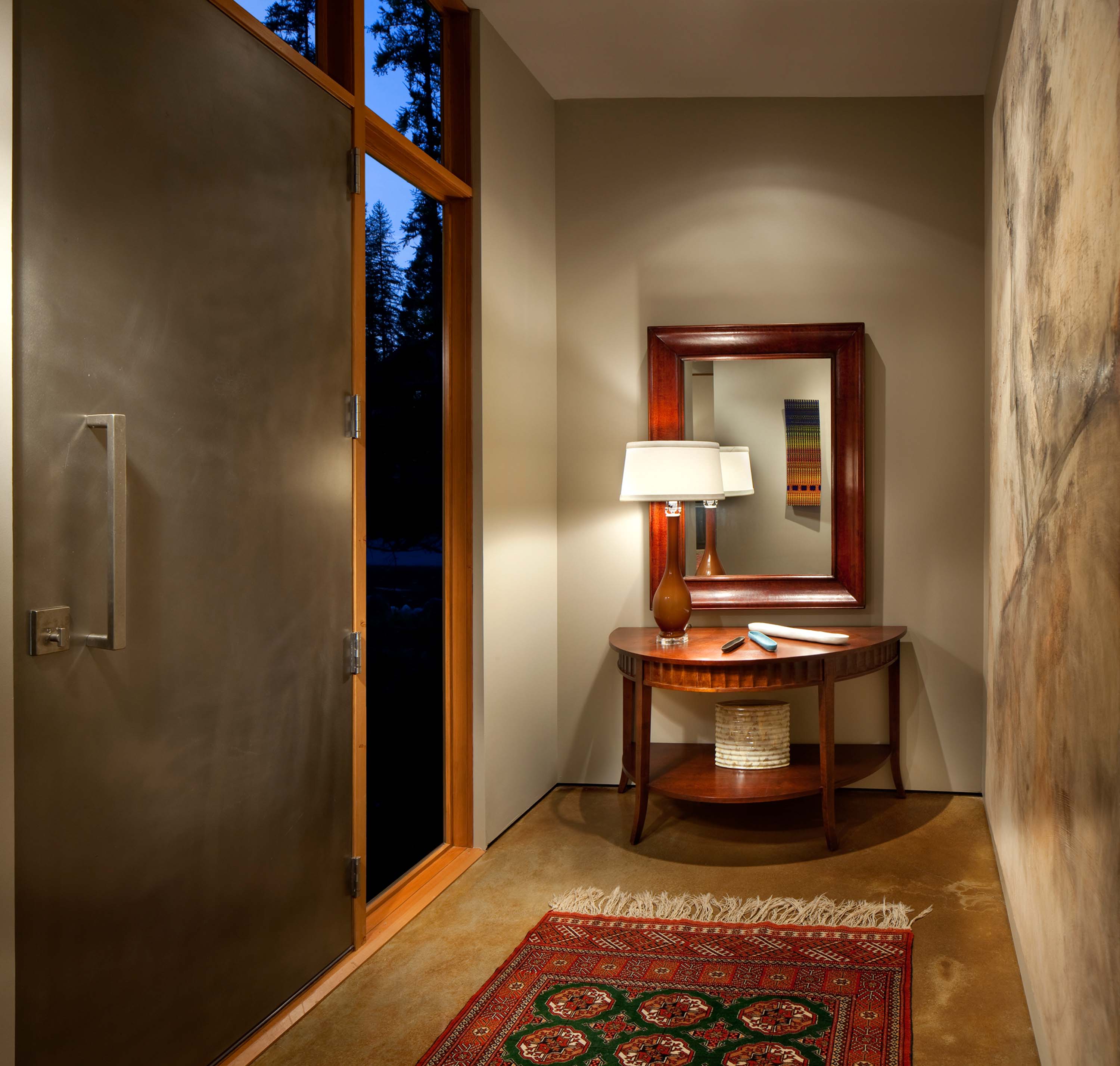
We enter the house through a long, gallery-style corridor. What you see on the walls is artwork created by local artists, including Marshall Noice, Shawna Moore and Madeline Boyle. What you don’t see are baseboards, molding or trim. Instead the walls float over a polished concrete floor, a remarkable architectural feat achieved by the home’s builder, Denman Construction, Inc.
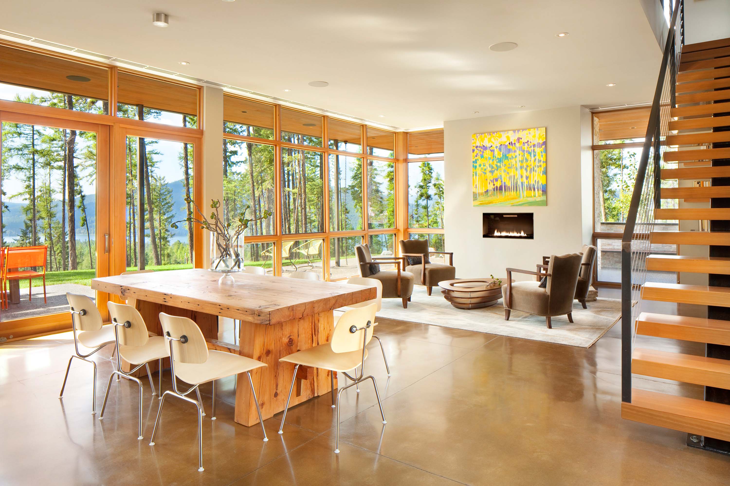
“What I think is most appealing about this home is the interior and exterior connection,” says Hunter Dominick, of Hunter & Company, who led the interior design. “There are no transitions.”
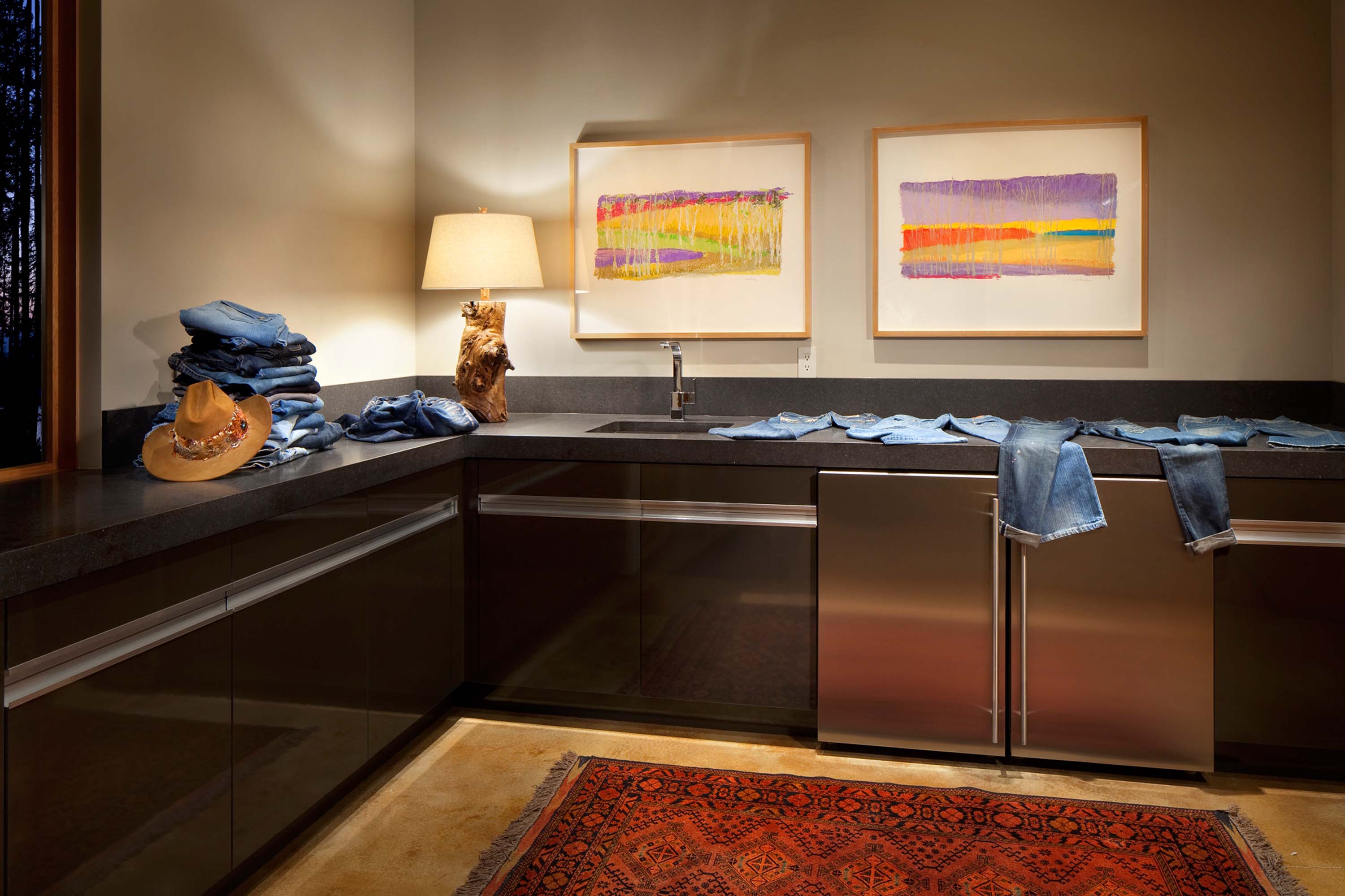
On our way to the main living area, we pass a sleek, modern mudroom and guestroom. The continuous polished concrete floor accentuates the room’s open-ness. An understated Sparks fireplace at the front of the house provides a natural place to congregate and entertain. Sliding glass doors line the southern perimeter of the large open space, creating a permeable connection between inside and out.
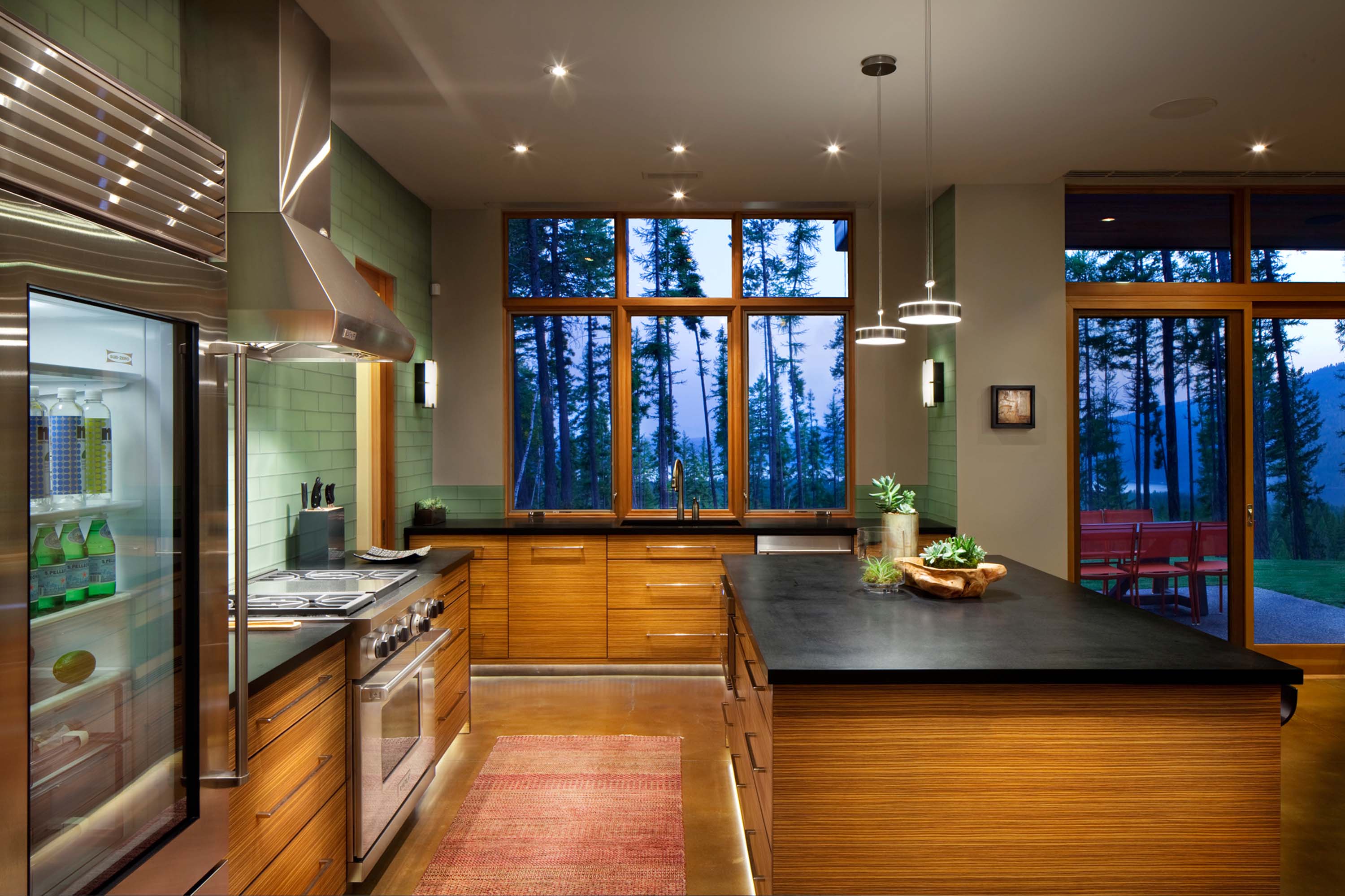
The kitchen is the room’s focal point — an intelligent, thoughtfully designed place where art and organization meet. The absence of overhead cabinetry adds to the room’s airiness, as do the low Tigerwood veneer cabinets, glass-front appliances and PaperStone countertops.
A soft, gleaming wall of sandblasted, glass bottle-blue subway tile separates the front from the back of the kitchen, reflecting light while adding a subtle splash of color. Nestled behind is a wine cellar and storage.
“It’s a lifestyle home,” says Dominick. “It was designed to be very accessible and functional. It’s very clean, open and minimalistic. There isn’t a lot of unused space.”
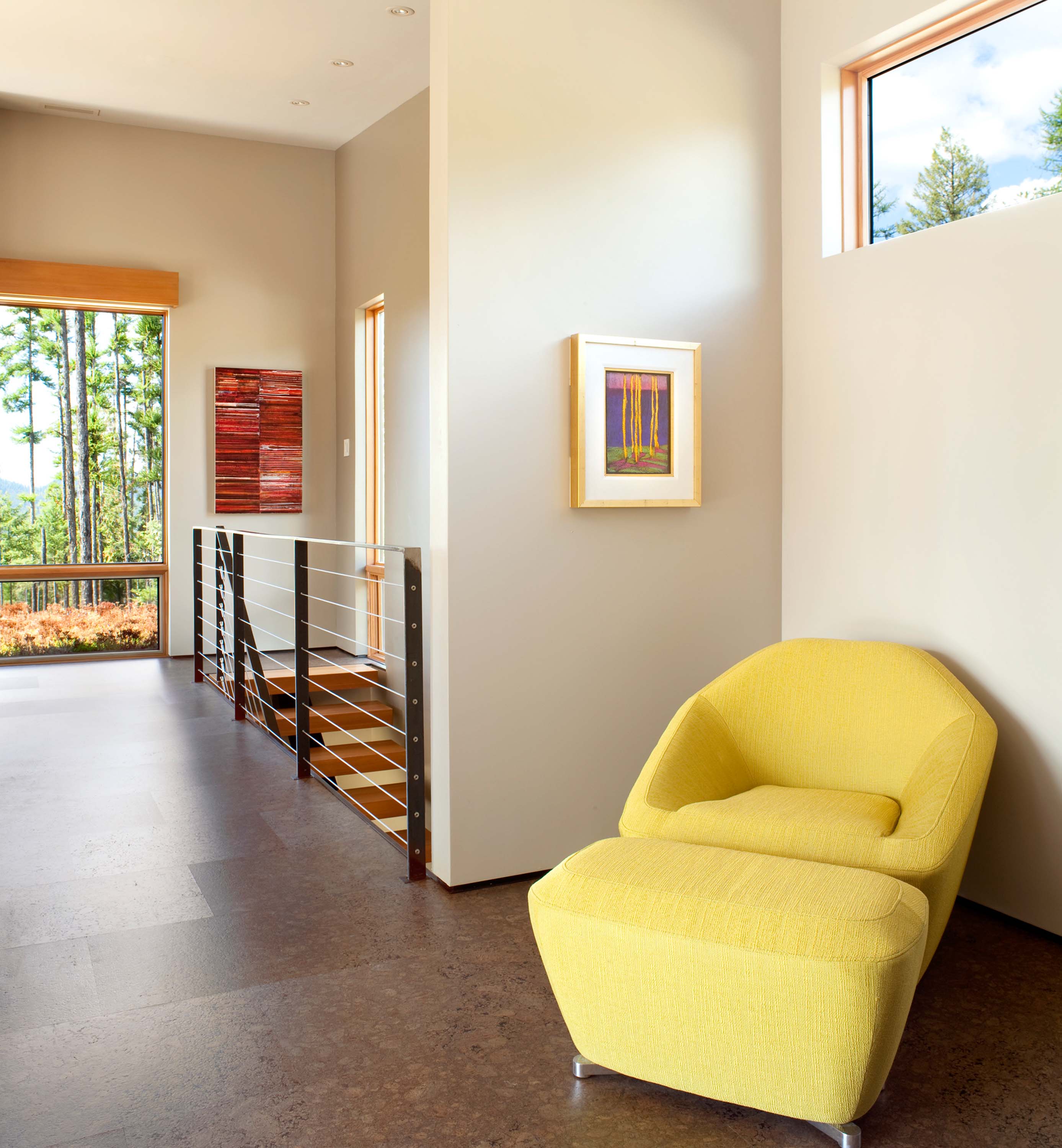
A floating stairwell leads to the upper level, a private retreat subtly divided into three spaces. There are no doors — each space is defined by a series of architectural elements.
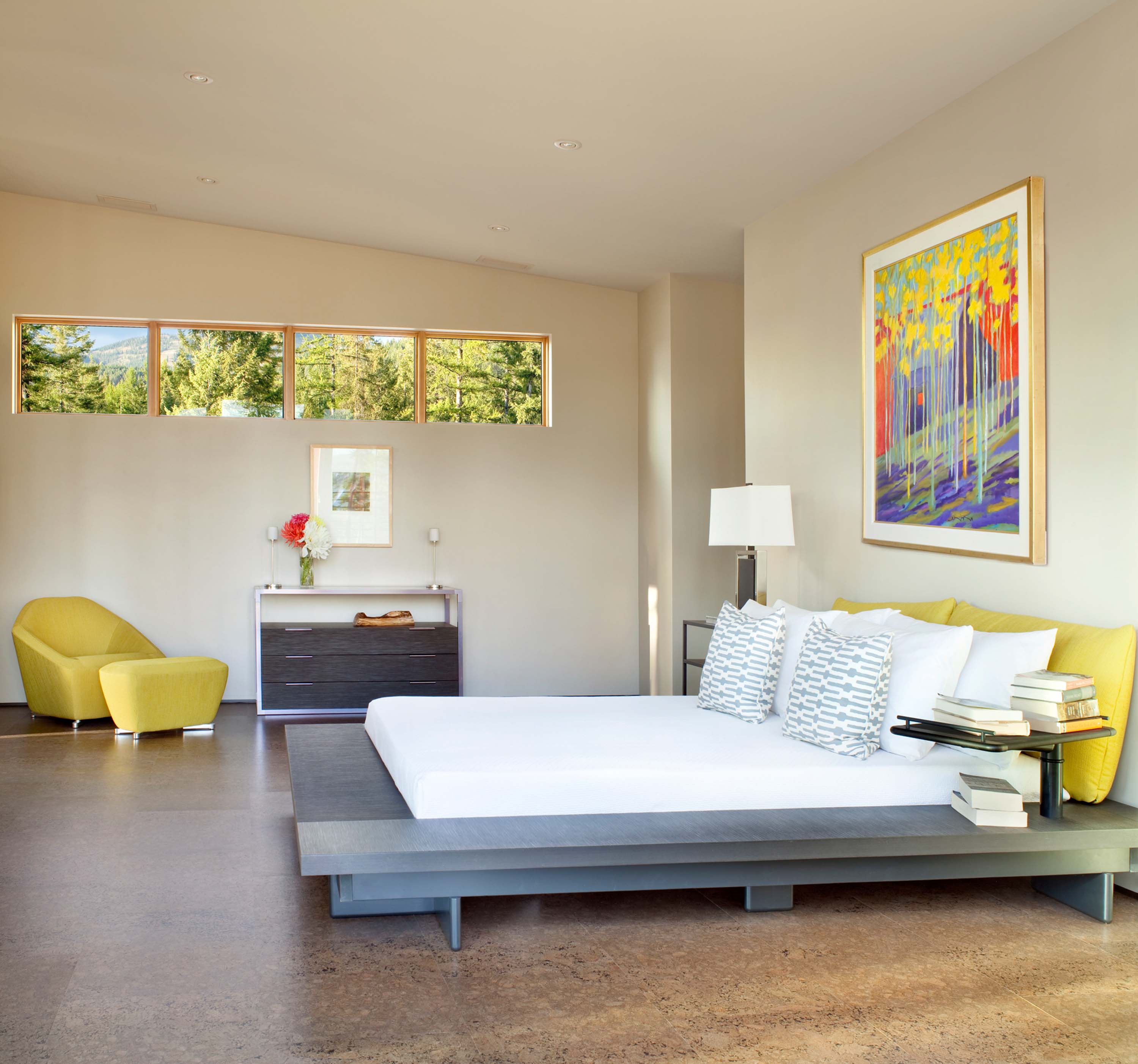
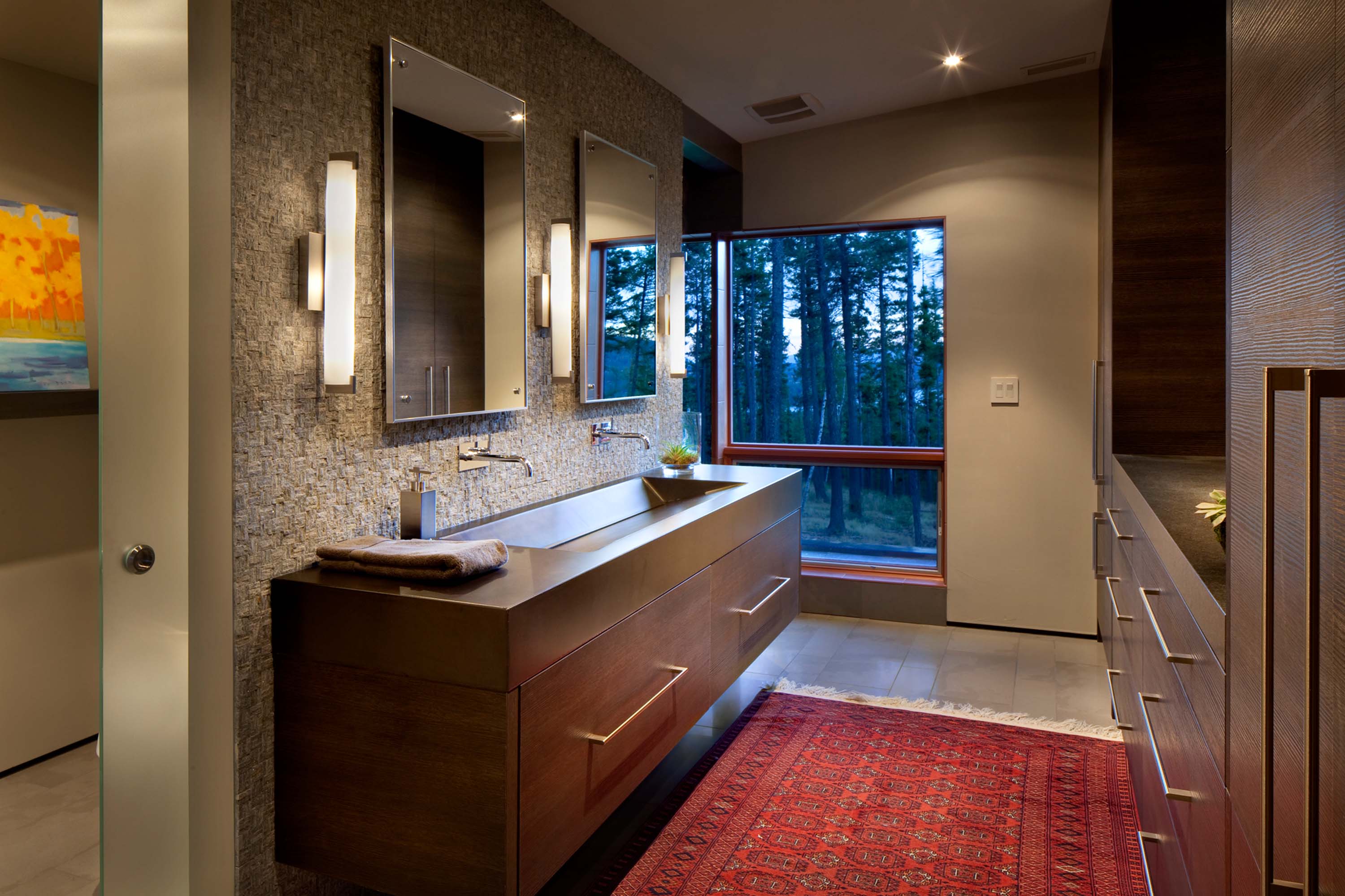
First, a well-curated office space blends the owner’s original, traditional furniture with more contemporary elements. Next, a master bedroom is perfectly situated to provide stunning views of two of the area’s cherished landmarks: A long slender window on one side provides a panoramic view of Big Mountain, while floor-to-ceiling windows on the other side look out to Whitefish Lake. Behind the bedroom sits an open, Italian-inspired walk-in closet and modern master bathroom that features a one-of-a-kind concrete sink countertop, a wall-anchored vanity and spacious steam shower.
The house’s exterior features a variety of different outdoor environments. The private backside of the house opens up to a large sweeping patio that includes an outdoor fireplace. The public, street-facing side features an inviting area to meet and greet neighbors. Upstairs, 16-foot sliding glass doors lead to a living roof, alive with colorful, climate-sensitive succulents and plants.
“One of the challenges was creating a space that was contemporary without being too cold,” says Dominick. “Montana Modern involves introducing a variety of warmer elements.”
“A lot of the choices are unique for this part of the country,” says Dominick. “But that doesn’t mean the design is less true to the spirit of the place or the nature that surrounds it.”
“Haley’s Hideaway is a true testament that simple is better,” says Koel. “Oftentimes people think you have to get really elaborate to make a statement. It’s amazing what you can achieve with less.”
Montana Modern is a simple, direct way of building that is responsive to the region’s steep terrain and vertical nature, satisfies the desire to bring the outside in, and promotes smart design as a way of life.
Haley’s Hideaway is, indeed, Montana Modern defined.


No Comments