16 Nov The Evolution of Taste
THERE'S NO DOUBT THAT AS YEARS GO BY, tastes can change. A one-time cherished piece of art or furniture may lose its luster, at least in the owner’s eyes, as trends and lifestyles evolve and shift. This was certainly the case for a Midwestern couple who exchanged their 9,000-square-foot classic Victorian home near Cincinnati, Ohio, for a Bauhaus-inspired modern home in Tucson, Arizona.
“Ours was a magnificent house, built in 1865, but with a structure that age it just meant that we were constantly working on it,” explains the wife, noting that shoveling snow in itself was a huge undertaking. “We thought this house was going to kill us!” At the same time, their design tastes were leaning toward a more contemporary aesthetic; they began collecting modern art and the husband served as a board member for the Contemporary Arts Center in Cincinnati. When they purchased a condominium in Chicago, Illinois, in a glass-and-steel building, they went for a minimalist design approach with mid-century modern accents.
“Taking care of a Victorian mansion and then spending time in Chicago in a minimalist place, we got inspired in the next move to build a modernist space,” explains the husband.
With a daughter and grandson in the Tucson area, the couple’s frequent visits had already confirmed that the climate in Arizona was more conducive to a retirement lifestyle, one that did not involve shoveling sidewalks. In 2012, they made a three-year plan to sell both Midwestern homes and build a primary residence in Tucson. “We wanted to do a minimalist contemporary residence that echoed our condo in Chicago,” the husband says.
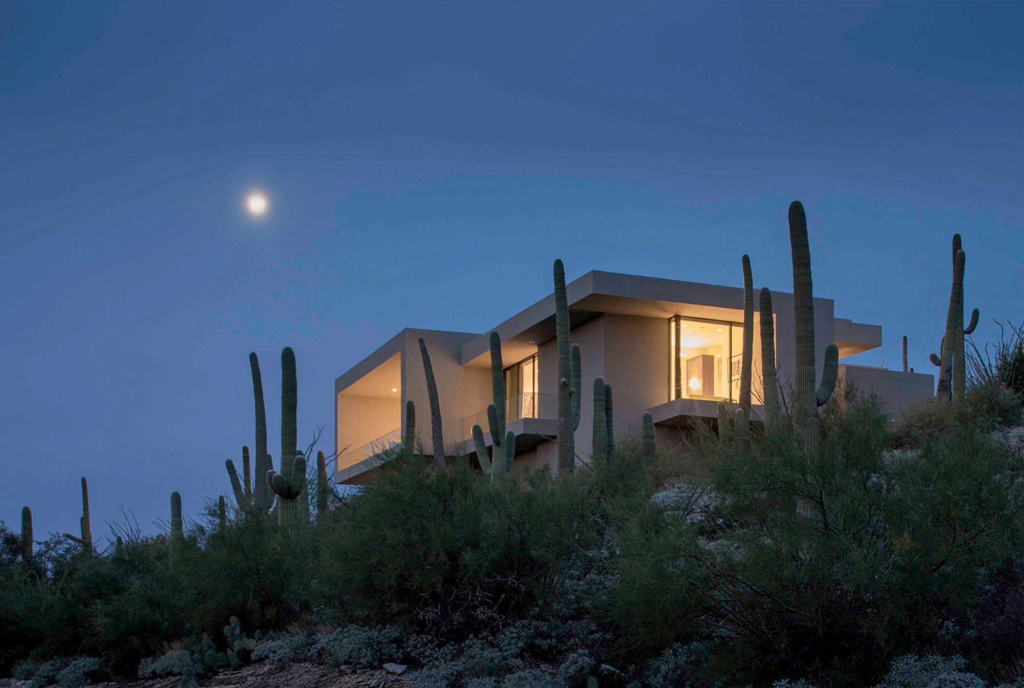
The end result is what they refer to as “Mucho Saguaro,” a 5,500-square-foot, box-shape structure in the foothills of the Catalina Mountains, set in the midst of the Sonoran Desert among a forest of saguaros. The residence expands to 7,500 square feet when outdoor living spaces are included, and it also acts as a gallery, housing the couple’s extensive contemporary art collection. Designed to contrast with the landscape instead of fit in, the structure serves as a counterpoint to the typical adobe architecture favored in this Southwestern city.
“When we first came to Tucson, all we saw was Western-style adobe and stucco, and we thought, ‘Where are we going to find an architect?’” says the husband. A house near their 6-acre lot was an anomaly, a modern structure in a neighborhood of Southwestern-style homes. They discovered the architect was Kevin Howard of the Tucson-based Kevin B. Howard Architects. “We knew we wanted minimalist architecture, and Kevin was able to take it to a new level,” the husband states.
Howard has designed homes in southern Arizona, along with some in Cabo San Lucas, Mexico; San Diego, California; and Park City, Utah. The architect has built a reputation for unique, site-driven designs. “We are known for doing what I’d like to call a ‘Desert Modern Zen,’” he explains. “In between the two paradigms, our homes tend to have a little more material richness and variety, but this couple wanted a very minimalist design approach. It’s something I have a great appreciation for, but not a lot of clients ask for it.”
Howard explains that the clients were unique in that they had succinct desires, and they wanted a home that would showcase their art. The homeowner being a connoisseur of art, is purposefully driven by the early 20th-century Modern architecture movement. He wanted a minimal box, which defines that look.”
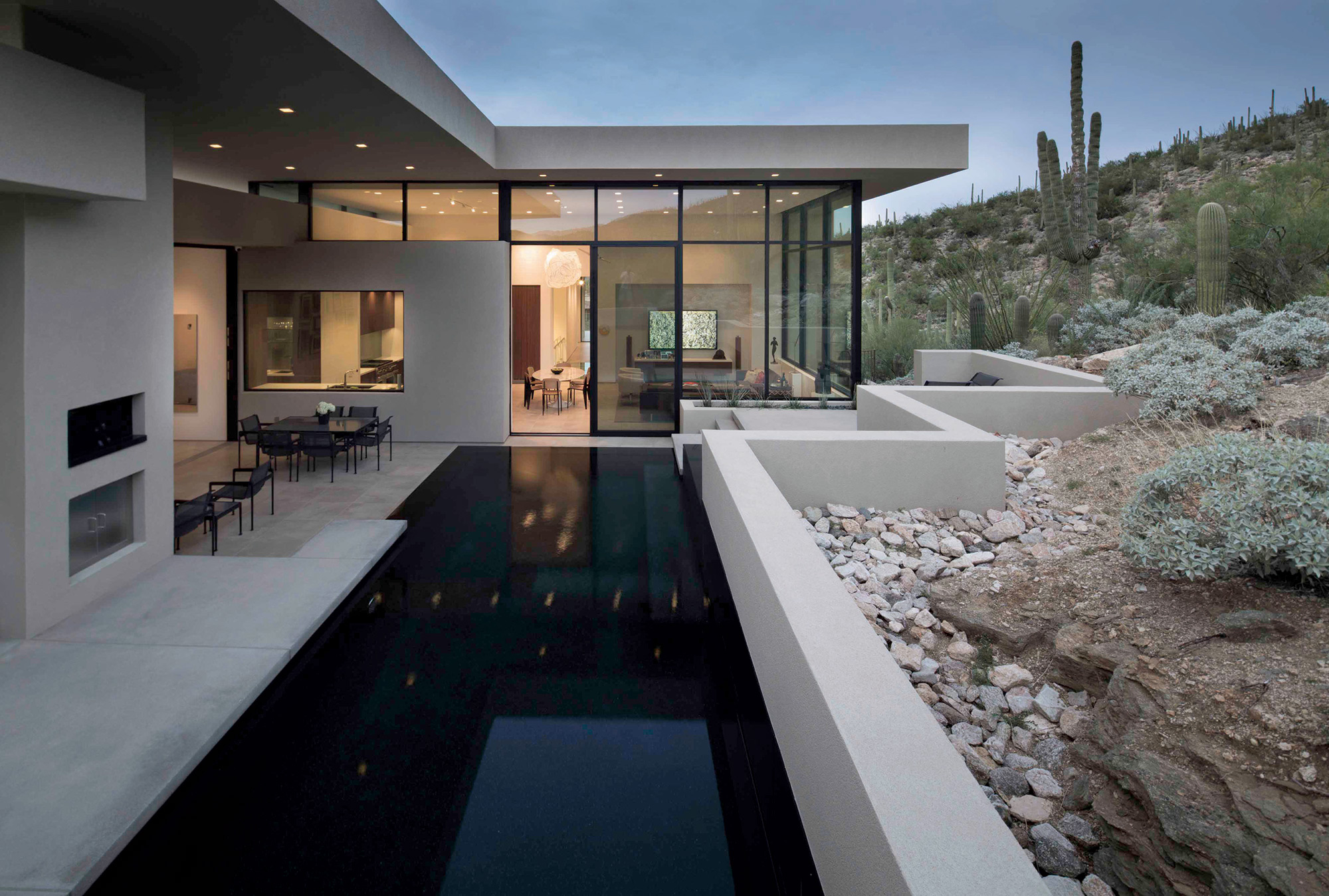
Howard’s challenge was to adapt that look to the desert landscape and climate, to capture the views, and to use a lot of glass. But he also had to protect the clients’ artwork. “They wanted very thin lines, but we added deep overhangs and a thickness to the walls that gives the home a substantiality and shadow lines,” Howard says.
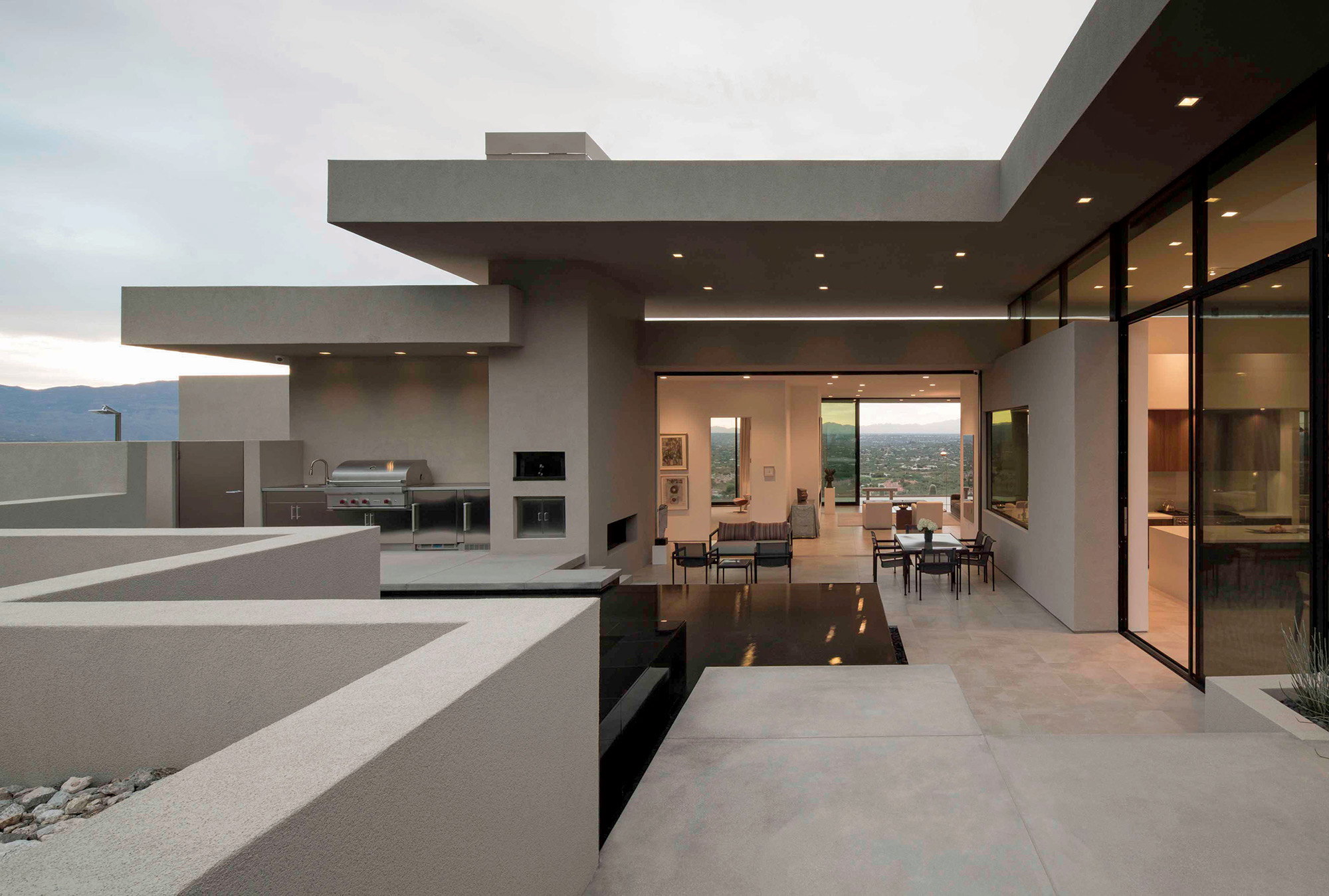
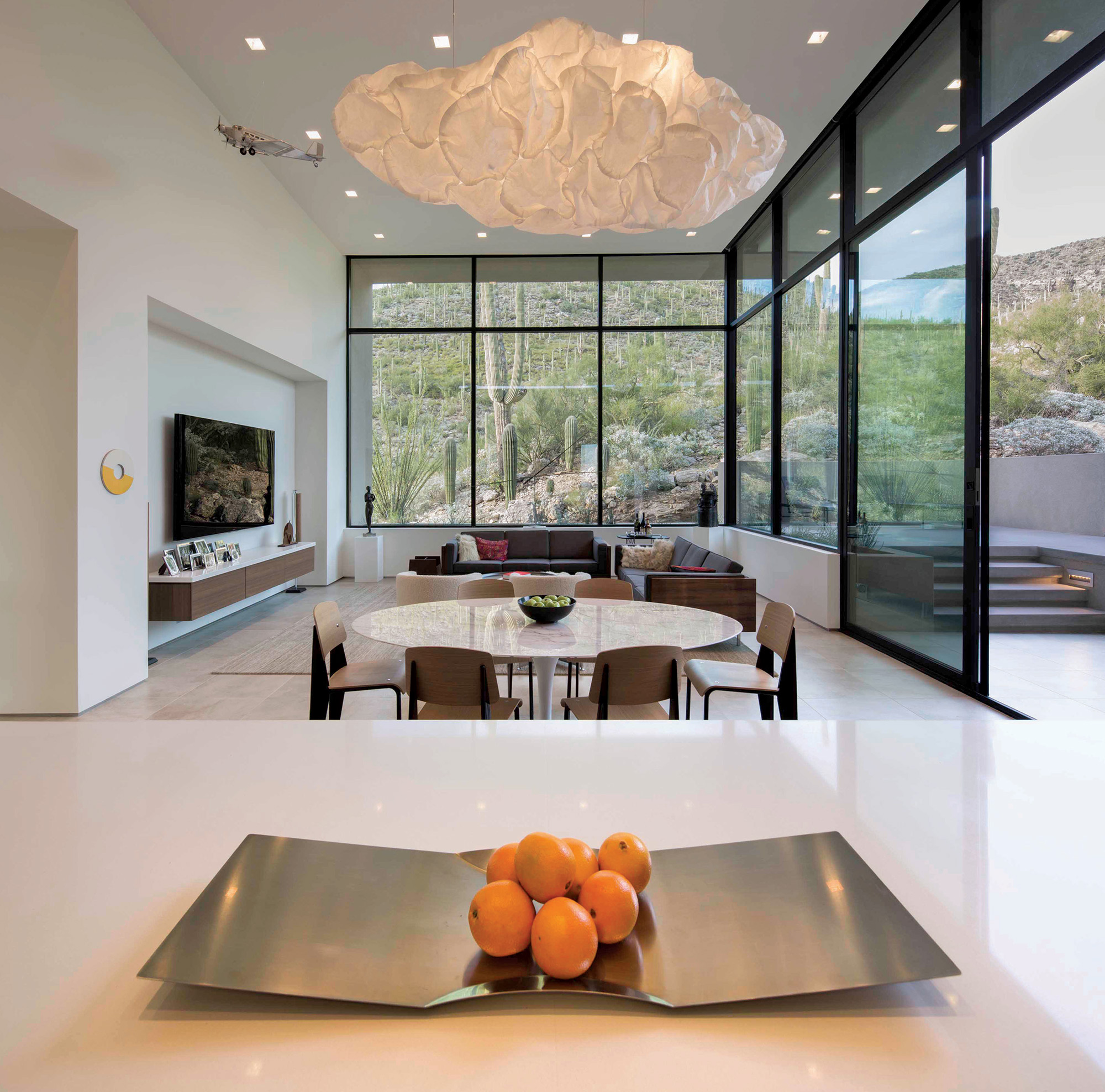
Kevin B. Howard Architects not only managed the design but also built the home, while the couple took charge of the interiors. In an attempt to lessen the distinction between indoor and outdoor spaces, the great room, kitchen and family areas have sliding-glass pocket doors and flooring that continues from the rooms to the patios, creating seamless transitions from inside to outside. “Getting a home or structure down to its essentials is all about light, and in this house the light becomes a material since there’s not a lot of material variety,” Howard says.
An art gallery is situated in the entryway. “The gallery is the first impression of the house,” the wife says. “We often serve champagne there and give our guests an overview of our art collection.”
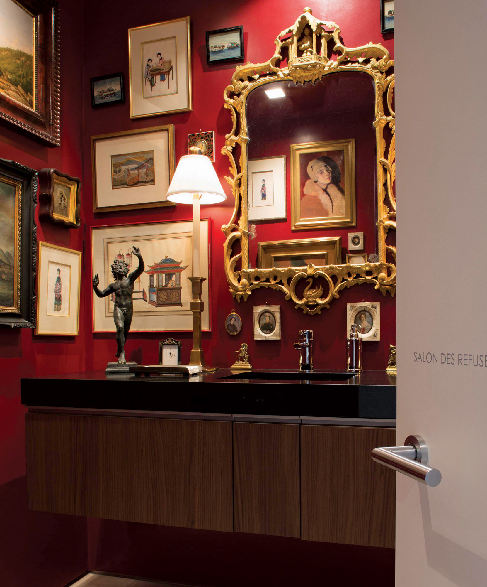
There are also a couple of surprises throughout the home. There are two secret rooms: one accessed by pushing a paneled wall, the other through a bookcase. One leads to a bunk room, the other to an arcade. Another surprise is a red-lacquer powder room the couple calls the Salon des Refusés, French for “exhibition of rejects.” This room, a tribute to their past life in the Midwest, is where they hang oil paintings in ornate gold frames, including a couple of Joseph Sharp’s paintings of American Indians that don’t fit into their current lifestyle.
“There are red lacquered walls, and all these paintings hung salon style,” the husband says. “It looks like a Louisiana whore house; it’s really fun. You walk through this white-walled, glass-and-steel building; then walk into the powder room, and it’s a stark contrast, an homage to our old Victorian house and to how we have reinvented ourselves in a minimalist house in Arizona.”
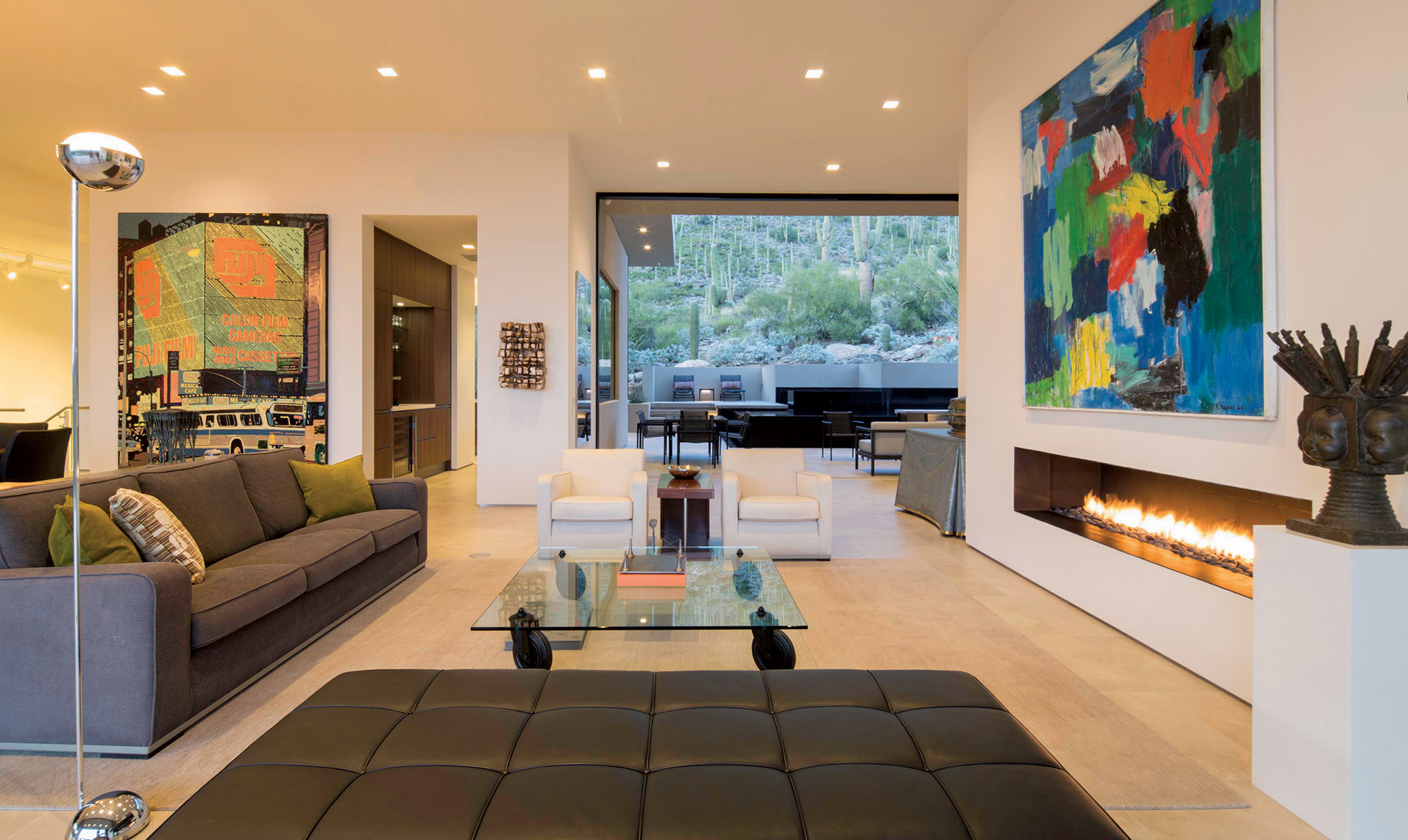
- The formal living room features a Poul Kjaerholm PK80 daybed, a Morio Shinoda steel sculpture on a Tavola Con Ruote glass table and a Maxalto sofa and club chairs with a vintage Gilbert Rohde machine-age table between them. The bronze sculpture on the small wall to the left is by Jan Albers, and a vintage John Dickinson faux draped tin table sits to the left of the fireplace.
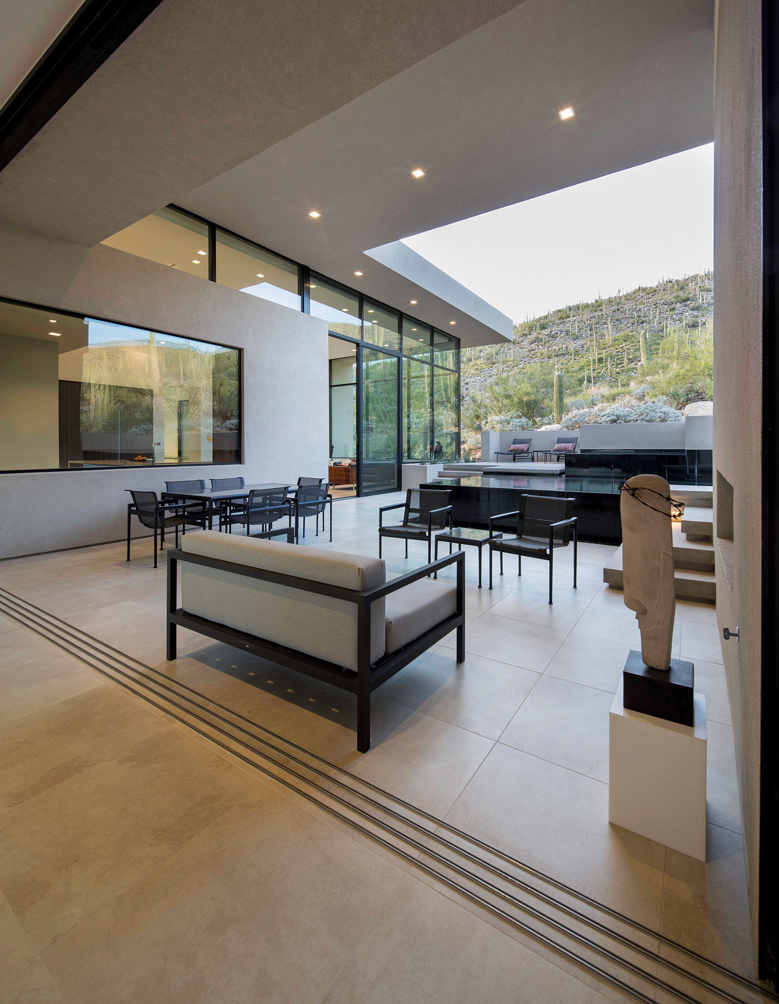
- A pool, grill and wood-fired oven complete the north terrace. The dining area features Richard Shultz 1966 outdoor furniture.
- The casual dining area features a Frank Gehry treated paper cloud hovering over a mid-century marble-topped Eero Saarinen table surrounded by Prouve chairs. The sitting area features a pair of matching Milo Baughman rosewood case couches, reupholstered in B&B Italia fabric.
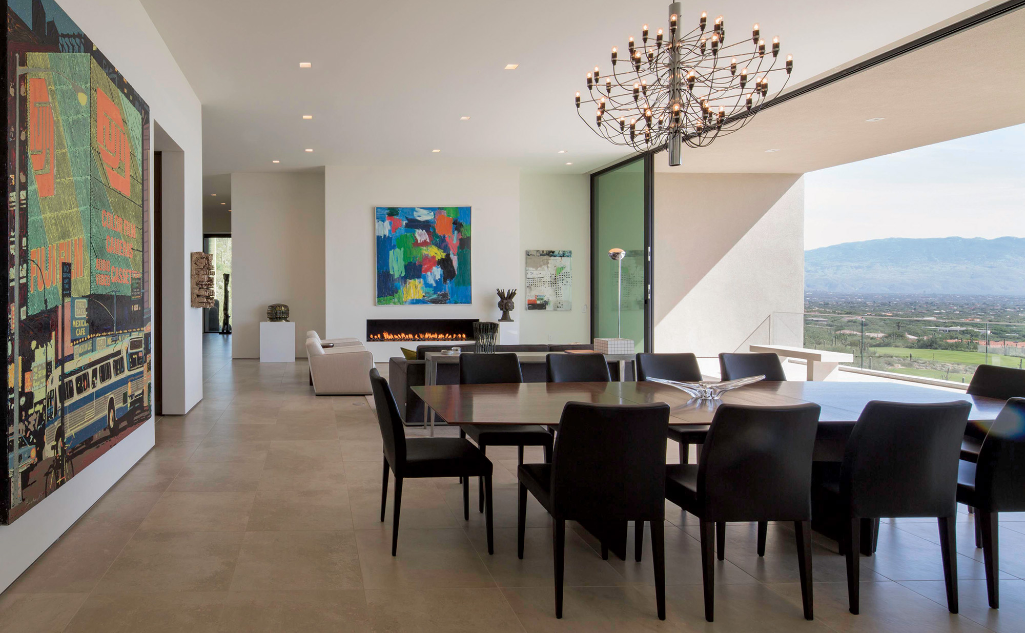
- A mid-century vintage Edward Wormley dining table is surrounded by Poltrona Frau chairs with a Gino Sarfatti chandelier overhead. A painting of Times Square by Cincinnati artist Tom Bacher hangs on the left wall. The 93-year-old Tucson artist, Robert Barber, painted the abstract above the sitting room fireplace.
- Sliding glass pocket doors lead seamlessly to outdoor living spaces.
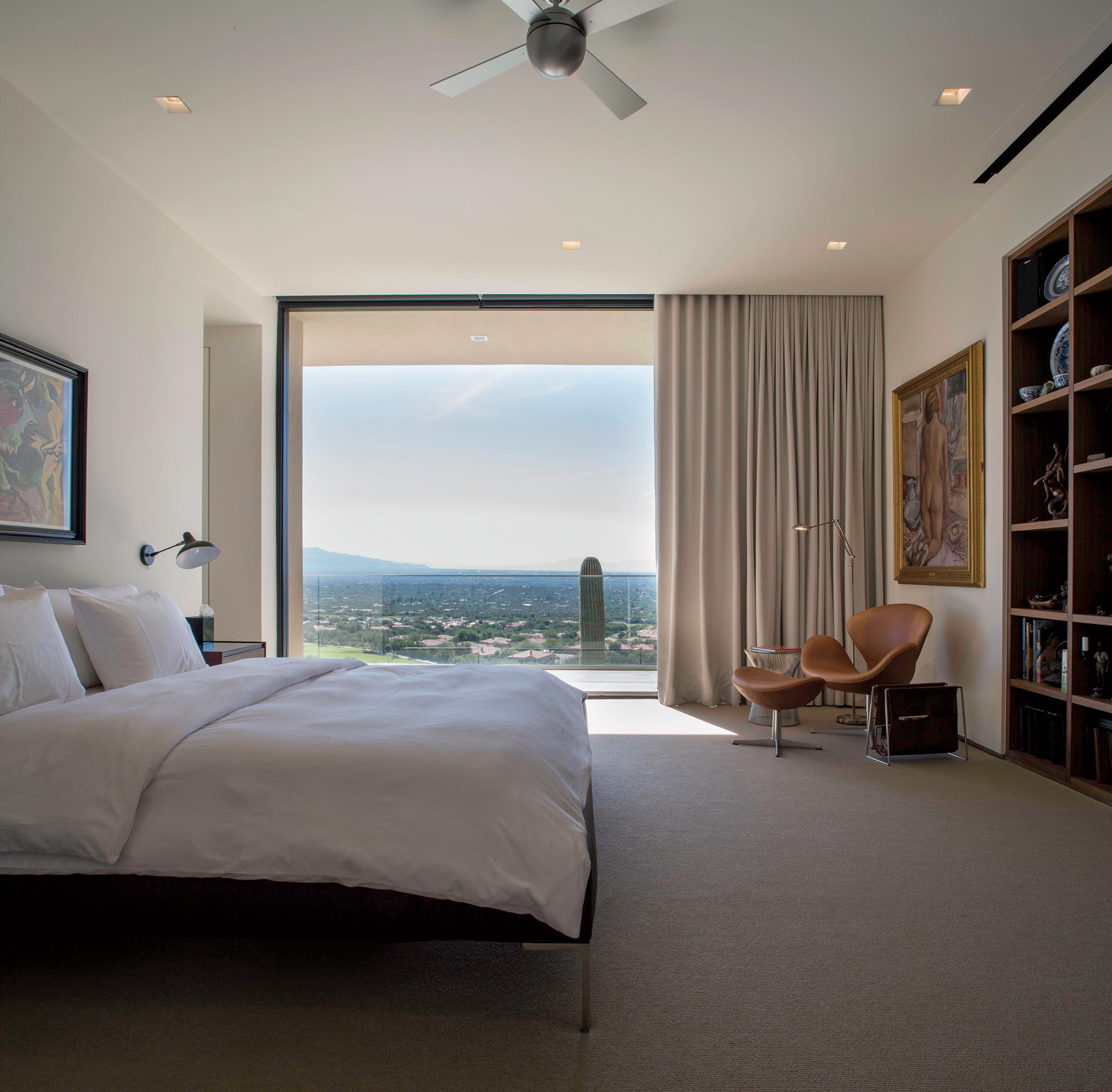
- The master bedroom features a B&B Italia bed and a leather-covered Arne Jacobsen Swan Chair with an Egg Chair ottoman.
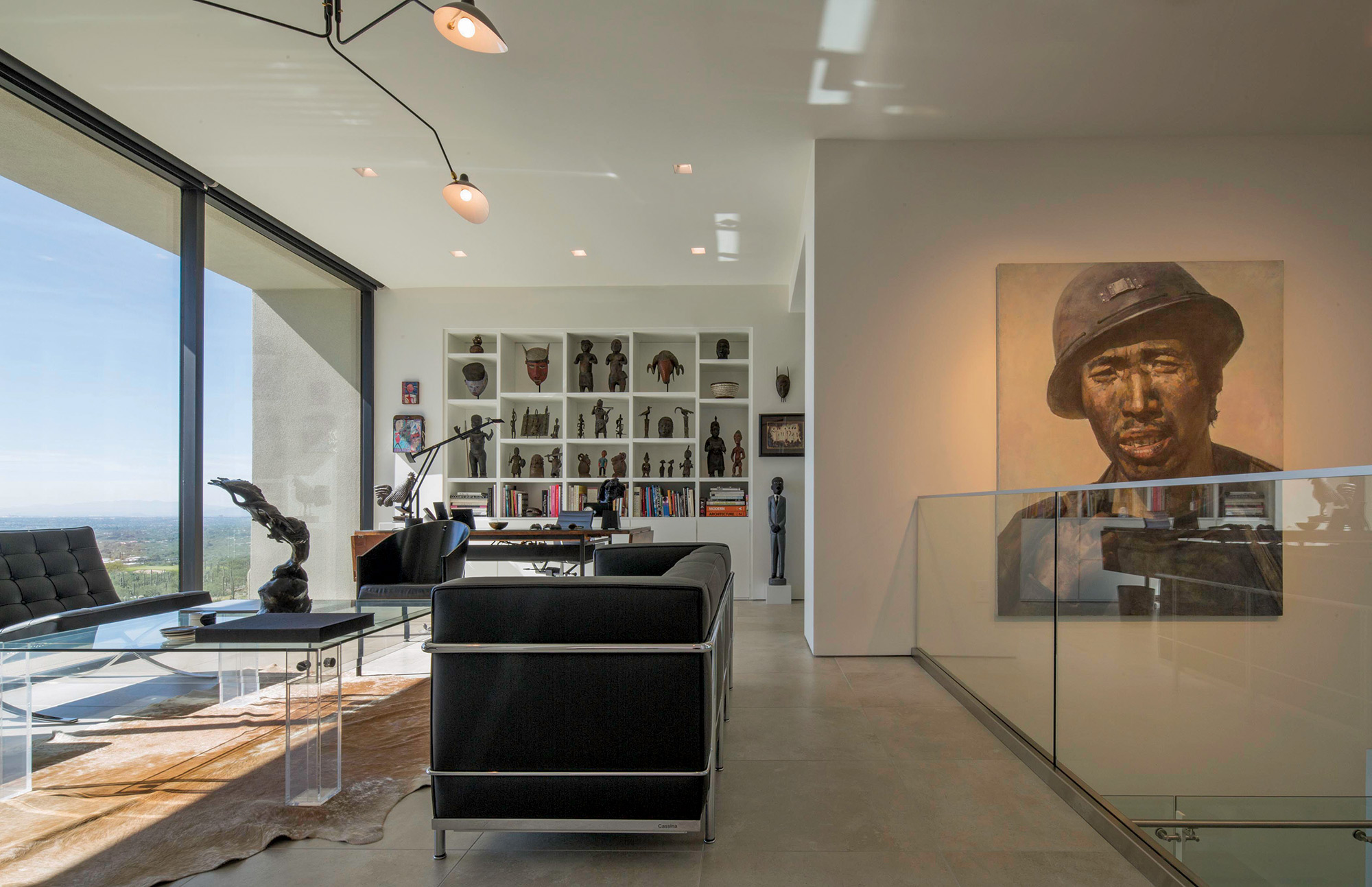
- A Chen Guang Ming painting, hangs in the stair hall. The study features a black leather Le Corbusier couch and a Serge Mouille three-arm chandelier over a vintage 1970’s Plexiglas and glass coffee table.
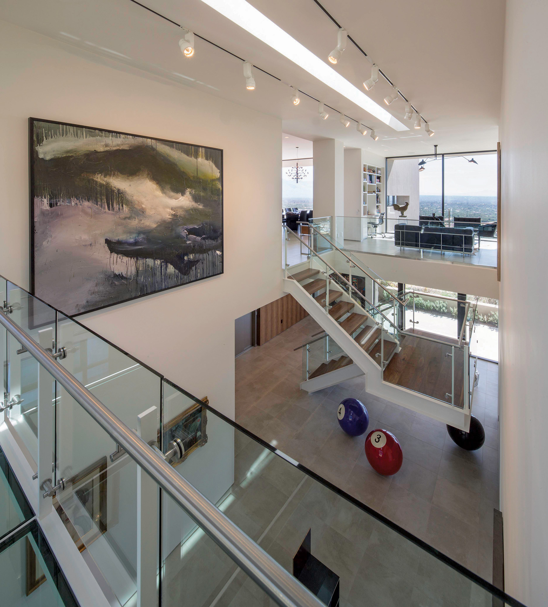
- A glass and steel bridge, connecting the main house with the guest wing, hangs over the gallery and entry way. The oil painting is by Chicago artist Wesley Kimler.
- A limestone sculpture, Oxford Christ, by the owner in his student days sits in the right foreground of the terrace.
- The powder room, called “Salon des Refuses,” contrasts with the stark modern quality of the rest of the house. An homage to their Victorian house, it contains a period gilded Chinese Chippendale mirror and works by Joseph Sharp, Picasso, Thomas Cole, Worthington Whittredge, A.F. Tate, Louis Comfort Tiffany and Goya, among others.


No Comments