14 Sep Dwelling in Possibility
“I SIMPLY COULD NOT STAY AWAY,” says Darwin Harrison.
This disclaimer explains why the designer decided to design, build, and craft the interiors — not to mention the landscape — of the new house he shares with his partner, Robert Buckner. The Austin, Texas-based polymath (he also is a  photographer and writer) had a good excuse — the couple lived just down the street, less than two minutes away. And Harrison and Buckner often drove past the vacant lot, which was actually the side yard of a rambling limestone-block farmhouse, built in 1938, on the former site of a dairy farm.
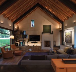
In the living room, a 4-foot-wide oil on canvas painting by Lynn Boggess evokes the sense of moving water in the vaulted space; Chris Richter’s oil Green Space makes its own green space above the fireplace.
Now, the 1-acre spread is in the middle of booming Austin, a verdant oasis that resonates of another time and place. A few years ago, when the lot appeared on the market for the first time ever, Harrison and Buckner leapt at the chance to purchase a site where they could build a house squarely at the epicenter of Austin’s perfect universe — right on Shoal Creek, right next to Austin’s Hike and Bike Trail, and within walking distance to restaurants.
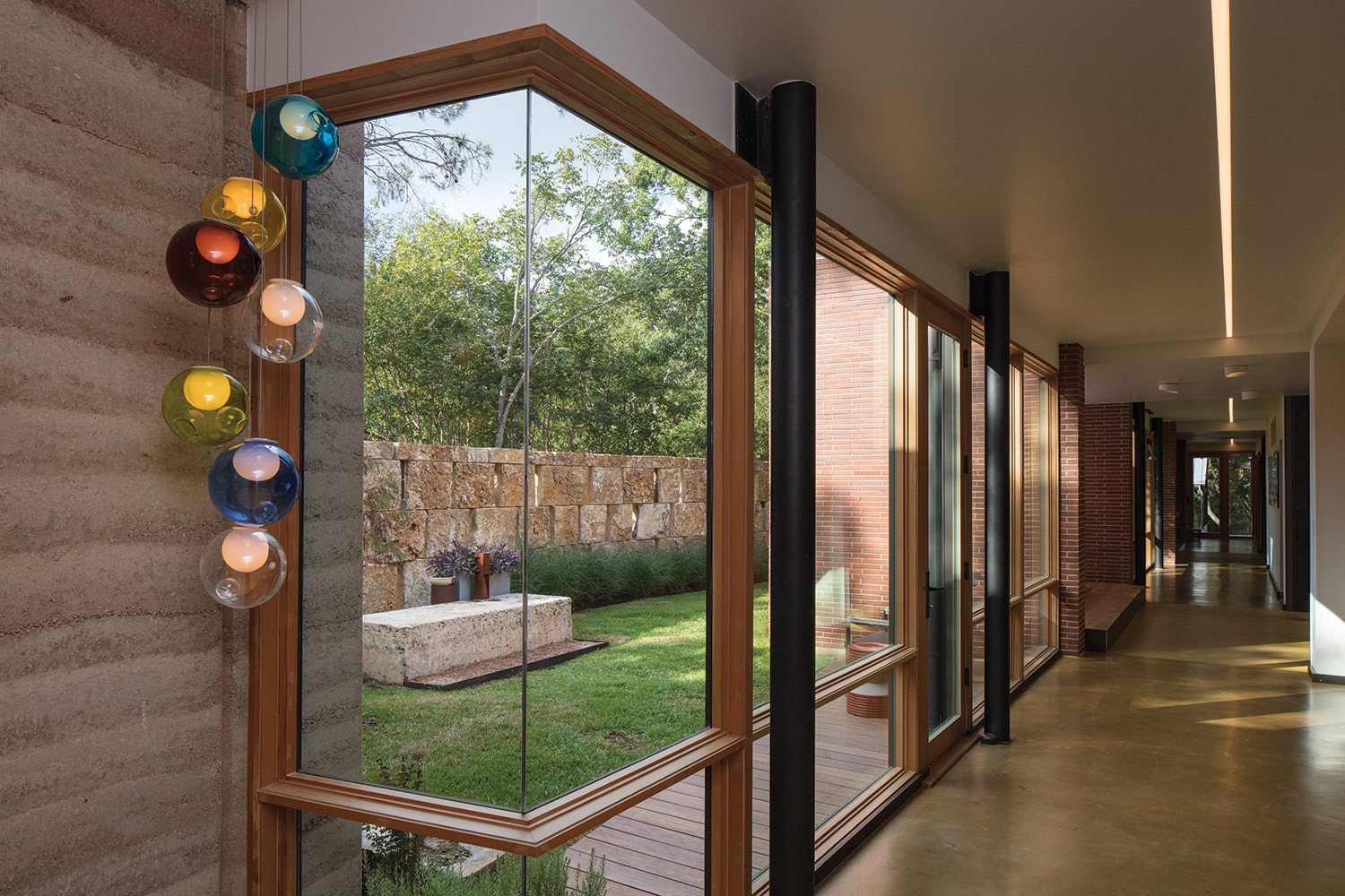 A curved 7-foot, 4-inch wall shapes the driveway and courtyard spaces and contrasts with the rectilinear aspects of the house. Harrison wanted a wall that offered privacy and presence, but he also didn’t want the area to feel too enclosed. He alternated the limestone blocks with open slits that create stripes of sunlight at certain times of the day. The slits are occasionally filled with 2-inch-thick colored glass plugs from Italy that refer to the colors in the Bocci lighting pendant.
Harrison turned the rammed-earth wall at the end of the library into a lighted sculptural feature, but it was originally his experiment to determine the best way to build the rammed-earth wall used throughout the house.
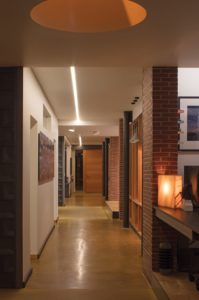
A light well in the hall is the work of lighting specialist Jill Klores of Essential Light Design Studio; its ever-changing array of LED colors is a tribute to light artist James Turrell.
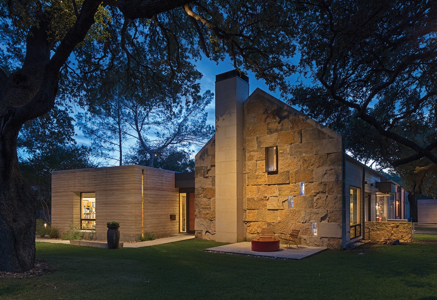
Today, that picturesque farmhouse has a next-door neighbor: a 3,600-square-foot, rock, glass, and rammed-earth dwelling that fits deftly into the treed setting. Its provenance is Modernist — the profiles of the three gabled pavilions connected by glass hallways are sleek and unadorned. And yet, the gables are a gentle acknowledgement of the adjacent vintage house. Jutting from the left of the entry is a rammed-earth-clad cube that serves as Harrison’s studio. Its simple form pays tribute to the power of carefully defined proportions and honest materials.
The earthy tangibility of the three-bedroom, three-bath house bestows enough robust character to suggest that this residence has thrived on its site since at least 1938. At the same time, though, the materiality — Harrison guesses he used 11 types of materials, ranging from Hardie board siding to burnished concrete floors to aluminum shingles — are a contrarian’s take on Modernism’s stereotypical starkness. “I wanted a realness to our modern, something that expresses how it’s made,” Harrison explains. For Buckner, the materials were the key to happiness: “They meant that our modern house could be elegant but not sterile.” It was also the opportunity of a lifetime for the designer, who adds, “One of the joys of this project was to use materials I’ve always loved and to see how they work together.”
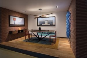
 Harrison devised ways to introduce light into the house, via the glass-enclosed breakfast nook, inserted between a custom Henrybuilt cabinet system framed from Douglas fir to match the windows and doors in the house. Buckner and Harrison personalized the Ingo Maurer light by clipping on their own photos. The table is by Wells Mason.
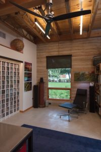
A rammed-earth wall makes for a tactile presence in the designer’s studio where he has hung three panels of his own photography, Light Experiment. Another electrical insulator sits atop an old clay chimney pipe. The painting on the right is by Charlie Burk.
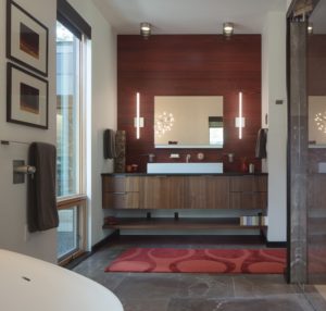
The Henrybuilt vanity in the master bathroom has the presence of an art installation.
Apparently, Harrison and Buckner weren’t the only ones who felt that way. After the project was completed, Harrison was confronted by two women who had parked their car in front of the house. “I’ve been wanting to touch it,” one of them said. “It looks so yummy.”
There were other goals for this long and lean house that is sliced down the middle by a 102-foot hallway. “I wanted a hallway,” says Harrison, “as a way to showcase our growing collection of art.” Many of the pieces the couple has collected are deeply personal. Paintings, photographs, and sculpture are from galleries in Santa Fe, New Mexico, and Austin, as well as privately commissioned works. Some — such as a bronze tumbleweed by Bale Creek Allen and a color photograph by LéAna Clifton of the Hotel Saint George in Marfa — reference the couple’s West Texas roots. Other pieces, such as the custom commission by Francis Gregory Di Fronzo of a fair sign in Harrison’s hometown, are pure nostalgia.
The hallway gives this house its meaning, as well as its functionality. It turned out that one of the features of the lot that made designing the house so difficult also made the hallway possible. “There are so many trees on this lot,” says Harrison. “All I could think was ‘Oh, the trees.’” Difficulty morphed into magic when the designer exploited the concept of the long hallway as an organizing principle, one that targeted a path right through the maze of oaks. Where the trees were avoidable, Harrison notched out courtyards. Two courtyards divide the house into three sections — the front pavilion for living, dining, and kitchen; the second for two guest rooms with a bath between; and the third for the master suite. Each courtyard opens off the hallway and each has a corresponding bump-out directly across: one is the dining room, and the other is a sitting room. With courtyards across the hall, both rooms gain a sense of spaciousness. “It is a way to project you into the landscape,” explains Harrison.
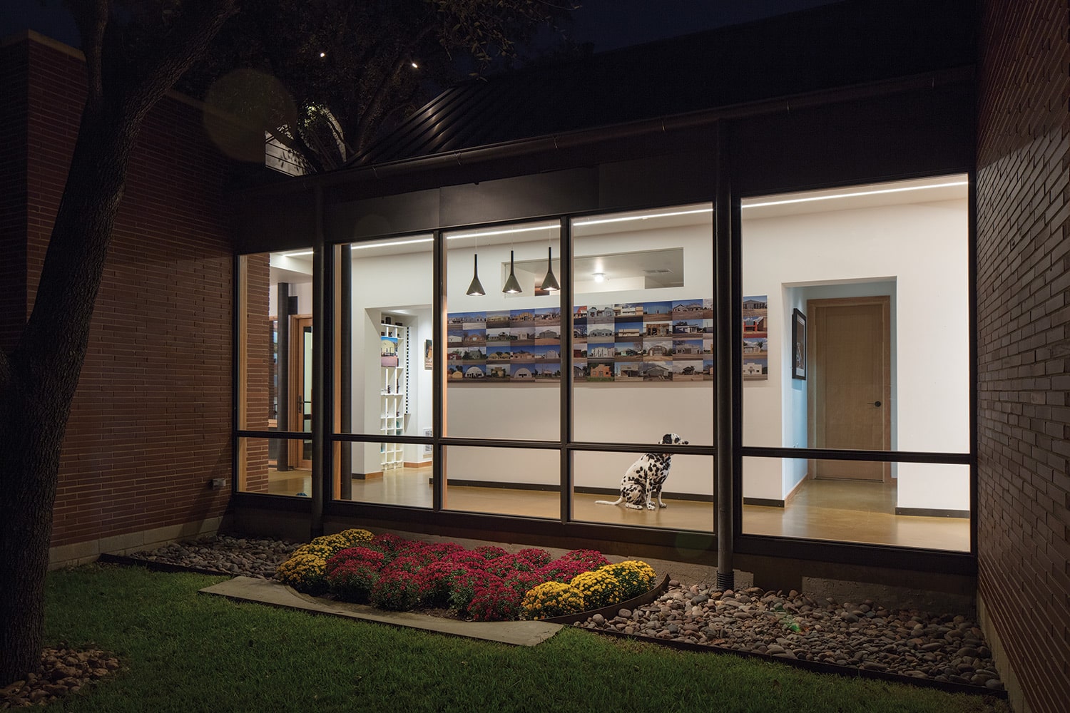 The family dog, Louie, contemplates panels of photography by Harrison that are on display in the long hall.
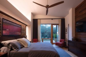
A “shou sugi ban” wall behind the bed in the master bedroom is by Delta Millworks in Austin and was charred so that the top grain of the cypress shows through.
“It’s like living in a park that you don’t have to leave,” says Buckner. “You get the sense of people being alive and doing
things here.” One of the things some people are doing is driving by the Harrison-Buckner house and admiring it. “One lady left us a poem,” says Harrison. It was by Emily Dickinson and begins: I dwell in Possibility – A fairer House than Prose –
The designer shares the poet’s enthusiasm. It’s an unexpected outcome for two people who were so drawn to the property
they couldn’t stay away. And now that their house is on it, they don’t have to.


No Comments