


17 Sep Collector’s Notebook: Illuminating Thoughts on Lighting
Light is an obsession in the art world. Artists’ studios are designed around north-facing windows to harness the most constant natural light source. Curators can spend days, sometimes weeks, adjusting and tweaking the lighting to achieve the best possible look and feel for a show. But as important as light is to the creation and enjoyment of art, it can also physically damage and destroy the objects we love.
To help art connoisseurs appropriately light, protect, and preserve their collection, gallerists, museum curators, and artists offer these tips, tricks, and strategies to not only show off your collection but keep it intact for years to come.
Notes from an Insider: What to Avoid
Linda Cook, a gallerist at David Cook Galleries in Denver, Colorado, works with historical art and textiles. Over the years, she’s witnessed what she thinks are the biggest lighting issues in collectors’ homes. “The main thing I see are ceiling fixtures mounted too close to the walls,” she says. “When you do that, the light casts a shadow on the art, usually from the frame. In a space that has a 9-foot ceiling, I typically suggest having the fixtures 3 feet from the wall. If you are limited by the width of the ceiling, place fixtures to the side so that you can angle the lights at the art.”
When it comes to fixtures, Cook suggests finding the least obtrusive ones with dimmer switches. She also suggests overdoing the lighting. “I have yet to see any house with too much lighting for art. It’s easier to remove bulbs or use lower wattage bulbs than try to add more fixtures after the fact. And having more options will allow you to overlay the light.”
Creating layers of light is key to bringing out the nuances in artwork, but, as Cook suggests, it requires more fixtures. The idea is to spotlight or pop out an aspect of a painting and then add a floodlight or two to illuminate the entire work. “The goal,” Cook says, “is to light the art so that it appears to float on the wall.”
An Artist’s Perspective: Creating the Time of Day
Today’s LED lights come in an overwhelming spectrum of colors, tones, and intensities. To figure out what bulbs are best, we asked landscape artist Len Chmiel to weigh in. Chmiel is renowned for translating his small paintings, created in natural light outdoors, into poetically subtle statements on a grand scale.
But will those plein-air-inspired paintings look different once indoors in artificial light? What lighting should the collector consider for the optimal effect?
“I believe paintings do show better in natural light,” Chmiel says, but he adds that even though he has a huge northern-facing window in his studio, these days, he paints under artificial lights. “I’ve covered the window up in favor of 5,000-degree Kelvin fluorescent lights and one 4,500-degree LED flood light,” he says.
This may come as a surprise to readers, but Chmiel explains that natural light varies throughout the day and makes the painting look different. “In the days before artificial light, north light was the most reliably consistent,” he says. “Not anymore. It took me years of thinking about that. This is the fourth iteration of my studio lighting and the most successful, once I realized I needed to cover the north light window.”
Bright Light: Finding the Right Bulbs
“With artificial lights, a color rendering index (CRI) in the high 90s is very important,” Chmiel says. “Very high-quality (and expensive) LEDs are best, after that, high-quality fluorescents that are — you guessed it — expensive. Whatever degree Kelvin you pick, the higher the temperature and CRI, the better. Fiber optic lighting is the very best, but that’s still not generally available, and it’s pricey last I checked.”
Preventing Damage: Avoid Sunlight
It’s true: the sun is hard on your skin and even harder on artworks. The mediums that tend to suffer the most from sun damage are works on paper — prints, photographs, and watercolors — while oils, acrylics, and pastels hold up much better to natural light.
According to master printmaker Leon Loughridge, dyes used in older works are subject to rapid fading. “Japanese prints pre-1867 were printed with organic dyes,” he explains, “and should never be hung in bright light or under fluorescent lighting. By the 1890s, artists had switched over to pigment-based inks. Contemporary prints are usually more light stable because of better quality pigments, but there are products in use that are not lightfast, so, when in doubt, the safest thing to do is hang color prints in low light with UV glazing.”
Another thing to consider when buying works on paper is the type of paper used in the process. Wood-pulp paper will yellow over time as the wood naturally deteriorates. Cotton fiber paper is much more stable and can withstand fluctuations in temperature and humidity.

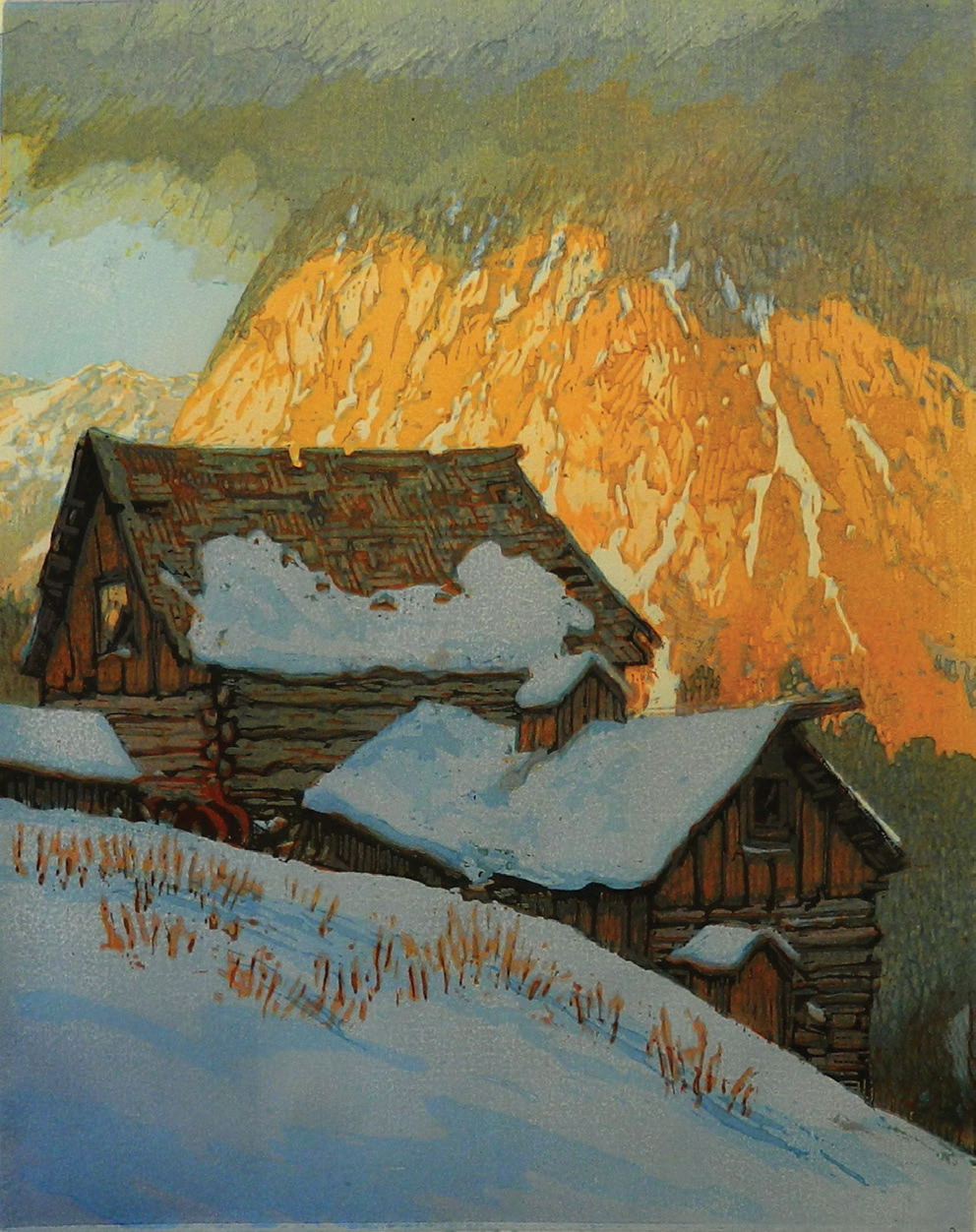
Len Chmiel, Lost in Space | Oil on Canvas | 40 x 32 inches
And then there are photographs. “Photos and watercolors,” says Eric Paddock, the Denver Art Museum’s curator of photography, “are susceptible to fading and color shifting when they get too much light. They never recover from that.”
In museums, lighting specs are more restrictive than most people want at home, mainly because houses have windows and museum galleries don’t. These are measured in foot-candles, a unit of light intensity. “As a general rule,” Paddock says, “19th-century photographs and color works require lower light levels than black and white pictures. We aim for 3 to 5 foot-candles for 19th-century prints and 20th-century photos on printed-out paper, such as those by Eugene Atget or Linda Connor. Color prints get between 5 to 8 foot-candles. We’ll go a bit higher — up to 9, rarely 10 — for black and white prints, provided they are in good condition and don’t exhibit any staining or oxidation. Cyanotype and color Polaroids of all types get only 3 foot-candles, and we don’t exhibit them for more than six to eight weeks before we rotate them out and replace them with other artworks.”
Basically, says Loughridge, sunlight, whether direct or indirect, is never a good thing for any works on paper; it will cause the work to fade, and the light will heat the interior of the frame environment, creating issues that are not healthy for the paper.
“Natural light,” echoes Cook, “is the most damaging to art, especially watercolors and aniline-dyed textiles. Collectors should protect their art with UV or museum glass or museum plexi.” And she notes, “if your home has a lot of solar gain, consider adding UV protective film on all windows.”
Whether you simply want to enjoy art on your wall or are seriously collecting as an investment, Paddock advises that you take care with the lighting and display. “One good way to do that,” he suggests, “is to collect more pictures than you can have on display at one time and change them seasonally or as the mood strikes. It can be nice, for example, to see landscape pictures that are spacious and full of light during the darkness of wintertime. The other thing is that we don’t really look at our art every day; it fades into the background eventually. That’s a good time to switch things out to get a fresh view of things.”
Collector’s Notebook” columnist Rose Fredrick writes a regular blog, The Incurable Optimist, where she covers the art market, collecting, and exhibitions, and presents in-depth interviews with artists; rosefredrick.com.
No Comments